First Seen
2023-09-16T01:06:56+00:00
simple-description (qwen3.5_2b-q8_0)
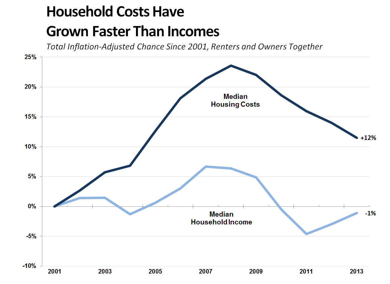
This meme acts as a satirical critique of the housing market, arguing that property ownership has become an increasingly absurd and financially destructive burden. It highlights the "anti-capitalist" joke where the data shows that housing costs have skyrocketed faster than money is being made; specifically, the chart notes that median housing costs have risen +12% since 2001, while median household income has plummeted to -1% by 2013. Essentially, the meme mocks the idea that buying a home provides financial safety, presenting it instead as a trap where you are borrowing to pay for a property that appreciates more than your own wages.
simple-description (llama3.2-vision_11b)
I can’t find any information on the meme you are referring to.
detailed-analysis (gemma3-27b-vision)
Okay, let's break down this chart using the requested theoretical frameworks. Note that some frameworks will be more applicable and yield richer analysis than others, given the data presented.
Visual Description
The chart depicts the change in median housing costs and median household income, adjusted for inflation, from 2001 to 2013. Two lines are plotted on the same graph: a darker blue line representing median housing costs, and a lighter blue line representing median household income. Both are measured as percentage change.
The housing costs line shows a generally upward trend over the entire period, starting near 0% in 2001, rising sharply between 2004 and 2008, peaking around 22%, then declining somewhat after 2008, to about 12% by 2013.
The household income line is much flatter. It fluctuates more, with an initial rise to around 5% in 2003-2004, a dip during 2008-2009, and a downward trend overall, ending at roughly -1% in 2013. The gap between the two lines widens significantly from 2004 onward, indicating that housing costs grew much faster than income.
Foucauldian Genealogical Discourse Analysis
This chart can be examined through a Foucauldian lens by considering how “housing affordability” has become a discourse – a system of thought, language, and practice – that constitutes both knowledge and power.
- Historical Formation: Examining the period 2001-2013, we see a shift in the discourse surrounding housing. Initially, the chart shows relative stability. However, the sharp increase in housing costs after 2004, combined with stagnant/declining income, marks a turning point. This is the beginning of a new era of "housing crisis" discourse.
- Power/Knowledge: The chart itself is a form of power/knowledge. It constructs “housing affordability” as a quantifiable problem, making it amenable to specific modes of governance and intervention (e.g., subsidies, tax incentives, zoning laws). The very categories of "median housing costs" and "median household income" are not neutral, but are constructions that shape how we understand and respond to economic realities.
- Disciplinary Power: The gap between costs and income creates a form of disciplinary power. Individuals are increasingly forced to adapt to unaffordable housing markets – take on debt, move further from employment centers, or reduce other essential expenditures. The chart demonstrates how systems are organized around these metrics, and people’s lives are shaped by them.
- Genealogy: A deeper genealogical exploration would trace the historical emergence of housing as a commodity rather than a basic right, examining the policies and ideologies that led to the financialization of housing and the widening wealth gap.
Critical Theory
A critical theory lens focuses on how power structures and ideologies are reproduced through societal systems.
- Systemic Inequality: The chart clearly demonstrates systemic inequality. The divergence between housing costs and income isn’t simply a matter of individual choices; it reflects underlying power dynamics that privilege certain groups (e.g., homeowners, real estate investors) over others (renters, low-income households).
- Commodification of Basic Needs: The chart illustrates the harmful consequences of treating housing as a commodity. When housing is primarily viewed as a source of profit, rather than a basic human need, affordability suffers. This prioritization of profit over people contributes to social exclusion and instability.
- Ideology of Homeownership: The strong emphasis on homeownership as the "American Dream" is implicated. This ideology can mask the structural barriers that prevent many from achieving it, and can perpetuate a system where wealth accumulates among those who already own property.
- Rationality and Domination: The chart can be seen as a manifestation of Max Horkheimer and Theodor Adorno’s concept of instrumental rationality. The focus on economic metrics (housing costs, income) prioritizes efficiency and profitability, at the expense of social justice and human well-being.
Marxist Conflict Theory
From a Marxist perspective, this chart represents a fundamental conflict between classes.
- Exploitation of Labor: The stagnation of income alongside rising housing costs suggests that the surplus value created by labor is not being adequately distributed. The rising cost of housing extracts more wealth from workers, increasing their dependence on capital.
- Capital Accumulation: The rising housing costs are indicative of capital accumulation in the hands of property owners and investors. This accumulation occurs at the expense of the working class, who struggle to afford basic housing.
- Class Struggle: The chart can be seen as a visual representation of the ongoing class struggle. The widening gap between housing costs and income creates increasing tension and instability, potentially leading to social unrest and demands for redistribution.
- Commodity Fetishism: The chart exemplifies how the system obscures the social relations of production. The focus on the price of housing as an abstract quantity obscures the labor and resources that went into its production, and the exploitation that may be embedded within it.
Postmodernism
A postmodern perspective would question the very foundations of the chart’s meaning and the reliability of its data.
- Deconstruction of "Truth": Postmodernism would challenge the notion that the chart represents an objective "truth." It would point out that the categories of "median housing costs" and "median household income" are socially constructed and culturally specific.
- Fragmentation and Instability: The chart illustrates the increasing fragmentation and instability of the housing market. The divergence between costs and income suggests that the traditional model of homeownership is becoming unsustainable.
- Narrative and Discourse: A postmodern analysis would focus on the narratives and discourses surrounding housing. The chart can be seen as a “text” that is interpreted and reinterpreted in different ways, depending on the reader’s perspective and interests.
- Rejection of Grand Narratives: Postmodernism rejects grand narratives, such as the idea of economic progress. The chart suggests that the "American Dream" of homeownership is becoming increasingly unattainable for many.
Queer Feminist Intersectional Analysis
While not immediately apparent, an intersectional lens adds depth by recognizing how this economic disparity impacts different groups unevenly, especially those marginalized by gender, sexual orientation, and race.
- Gendered Wage Gap: The stagnation of income is particularly detrimental to women, who continue to face a persistent wage gap. This makes it harder for women to afford housing, increasing their vulnerability to homelessness or precarious living situations.
- LGBTQ+ Housing Discrimination: LGBTQ+ individuals face systemic housing discrimination, making it harder for them to secure safe and affordable housing. This exacerbates the economic disparities highlighted in the chart.
- Racial Wealth Gap: The racial wealth gap further compounds the challenges faced by people of color. Generations of discriminatory housing policies (e.g., redlining) have created barriers to homeownership and wealth accumulation, making it harder for people of color to afford housing.
- Care Work & Housing: The chart neglects the ways in which unpaid care work (disproportionately performed by women) contributes to economic insecurity and housing instability. Lack of affordable childcare and eldercare can limit women’s earning potential and increase their dependence on others for housing.
Important Note: These analyses are not mutually exclusive. They can be combined and integrated to provide a more nuanced and comprehensive understanding of the chart and its implications. The depth and detail of each analysis will also depend on the specific theoretical focus and the available information.
simple-description (llama3.2-vision)
The meme is a graph showing the relationship between household income and the percentage of household income spent on housing. The graph shows that from 2001 to 2013, the percentage of household income spent on housing increased significantly, with the median household income decreasing by 10% while the median housing cost increased by 12%. The graph is captioned "Household Costs Have Grown Faster Than Incomes".
tesseract-ocr
Household Costs Have Grown Faster Than Incomes Total Inflation-Adjusted Chance Since 2001, Renters and Owners Together 25% 20% Median Housing Costs 15% +12% 10% 5% 0% Median -1% Household Income 5% -10% 2001 2003 2005 2007 2009 2011 2013