First Seen
2023-09-16T01:07:24+00:00
simple-description (qwen3.5_2b-q8_0)
This meme visually illustrates the unfair economic disparity in the housing system: the title, "Renters Have Continued to Climb," tracks the steep rise in median housing costs for renters over time, while the "Homeowners" line shows their massive profit margins and eventual market crash. In an anti-capitalist context, this graph serves as evidence of systemic exploitation, suggesting that private ownership of housing allows wealthy landlords to dictate terms and reap huge profits while forcing workers to absorb financial burden.
simple-description (llama3.2-vision_11b)
The meme is a graph showing the increasing cost of housing for renters compared to homeowners. The graph depicts a steep upward trend in the cost of renting, with the renter's share of the median household income increasing from 0% in 2000 to 27% in 2013. The text "rent is 27% of the median household income" is overlaid on the graph, highlighting the significant burden of housing costs on renters.
detailed-analysis (gemma3-27b-vision)
Okay, let's break down this graph – depicting the inflation-adjusted change in median monthly housing costs for homeowners and renters since 2001 – through several theoretical lenses. I'll only include sections where the theory offers relevant insight.
1. Visual Description
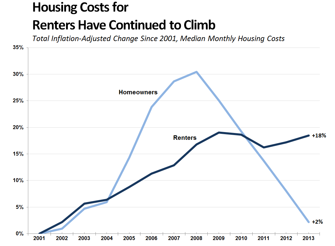
The graph presents two lines charting the percentage change in housing costs over time (2001-2013). One line represents homeowners, the other renters.
- Initial Trend (2001-2004): Both lines begin very close to the zero percent mark, with very similar, modest increases.
- Divergence (2004-2008): Starting around 2004, the homeowner line begins to climb rapidly, accelerating significantly past the renter line. The renter line also increases, but at a much slower pace.
- Peak and Drop (2008-2010): The homeowner line peaks around 2007/2008 at approximately 30% increase, then experiences a dramatic decline, falling back to levels close to those seen in the early 2000s. The renter line continues to increase, though at a more moderate rate.
- Stabilization (2010-2013): The renter line continues a slow, steady climb, reaching +18% by 2013. The homeowner line flattens out and stabilizes, ending at +2% in 2013.
2. Marxist Conflict Theory
This graph is strongly amenable to a Marxist interpretation. The stark difference in the trajectories of housing costs for homeowners and renters can be understood as a manifestation of class conflict and the exploitative nature of capitalist systems.
- Commodity Fetishism: Housing, fundamentally a basic human need, is treated as a commodity – something to be bought and sold for profit. The graph demonstrates how the value of this commodity is not determined by need, but by market forces (supply and demand, speculation, financialization).
- Capital Accumulation: The rapid increase in homeowner costs, especially in the mid-2000s, can be linked to financial speculation and the accumulation of capital by those who own property (the bourgeoisie). The bubble-like curve in homeowner cost can be attributed to financialization of the housing market.
- Proletariat Exploitation: Renters, representing the proletariat, experience a steady increase in housing costs, while homeowners benefit from escalating property values (until the crash). This demonstrates how the capitalist system extracts surplus value from the working class through housing costs. Renters are effectively subsidizing the wealth accumulation of homeowners.
- Crisis and Contradiction: The 2008 housing crisis, reflected in the homeowner line's drop, reveals the inherent contradictions within capitalism. The unchecked accumulation of capital eventually leads to instability and crisis. This crisis does not disproportionately harm renters, however. They continue to experience climbing costs.
- Class Struggle: The graph can be seen as a visual representation of the ongoing struggle between homeowners (who benefit from the system) and renters (who are disadvantaged by it).
3. Foucauldian Genealogical Discourse Analysis
We can analyze this graph through a Foucauldian lens to understand the power dynamics shaping housing and the discourses that normalize certain arrangements over others.
- Power/Knowledge: The graph isn’t simply a neutral presentation of facts. It reflects how power operates through knowledge. The very collection and presentation of this data are acts of power, defining what is considered "housing cost," what metrics are used, and which groups (homeowners vs. renters) are considered.
- Discipline and Normalization: The increase in homeowner costs, and its eventual crash, demonstrate how financial institutions and market forces discipline individuals through the "rational" demands of the economy. The idea of homeownership as the "American Dream" normalizes a particular lifestyle and exerts pressure on individuals to participate in a system that benefits some more than others.
- Genealogy of Housing: Tracing the historical development of housing policies, financial instruments (mortgages, subprime lending), and social norms around homeownership reveals how these practices have become deeply ingrained in our culture and exert control over individuals.
- Surveillance: The data collection itself represents a form of surveillance – tracking and categorizing individuals based on their housing status.
4. Critical Theory
Critical Theory expands on the Marxist framework by exploring the cultural and ideological dimensions of domination.
- Ideology and False Consciousness: The "American Dream" narrative—the belief that anyone can achieve homeownership through hard work—serves as a powerful ideology that obscures the systemic barriers preventing many from accessing affordable housing. This creates a "false consciousness" where individuals may blame themselves for their housing struggles rather than recognizing the structural issues at play.
- Commodification of Everyday Life: The graph demonstrates how even basic needs like housing are increasingly commodified within late capitalist society, turning them into sources of profit and exacerbating inequality.
- Rationalization and Bureaucratization: The complexities of the housing market (mortgages, insurance, property taxes) can be seen as part of the broader process of rationalization and bureaucratization that characterizes modern society. This creates a system that is opaque, difficult to navigate, and potentially disempowering for individuals.
In essence, this graph isn't just about numbers. It's a visual representation of social, economic, and political forces that shape our lives. A variety of theoretical lenses can help unpack the complex dynamics at play and illuminate the power relations embedded within the housing market.
simple-description (llama3.2-vision)
The meme is a graph showing the increase in housing costs for renters and homeowners from 2000 to 2013. The graph is titled "Housing Costs for Renters Have Continued to Climb" and includes a subheading "Inflation-Adjusted Change Since 2001". The graph shows a sharp increase in housing costs for both renters and homeowners, with renters experiencing a 35% increase in costs.
tesseract-ocr
Housing Costs for Renters Have Continued to Climb Total Inflation-Adjusted Change Since 2001, Median Monthly Housing Costs 35% 30% Homeowners 25% 20% Renters +18% 15% 10% 5% +2% 0% “3001 2002 2003 2004 2005 2006 + 2007 2008 +2009 | 2010 + 2011 +2012 | 2013