First Seen
2023-05-10T20:59:58+00:00
simple-description (llama3.2-vision_11b)
This meme is a commentary on the struggles of first-time homebuyers in a rapidly changing and increasingly expensive housing market. The image shows a graph with the average price of a house in the United States from 2019 to 2023, with a sharp spike in price in 2020 and 2021, indicating a significant increase in the cost of housing. The meme is likely referencing the struggle of first-time homebuyers, who are often forced to take on high levels of debt to purchase a home, and the struggle to afford the rising costs of housing.
detailed-analysis (gemma3-27b-vision)
Okay, let's break down this chart with the requested theoretical lenses. It's a compelling visual, and applying these frameworks will help reveal deeper meanings beyond the raw data.
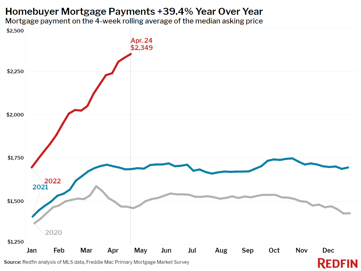
Visual Description
The chart depicts the trend of median monthly mortgage payments from January 2020 through December 2022. Three lines represent the rolling average payments for each year.
- 2020 (Gray): Starts at approximately $1,300 and experiences a moderate, gradual increase throughout the year, reflecting a relatively stable housing market.
- 2021 (Blue): Begins around $1,500, shows a more pronounced increase in the first half of the year, and then plateaus, demonstrating growing but eventually settling demand.
- 2022 (Red): Starts around $1,600, but undergoes a dramatic, almost vertical increase beginning in February/March and peaking in April at $2,349. This rise is far more substantial than the previous two years. The chart headline states “+39.4% Year Over Year,” highlighting the significant surge.
The chart overall shows a clear trend of increasing mortgage payments, with the most dramatic increase occurring in 2022. The labeling is minimal but effective, clearly identifying the years and peak value.
---
Foucauldian Genealogical Discourse Analysis
This chart is not merely a depiction of economic reality, but a production of knowledge about homeownership and its associated costs. Foucault would argue that the chart isn’t neutral; it performs an understanding of the housing market.
- Discourse of Affordability: The very act of measuring and presenting mortgage payments defines what is considered “affordable” or “unaffordable.” This is not an objective truth but a construction within a particular discourse. The "normal" baseline established by 2020/21 becomes a point of comparison, subtly framing the 2022 spike as an exception or crisis rather than perhaps a logical outcome of larger systemic forces.
- Power/Knowledge: The institutions generating this data (Redfin, Freddie Mac) wield significant power. They define the metrics, collect the data, and present it in this specific format, thereby shaping public perception and influencing policy. The chart allows a particular narrative to dominate, potentially obscuring alternative understandings of the housing situation.
- Genealogy of "Homeownership": A genealogical analysis would trace the historical development of the concept of "homeownership" itself. How has the meaning of owning a home changed over time? What power structures have shaped the ideal of homeownership as a central tenet of the American Dream? This chart reveals the material consequences of these historically constructed ideas.
---
Marxist Conflict Theory
This chart provides a clear illustration of the inherent conflicts within a capitalist system, particularly as they relate to housing.
- Class Struggle: The escalating mortgage payments represent a growing barrier to entry for working-class and lower-middle-class individuals seeking homeownership. Housing, fundamentally a need, is increasingly becoming a commodity accessible only to those with sufficient capital. This exacerbates class divisions.
- Exploitation of Labor: The increase in mortgage rates (not directly shown, but strongly implied) can be linked to broader macroeconomic forces, such as inflation and rising interest rates. These forces, in turn, are rooted in the dynamics of capital accumulation and the exploitation of labor. Workers' wages may not keep pace with the rising cost of housing, creating a situation of relative impoverishment.
- Commodification of Housing: The chart demonstrates how housing has been fully integrated into the capitalist market. It is no longer primarily about shelter but about profit and investment. The steep increase in payments reflects the logic of capital – maximizing returns regardless of the social consequences.
- Alienation: The increasing financial burden of homeownership can lead to alienation – a sense of disconnection from the fruits of one’s labor. Individuals may feel trapped in a cycle of debt and financial insecurity, diminishing their sense of agency and well-being.
---
Postmodernism
A postmodern reading of the chart emphasizes the instability of meaning and the rejection of grand narratives.
- Deconstruction of "The American Dream": The chart challenges the conventional narrative of homeownership as a guaranteed path to security and prosperity. The soaring costs suggest that this "dream" is becoming increasingly unattainable for many, deconstructing its supposed universality.
- Simulacra and Simulation: The chart itself can be seen as a simulacrum – a copy without an original. It represents a stylized and abstracted version of a complex reality, potentially obscuring the lived experiences of individuals struggling to afford housing.
- Fragmentation and Discontinuity: The chart illustrates the lack of a stable and predictable housing market. The sharp spike in 2022 disrupts the previous trend, suggesting a discontinuity in the established order.
- Rejection of Objective Truth: Postmodernism would question the notion that this chart presents an objective truth. It emphasizes that data is always interpreted through a particular lens and shaped by power relations.
---
Queer Feminist Intersectional Analysis
While this chart doesn’t immediately scream “gender” or “sexuality,” an intersectional lens reveals how the burden of rising housing costs disproportionately impacts marginalized groups.
- Gendered Economics of Housing: Women, particularly single mothers and women of color, are more likely to experience economic insecurity and face greater barriers to homeownership. The rising cost of housing exacerbates these existing inequalities.
- Racial Capitalism: The historical and ongoing racial disparities in wealth and access to credit mean that communities of color have been systematically excluded from homeownership opportunities. The current housing crisis perpetuates these injustices.
- Queer Spaces and Housing Instability: LGBTQ+ individuals may face discrimination in housing and experience higher rates of housing instability. Rising costs further marginalize these communities.
- Intersection of Gender, Race, and Class: The chart highlights the ways in which these intersecting identities shape access to housing. A Black single mother, for example, may face a unique set of challenges that make homeownership particularly difficult.
- Care Work and Housing Costs: The disproportionate burden of care work (childcare, eldercare) on women can limit their earning potential and make it harder to afford housing. Rising costs further strain already limited resources.
I've tried to provide a nuanced reading of the chart through these various lenses. It's important to remember that these frameworks aren't mutually exclusive, and they can often be used in combination to provide a more comprehensive understanding of social phenomena. Let me know if you'd like me to expand on any particular aspect or explore additional theoretical perspectives.
simple-description (llama3.2-vision)
The meme is a graph showing the monthly average prices of homes in the US, with a significant spike in 2021-2022. The text at the top reads "Homebuyer Mortgage Payments 2021-2022" and the title "Inflation is a Bitch" is written above the graph. The graph shows a steady increase in prices from 2020 to 2022, with a sharp spike in 2021, and then a slight decline in 2022.
tesseract-ocr
Homebuyer Mortgage Payments +39.4% Year Over Year Mortgage payment on the 4-week rolling average of the median asking price $2,500 Apr. 24 $2,349 $2,250 $2,000 $1,750 2022 2021 $1,500 $1,250 Jan Feb Mar Apr May Jun Jul Aug Sep Oct Nov Dec Source: Redfin analysis of MLS data, Freddie Mac Primary Mortgage Market Survey REDFIN