First Seen
2024-03-27T22:50:47.976772+00:00
simple-description (qwen3.5_2b-q8_0)
This image displays a graph showing "U.S. New Home Median Sales Price" plummeting from over $500,000 to $400,500 in 2024. From an anti-capitalist perspective, the skyward spike and subsequent crash represent the speculative housing bubble, where people buy homes simply to resell them at lower prices, destroying the value of the system. The "HOME FOR SALE" sign on the house and the "NO PARKING / STANDING FIRE LANE" text on the truck mock the chaotic, money-focused nature of the housing market.
simple-description (llama3.2-vision_11b)
The meme is a graph showing the decline of new home prices in the US, with a caption that says "New home prices have fallen 40% from their 2022 peak, but are still 50% higher than before the 2008 financial crisis". This meme is relevant to the category of Anti-Capitalism - Housing, as it highlights the issue of unaffordable housing and the struggle of many people to own a home due to high prices. The meme is also a commentary on the economic inequality and the need for policy changes to address the housing crisis.
detailed-analysis (gemma3-27b-vision)
Okay, here's an analysis of the image, broken down into the requested sections. I'll indicate where a section doesn't really apply or is limited in scope.
Visual Description
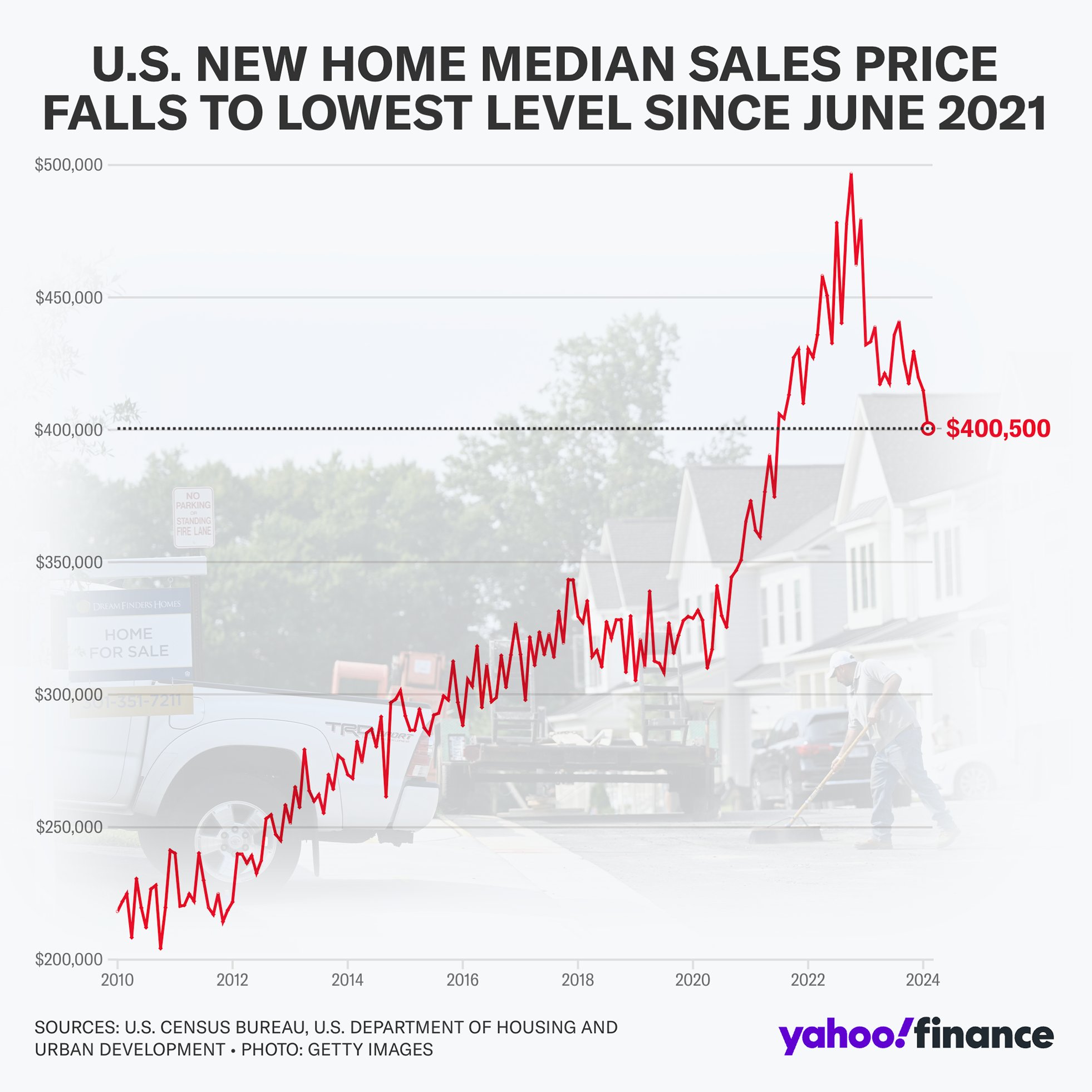
The image is a line graph charting the median sale price of new homes in the United States from 2010 to early 2024. The Y-axis ranges from $200,000 to $500,000, representing price in dollars. The X-axis is the timeline, demarcated in years.
The graph shows a relatively stable but fluctuating price range from 2010 to 2020, generally increasing. A dramatic spike in prices occurs around 2021-2022, peaking at just over $470,000. The graph shows a steep decline from this peak into early 2024, leveling off around $400,000, which is marked with a red indicator and text.
A blurred image of new houses/suburban homes appears in the background, creating the visual context for the data. The image is branded with Yahoo Finance, with sources cited as the U.S. Census Bureau, Department of Housing and Urban Development, and Getty Images.
Foucauldian Genealogical Discourse Analysis
This image isn't strongly suited to a full genealogical analysis, but some relevant points can be made. The graph presents “truth” about the housing market as an objective, quantifiable reality. However, the very construction of this data—the decision to track median price, the categories of "new" homes, the data collection methods—are all discourses that create and normalize particular understandings of housing value.
The graph participates in a larger "regime of truth" about the market, where price is a primary indicator of success, and housing is treated as a commodity. Foucault would suggest we look at the historical development of these methods of data collection and the institutions that use them (e.g., banks, government agencies, real estate firms) to understand how "the housing market" came to be seen as a natural, self-regulating force. The graph, therefore, performs power by shaping how we understand and engage with housing. The image normalizes the concept of housing as financial investment, framing value in strictly monetary terms and obscuring other values (e.g., shelter, community, social good).
Critical Theory
The graph lends itself well to critical theory, specifically a critique of instrumental reason. The graph, and the economic logic it embodies, prioritizes quantifiable data (price) above all other considerations. This reinforces a system where housing is treated as a means to an end (profit, investment), rather than an end in itself (basic human need, community building).
The emphasis on price can be seen as contributing to the commodification of housing—reducing it to an object of exchange, divorced from its social function. A critical theory perspective would argue this process alienates people from the basic need for secure shelter and reinforces inequalities based on economic status. The image implicitly suggests that the "health" of the housing market (as measured by price) is the most important metric, masking the human cost of housing instability.
Marxist Conflict Theory
This image is particularly strong for a Marxist analysis. The graph clearly illustrates the dynamics of capital accumulation in the housing market. The significant price increase from 2020-2022 represents the extraction of surplus value from those seeking housing.
The graph highlights the inherent contradictions of capitalism—the tension between the social need for shelter and the drive for profit. The steep decline in price might seem positive on the surface, but from a Marxist perspective, it could signal a crisis of overproduction or a contraction in capital investment in the housing sector, potentially leading to job losses and increased housing insecurity.
The image implicitly highlights the class struggle inherent in the housing market—between those who own capital (developers, investors) and those who are dependent on wage labor to access housing. The increase in prices makes housing less accessible to the working class and exacerbates existing inequalities.
Postmodernism
While not a central focus, a postmodern reading could deconstruct the authority of the graph. The idea of a "median price" is a construct—a statistical averaging that obscures the diversity of housing experiences and the subjective meaning people attach to their homes. The graph presents a seemingly objective "truth," but this truth is relative to the data collection methods and the specific definitions used.
A postmodern perspective would question the grand narrative of a stable, predictable housing market. The fluctuations shown in the graph suggest that the market is a complex, contingent system, subject to unforeseen events and unpredictable forces. The image can be seen as a simulacrum – a representation that has become detached from any underlying reality.
Queer Feminist Intersectional Analysis
This image could be linked to queer feminist intersectional analysis, but it requires more interpretation. Housing affordability disproportionately impacts marginalized groups – including LGBTQ+ individuals, people of color, and women, particularly single mothers.
These groups face systemic discrimination in housing markets, making it harder to access affordable and safe housing. The price fluctuations shown in the graph exacerbate these existing inequalities, widening the wealth gap and creating further barriers to economic and social inclusion.
The graph also implicitly reinforces heteronormative assumptions about housing – for example, the idea of a nuclear family owning a detached home. Access to affordable housing can be particularly challenging for LGBTQ+ individuals and families who may face discrimination in rental and mortgage markets. A queer feminist analysis would highlight the need for housing policies that are inclusive and address the specific needs of marginalized groups.
Let me know if you'd like any of these sections expanded or clarified!
tesseract-ocr
U.S. NEW HOME MEDIAN SALES PRICE FALLS TO LOWEST LEVEL SINCE JUNE 2021 $500,000 $450,000 $400,000 ssrssresestssteessentenseessentenseententenasentenenasensesasensenenanenannnannerntsnasensanserarsarsnasramsaesateaerseasserseareersnaeeer- $400,500 $350,000 $300,000 $250,000 $200,000 2010 2012 2014 2016 2018 2020 2022 2024 freee oe yahoo/finance
simple-description (llama3.2-vision)
The meme is a graph showing the decline of the US stock market (S&P 500) from 2022 to 2023. The graph is titled "S&P 500: 2022-2023" and has a red downward trend line. The text "down 30% in 1 year" appears below the graph.
The image also includes a caption: "When you invest in the S&P 500 and it goes down 30% in 1 year"