First Seen
2023-12-17T06:01:57+00:00
simple-description (qwen3.5_2b-q8_0)
This graphic illustrates that the current housing market has crashed by nearly 30% the moment the government tried to slow the economy, proving that the current cycle is the worst performance in 45 years. It argues that the housing market has completely divorced itself from normal market logic, reacting negatively to government intervention instead of growing, which is the opposite of how a stable capitalist system should behave.
simple-description (llama3.2-vision_11b)
The meme appears to be a chart showing the decline of homeownership rates in the United States, with a red line indicating a significant drop in 2022. The chart's title, "This is the worst housing market in 40 years," suggests that the current market is experiencing unprecedented difficulties. The text "2022: The worst housing market in 40 years" is likely a reference to the current economic situation, implying that the housing market is struggling due to various factors such as high inflation, rising interest rates, and a decline in homeownership rates.
detailed-analysis (gemma3-27b-vision)
Okay, here's an analysis of the graph, broken down into the requested sections. It's important to note that applying these critical theories to a simple economic graph requires interpretation and a bit of stretching to make connections. I'll indicate the strength of the connection for each section. I'll also preface by saying that my response is based on the image and title as provided.
Image Description:
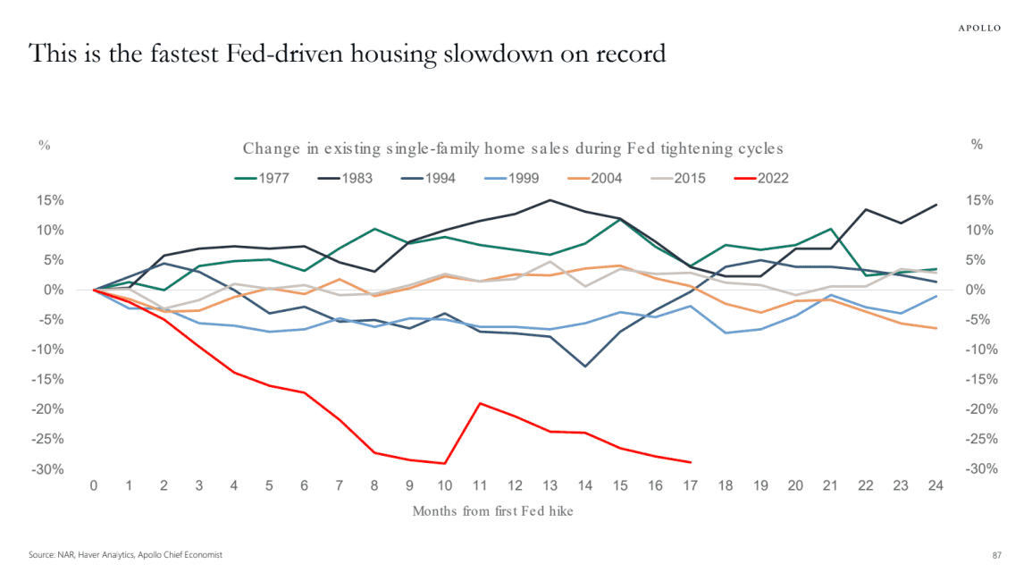
The graph displays a line chart representing the percentage change in existing single-family home sales following the first Federal Reserve (Fed) interest rate hike in various economic cycles. The x-axis represents months since the first Fed hike, ranging from 0 to 24. The y-axis represents the percentage change in sales, from -30% to +15%.
Multiple lines represent the historical data from different periods: 1977, 1983, 1994, 1999, 2004, 2015, and 2022. The 2022 line (red) exhibits a much steeper decline than any of the other cycles, indicating a significantly faster slowdown in home sales compared to previous cycles. The other lines generally show a more gradual downturn and eventual recovery. The title states this is the fastest Fed-driven housing slowdown on record.
Foucauldian Genealogical Discourse Analysis (Moderate Strength Connection)
A Foucauldian analysis would examine how the very categorization of housing as a central indicator of economic health has emerged through historical power relations. The graph itself participates in a "discourse" about economic prosperity linked to homeownership.
- Power/Knowledge: The graph is not a neutral representation of reality, but a product of experts (Haver Analytics, Apollo Chief Economist) who define what counts as 'significant' data and how it should be interpreted. Their expertise grants them power to shape the narrative around housing and the economy. The "Fed" becomes a central authority within this discourse, its actions seen as driving the market.
- Genealogy: Tracing the historical emergence of the idea that homeownership is desirable and equates to security would reveal how this belief has been constructed over time through policies, marketing, and social norms. This graph implicitly relies on that prior construction.
- Discipline: The graph, and the economic policies it informs, contribute to a broader system of social discipline. The emphasis on housing as an investment encourages certain behaviors and financial arrangements, effectively 'disciplining' individuals into conforming to the market. The 2022 line, in this view, represents a disruption of this disciplinary regime, potentially indicating a need for a new form of economic control.
Critical Theory (Moderate Strength Connection)
Applying Critical Theory, particularly the Frankfurt School, focuses on how power structures perpetuate themselves through cultural and ideological means.
- Instrumental Reason: The graph showcases a focus on quantitative data (percentage changes) as the primary measure of economic health. This exemplifies an emphasis on "instrumental reason" – a focus on efficiency and calculation without considering broader social consequences. The emphasis on slowing sales overshadows the human impacts.
- Commodification: The graph treats housing as a commodity – something to be bought and sold for profit. This commodification obscures the fundamental need for shelter and contributes to housing insecurity. The steep decline in sales in 2022, in this view, could highlight the failures of the market to meet basic human needs.
- Ideology: The idea that a strong housing market is synonymous with a strong economy is an ideology that reinforces the status quo. The graph, by presenting this relationship as self-evident, contributes to the perpetuation of this ideology.
Marxist Conflict Theory (Strong Strength Connection)
Marxist analysis centers on class struggle and the inherent contradictions within capitalism.
- Capital Accumulation: The graph reflects the dynamics of capital accumulation in the housing market. The rise and fall of sales represent the flow of capital between different classes. The 2022 line suggests a potential crisis in capital accumulation, as declining sales could lead to losses for investors and builders.
- Exploitation: Housing, as a commodity, is subject to the laws of supply and demand. This creates potential for exploitation – builders seeking maximum profit, investors speculating on rising prices, and individuals forced to pay high prices for essential shelter. The rapid decline suggests a potential imbalance in power dynamics.
- Crisis of Capitalism: The steepness of the 2022 line could be interpreted as a symptom of a broader crisis within capitalism, as the housing market (a key component of the economy) experiences a significant shock. This could point to deeper structural problems within the capitalist system.
Postmodernism (Moderate Strength Connection)
Postmodern analysis challenges grand narratives and emphasizes the subjective nature of reality.
- Deconstruction of 'Truth': The graph appears to offer an objective 'truth' about the housing market. However, a postmodern perspective would question the underlying assumptions and categories used to construct this 'truth'. What other factors are not represented in the graph?
- Simulacra and Simulation: The graph itself is a simulation of economic reality – a representation of data that has been filtered and interpreted. It's a step removed from the actual lived experiences of individuals in the housing market.
- Fragmentation and Uncertainty: The fluctuating lines on the graph reflect the fragmented and uncertain nature of the modern economy. There's no single, predictable trajectory. The 2022 line's drastic drop could be seen as a symptom of increasing economic instability.
Queer Feminist Intersectional Analysis (Weak Strength Connection - hardest application)
This lens focuses on how intersecting systems of power (gender, sexuality, race, class, etc.) create unique forms of oppression and marginalization.
- Housing as a Site of Exclusion: Historically, housing policies have been used to systematically exclude marginalized groups (e.g., redlining). The graph, while not directly addressing this, can be seen as reflecting the consequences of these historical exclusions.
- Gendered Impacts: The housing market can disproportionately affect women, particularly single mothers and elderly women, who may face economic vulnerabilities. A decline in sales could exacerbate these vulnerabilities.
- Intersectionality: The impact of the housing slowdown would be felt differently depending on an individual's intersecting identities. For example, a Black, low-income woman would likely experience the effects more acutely than a white, wealthy man.
- Challenges to Normative Systems: A queer feminist analysis could challenge the normative assumption that homeownership is the ideal way of life, and the way people should seek economic stability. There are other ways to live and thrive.
Important Note: The application of these theoretical frameworks is interpretive. The graph itself is a relatively simple visualization of economic data, so drawing connections to complex social theories requires a degree of extrapolation and creativity. The strength of the connections varies depending on the theoretical lens being used.
tesseract-ocr
avouto This is the fastest Fed-driven housing slowdown on record % Change in existing single-family home sales during Fed tightening cycles % —1977 —1983 —1994 —1999 —2004 2015 —=2022 15% 15% 10% 10% 5% 5% 0% Sree =e 5% -5% -10% -10% “15% 15% -20% -20% -25% -25% -30% -30% 0 1 2 3 4 5 6 7 8 9 10 11 12 13 14 #15 16 #17 18 #19 20 21 22 23 24 Months from first Fed hike soc NA Hoe acs Ap Cie coro ®
simple-description (llama3.2-vision)
The meme is a humorous illustration of the 2022 stock market downturn, comparing it to previous market crashes. The image shows a graph with various market downturns labeled "1-10" and the current market downturn labeled "11". The text at the top reads "In case you were wondering where we put the 1-10" and "2022 is just 11".