First Seen
2023-05-10T21:03:33+00:00
simple-description (llama3.2-vision_11b)
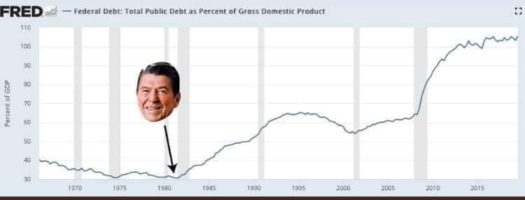
The meme depicts a graph showing the growth of the national debt as a percentage of the GDP, with a photo of Ronald Reagan's face superimposed on it. The image is captioned "Reaganomics" and the text "I'm not paying for your socialism" is written above it, implying that the national debt is a result of the policies of the Reagan administration. The meme is a commentary on the economic policies of the Reagan era, suggesting that the national debt is a consequence of the "Reaganomics" policies that were meant to reduce the government's role in the economy.
detailed-analysis (gemma3-27b-vision)
Okay, let's break down this image through a series of analytical lenses as you requested. It's important to note that applying all these theories to one image is a rather maximalist exercise, and some will be more fruitful than others. I will attempt to be thorough and explain the connections.
Image Description:
The image is a line graph showing the United States' Federal Debt as a percentage of Gross Domestic Product (GDP) from 1970 to 2015. The graph displays a generally low and stable debt level from 1970-1980, around 30-40% of GDP. A sharp, upward spike begins around 1980. The line continues to fluctuate but generally trends upwards, reaching over 100% by 2015. Superimposed onto the graph is a portrait of Ronald Reagan, with an arrow pointing from his face to the point of the initial sharp increase in debt. The source of the graph is identified as “FRED” (Federal Reserve Economic Data).
Foucauldian Genealogical Discourse Analysis
Foucault’s genealogical approach looks at how power operates through discourses – systems of thought, language, and practice. In this image, the discourse revolves around national debt, economic policy, and what constitutes responsible governance.
- Power/Knowledge: The graph doesn't simply show data; it constructs a narrative. It subtly suggests that the surge in debt began with Reagan. This becomes a "truth" through the visual presentation. The very act of quantifying debt and presenting it as a line reinforces the idea that it is something to be measured, managed, and controlled – a key aspect of modern governance.
- Historical Contingency: A Foucauldian analysis would question why we even measure national debt as a percentage of GDP. This way of framing the issue isn’t inherent; it's a historical construction that developed alongside specific economic and political theories. The graph doesn’t reveal the historical conditions that led to this way of understanding debt.
- Disciplinary Power: The visual depiction of debt as a trend invites a kind of self-regulation. It suggests that debt is something to be ‘controlled’ through policy, implying that specific actors (politicians, economists) have the power to govern and correct economic trends.
Critical Theory (Frankfurt School)
Critical Theory focuses on how power structures are embedded in social and cultural systems, often masking exploitation and domination.
- Ideology: The image could be interpreted as reinforcing a specific ideological narrative about the causes of national debt. By prominently featuring Reagan, it implies his policies were a primary driver of increasing debt, potentially obscuring other contributing factors (e.g., military spending, tax cuts, demographic changes). This can be seen as a subtly ideological move.
- Instrumental Reason: The graph emphasizes quantifiable data (percentages) over qualitative considerations (e.g., the social impact of debt, who benefits from certain economic policies). This aligns with the Frankfurt School’s critique of instrumental reason – the focus on efficiency and calculation at the expense of human values.
- Commodification: National debt itself can be seen as a commodified concept. It’s a financial instrument, something that is bought and sold, and the graph treats it as an objective value rather than a social construct with real consequences.
Marxist Conflict Theory
Marxist theory emphasizes the inherent conflict between social classes due to the unequal distribution of resources.
- Class Struggle: A Marxist reading would see the increasing debt as a symptom of the ongoing struggle between capital and labor. Tax cuts (often associated with Reaganomics) might be seen as benefiting the wealthy at the expense of social programs and the working class, leading to increased debt.
- Capital Accumulation: The debt increase could be linked to the process of capital accumulation. Policies that favor investment and profit-making (even if they increase debt) are seen as serving the interests of the capitalist class.
- State as an Instrument of Class Rule: The graph might be interpreted as highlighting how the state (through its fiscal policies) serves the interests of the dominant class, even if it means increasing national debt.
Postmodernism
Postmodernism questions grand narratives and emphasizes the subjective nature of truth.
- Deconstruction of "Truth": A postmodern analysis would challenge the idea that the graph presents an objective "truth" about national debt. It would point out that the data is selected, presented in a specific way, and interpreted through a particular lens. There are multiple ways to interpret the graph, and no single interpretation is necessarily more valid than another.
- Fragmentation of Meaning: The image itself is a fragmented representation of a complex issue. It reduces national debt to a single line on a graph, ignoring the underlying social, political, and economic factors.
- Simulacra and Simulation: The graph can be seen as a simulacrum – a copy without an original. It represents debt as an abstract concept, divorced from the concrete realities of its impact.
Queer Feminist Intersectional Analysis
This is the most challenging lens to apply directly to the image. However:
- Intersectionality of Economic Policies: Economic policies that lead to increased debt often disproportionately affect marginalized groups (women, people of color, LGBTQ+ individuals). Tax cuts and austerity measures can lead to cuts in social programs that these groups rely on.
- The Gendered Nature of Debt: Historically, women have been more likely to experience economic insecurity and rely on social safety nets. Increased debt can exacerbate these inequalities.
- Challenging Dominant Narratives: A queer feminist approach might question the dominant narratives about fiscal responsibility and economic growth, arguing that these narratives often prioritize the interests of heterosexual, cisgender, and affluent individuals. The graph's framing might implicitly reinforce these norms.
Important Considerations:
It is essential to recognize that these are interpretations. The image is open to multiple readings. A nuanced analysis would acknowledge the limitations of applying any single theoretical framework and strive for a more holistic understanding of the underlying issues.
Let me know if you would like me to elaborate on any of these points or explore other analytical perspectives.
simple-description (llama3.2-vision)
The meme is a humorous representation of the US federal debt as a percentage of the country's GDP, with a graph showing a sharp spike upwards. The text "Federal Debt: 100% of GDP" appears on the right side of the graph, implying that the US is now essentially bankrupt. The meme is likely referencing a recent economic crisis or a commentary on the country's financial situation.
tesseract-ocr
FRED 2< — Federat vebt: Total Public Debt as Percent of Gross Domestic Product 2 i ol en “= = we «6 | ee «owes