First Seen
2023-05-10T21:03:33+00:00
simple-description (llama3.2-vision_11b)
The meme is a graph showing the top 1% vs. the bottom 50% of income in the US and Western Europe from 1980 to 2016. The graph is titled "Top 1% vs. Bottom 50% National Income Shares: A Tale of Two Countries" and shows that the top 1% of earners in the US and Western Europe have seen their share of national income increase significantly over the past 35 years, while the bottom 50% has seen their share decrease. The graph is often referred to as the "Reaganomics" meme, as it shows the growing income inequality in the US and Western Europe, and is often used to illustrate the negative effects of the 1980s economic policies of President Ronald Reagan, known as "Reaganomics".
detailed-analysis (gemma3-27b-vision)
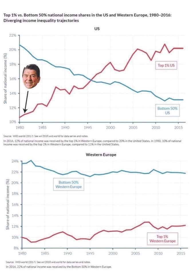
Okay, here's an analysis of the provided image ("Top 1% vs. Bottom 50% national income shares in the US and Western Europe, 1980-2016"), broken down into the sections you requested, only including sections where the framework is applicable. The image depicts line graphs showing the percentage of national income held by the top 1% and bottom 50% of earners in both the US and Western Europe from 1980 to 2016.
1. Visual Description
The image consists of two line graphs presented side-by-side. The top graph focuses on the United States, and the bottom graph represents Western Europe. Both graphs depict two lines representing the share of national income. A red line shows the percentage held by the top 1% of earners, and a blue line indicates the percentage held by the bottom 50%.
Key Visual Features:
- US Trend: In the US, the red line (top 1%) steadily increases from about 11% in 1980 to over 20% in 2016. The blue line (bottom 50%) generally declines, although with fluctuations, from roughly 12% in 1980 to below 12% in 2016. The gap between the lines widens significantly over the period. An image of Ronald Reagan is overlayed on the graph, marking around 1980.
- Western Europe Trend: In Western Europe, the red line (top 1%) remains relatively stable around 10-12% for the entire period. The blue line (bottom 50%) gradually increases slightly from around 19% to above 22% in 2016. The gap between the lines remains relatively narrow.
- Overall Impression: The graphs visually demonstrate a diverging trajectory between the US and Western Europe. The US experienced a dramatic increase in income concentration at the top and a decline in income share for the bottom 50%, while Western Europe showed a more equitable distribution, remaining relatively stable over the period.
2. Marxist Conflict Theory
This image is extremely relevant to Marxist Conflict Theory. The graphs directly illustrate the core tenet of the theory: inherent class struggle.
- Class Polarization: The diverging lines in the US graph demonstrate a growing polarization of wealth between the bourgeoisie (the top 1%, who own the means of production) and the proletariat (the bottom 50%, who provide the labor). The rising share of income for the top 1% suggests increased exploitation of labor and capital accumulation.
- Capitalist Logic: The data supports the Marxist argument that capitalism inherently leads to increasing inequality. The pursuit of profit maximization within a capitalist system concentrates wealth in the hands of a few, while the majority experience stagnant or declining economic conditions.
- Potential for Conflict: The increasing gap between the top and bottom 50% creates conditions ripe for social unrest and conflict. As the bottom 50% receive a shrinking share of national income, their economic insecurity and frustration are likely to escalate, potentially leading to protests, strikes, or other forms of resistance.
- Historical Context: The image of Ronald Reagan overlaid over the graph is important to note. His administration, known for its supply-side economics ("Reaganomics") and deregulation, is often cited by Marxist scholars as a turning point in the intensification of wealth inequality in the US.
3. Foucauldian Genealogical Discourse Analysis
While not as central as Marxist theory, a Foucauldian approach can offer insights into the ways inequality is produced and maintained, and how it becomes normalized.
- Discourses of Meritocracy: The rise in inequality isn't simply an economic phenomenon, but is produced through discourses that justify it. The idea of "meritocracy" - that success is solely based on individual effort and talent - becomes a powerful discourse. These discourses mask the structural factors (like regressive tax policies, weakening of labor unions, and globalization) that contribute to inequality.
- Power/Knowledge: The data itself (as presented in the graphs) is a form of "power/knowledge." Those who produce and disseminate these statistics wield power by defining what counts as "inequality" and shaping public understanding of it. The way the graphs are constructed (lines, colors, labels) can also influence how they are interpreted.
- Normalization of Inequality: Over time, the widening gap between the top 1% and the bottom 50% has become normalized. Discourses of individual responsibility and entrepreneurialism have obscured the systemic factors that contribute to inequality, making it seem like a natural or inevitable outcome.
- Genealogy of Inequality: A genealogical investigation would trace the historical shifts in policies, ideologies, and social practices that have contributed to the current state of inequality. This would involve examining how ideas about wealth, poverty, and social mobility have evolved over time.
Why other frameworks aren't directly applicable:
- Postmodernism: While postmodernism could critique the grand narrative of economic progress or challenge the notion of objective truth in economic data, it doesn’t offer a strong explanatory framework for the data itself.
- Queer Feminist Intersectional Analysis: While income inequality undoubtedly intersects with other forms of oppression (gender, sexuality, race), the image doesn't provide enough information to apply a specifically queer feminist intersectional analysis. It would require data on how income inequality differs across various identity groups.
Let me know if you would like me to elaborate on any of these points or explore another analytical framework.
simple-description (llama3.2-vision)
The meme is a humorous representation of the widening income gap in the United States and Europe. The image shows a graph with two lines representing the top 1% and the bottom 50% of income earners in the US and Europe, with the US line growing significantly faster and further to the right. The text "US vs EU" is written above the graph, and the caption "We're not broke, we're just redistributed" is written below.
tesseract-ocr
Top 1% vs. Bottom 50% national income shares in the US and Western Europe, 1980-2016: Diverging income inequality trajectories us 22% 20% z 2 5 18% Top 1% US = 5 tos é 2 4% 5 at 12% | Bottom SO% | us 10% 1980 1988 1990 1995 2000 2005 2010 2015 Leaver, iD wert COUN San wr a ner eats re a ren In 2016, 12% otraionl income was received by the top 1% in Wester Europe compared to 20% inthe Unted Sates. In 1960, 10% of ations) ‘come ma received he tp it in Western Eure. compareato 12M te Unies State Western Europe 24% 22% # 20% Bottom 50% 2 | Western Europe 2 18% i 5 1s E. 5 ux i EB ux 10% | Ton a l ‘Western Europe 8% 1980 1985 1990 ws 2000 2005 2010 2015, seerce WO aed 2017 te we20tRe nate cease tran In 2016, 22% of nations ncame nat received bythe Bottom SON in Western Europe