First Seen
2023-05-10T21:03:33+00:00
simple-description (llama3.2-vision_11b)
This meme is a satirical commentary on the economic policies of former US President Ronald Reagan, known as Reaganomics. The image is a graph comparing life expectancy to healthcare spending over time, with a red line representing the US, which has a significant increase in healthcare spending while experiencing a decrease in life expectancy. The text "Reaganomics" is written at the top of the graph, implying that the economic policies of Reagan's time have led to a decrease in life expectancy.
detailed-analysis (gemma3-27b-vision)
Okay, let's break down this graph through various theoretical lenses. It's a complex visual, and a robust analysis will hit on a few of these areas, especially when examining the US outlier.
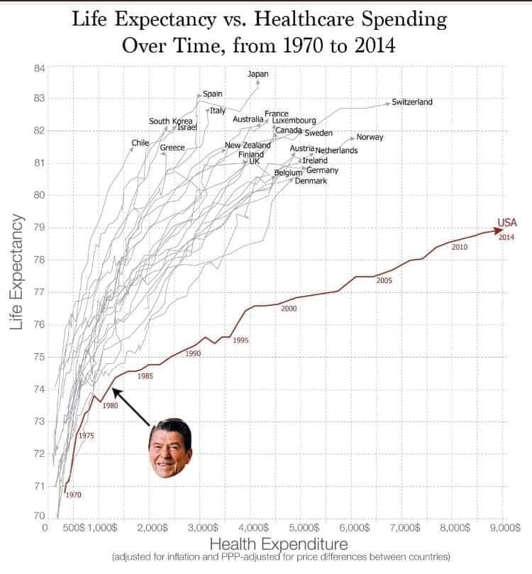
Visual Description
The graph presents a scatter plot demonstrating the relationship between healthcare expenditure (on the x-axis, in USD, adjusted for inflation and PPP) and life expectancy (on the y-axis) for various countries from 1970 to 2014. Each thin line represents a country's trajectory over these decades. There is a clear general trend of increasing life expectancy correlating with increasing healthcare expenditure. However, the United States stands out prominently.
- General Trend: Most countries follow a relatively similar upward slope, indicating a positive correlation between expenditure and lifespan. The lines bunch together in the early years (1970s-1990s) and spread out somewhat as years progress.
- US Outlier: The US line starts in a comparable position to other developed nations but significantly deviates over time. While US healthcare expenditure dramatically increases (reaching the highest levels on the graph), its increase in life expectancy is comparatively small and doesn't match the level of investment. It's the red line that’s significantly to the right and lags behind in relation to all other countries.
- Ronald Reagan: A small portrait of Ronald Reagan is positioned at a point in the time series around 1980, with an arrow linking him to the trajectory of the graph. This implies a perceived causal relationship between his policies and the change in the trajectory.
- Labeling/Annotations: The graph includes years (1970, 1975, 1980, 1985, 1990, 1995, 2000, 2005, 2010, 2014) to denote the trajectory of countries over time, a label noting that the expense figures are adjusted for inflation and PPP (Purchasing Power Parity), and country names at the highest points on the graphs.
Foucauldian Genealogical Discourse Analysis
Foucault's work emphasizes how knowledge is tied to power, and how discourses shape our understanding of things. This graph can be analyzed by considering the discourse of health and how it has evolved over this period.
- Biopower: The graph itself embodies Foucault’s concept of biopower – the exercise of power over life itself. Healthcare spending represents the attempt to regulate and optimize populations by managing health and extending life expectancy. The graph quantifies this attempt.
- Disciplinary Power: The relationship between spending and lifespan is presented as a ‘natural’ connection, suggesting that increased spending should lead to increased lifespan. This reinforces the idea that healthcare is a system of discipline that should deliver expected results. The US deviation challenges this expectation.
- Genealogy of Healthcare: We could trace the historical development of healthcare systems in different countries. The inclusion of Reagan implies a point of divergence in the US – perhaps a shift toward market-based healthcare that prioritized profit over universal access.
- Power/Knowledge: The graph isn't just a neutral representation of data; it’s a construction of knowledge. The choice of metrics (spending, life expectancy) and the visual representation itself shape our understanding of healthcare effectiveness. The US outlier forces a re-examination of the assumed relationship.
Critical Theory
Critical Theory (drawing on thinkers like the Frankfurt School) emphasizes challenging dominant ideologies and examining power structures.
- Ideology of Efficiency: The graph appears to support the idea that more money in healthcare equals better outcomes. This reinforces an ideology of efficiency and assumes a purely rational, quantifiable approach to health. The US divergence disrupts this.
- Commodification of Health: The focus on spending suggests that healthcare is treated as a commodity, something to be bought and sold. Critical theorists would argue this obscures the fundamental human right to health.
- Systemic Critique: The graph doesn't address the quality of healthcare, access for all, or social determinants of health (poverty, education, environment). It operates within a narrow, technical framework. The US divergence signals that there is more to the equation than simple economics.
- Unmasking the "Rational" System: The US outlier challenges the idea that the healthcare system is rational or universally effective. It suggests that other factors—profit motives, inequalities in access, structural racism—may be at play.
Marxist Conflict Theory
From a Marxist perspective, the graph can be examined through the lens of class struggle and the inherent contradictions of capitalism.
- Healthcare as a Commodity: Healthcare in the US (and increasingly in other countries) is treated as a commodity, subject to market forces. This creates a conflict between the need for healthcare and the drive for profit.
- Exploitation and Health: Marxist theory would suggest that health disparities are linked to class exploitation. Those with less economic power are more likely to experience poorer health outcomes. The US graph may reflect this through higher spending but lower gains in life expectancy.
- Capitalist Contradictions: The graph can be seen as exposing the contradictions of capitalism – the inability of the market to provide essential services equitably. The US case highlights how prioritizing profit can lead to inefficient outcomes.
- Class Struggle over Healthcare Access: The graph implicitly reveals a struggle over access to healthcare. Those with resources can afford better care, leading to disparities in life expectancy. The US position could indicate the worsening of such disparity.
Postmodernism
A postmodern analysis would focus on the deconstruction of grand narratives and the questioning of objective truth.
- Deconstructing "Progress": The graph appears to suggest a narrative of linear progress – more spending leads to longer life. Postmodernism would challenge this narrative, arguing that progress is not inevitable or universally defined.
- Multiple Perspectives: There's no single, objective interpretation of the graph. Different individuals and groups will view it through their own lenses, shaped by their experiences and values.
- Relativism of Truth: What constitutes "good" healthcare or a "desirable" lifespan is subjective and culturally contingent. The graph presents data as if it’s universally meaningful.
- Rejecting Metanarratives: Postmodernism rejects the idea of a single, overarching explanation for health outcomes. The US case further supports the claim.
Important Note: These are just interpretations. The strength of any analysis depends on the specific theoretical framework being applied and the evidence used to support it. The graph itself is a complex artifact, and its meaning is open to multiple readings.
simple-description (llama3.2-vision)
The meme is a humorous representation of the relationship between life expectancy and healthcare spending. The graph shows a curved line that starts low on the left (low life expectancy, low healthcare spending) and ends high on the right (high life expectancy, high healthcare spending). The text "Life Expectancy vs. Healthcare Spending" is at the top, and the bottom text reads "In 2 years, we'll be like Japan!"
tesseract-ocr
Life Expectancy vs. Healthcare Spending Over Time, from 1970 to 2014 & Japan 83 pam » Switdertand italy = sna yg] J Weta Bn 82 pF = Ganadsneden Pee |) Now 263808 usanetetlnds at | FORE Fase (a ‘ _pelgum Gemeny f 4 eeBermark 80 bg 3 2 if Wig usA Cc ( a 2014 s iY £4 0 O 7 f/-/ 2 j o It EA 2 YI {Bi F005 a ay VA wi 7 TE Ae ee @& [ ie f 2000 5 76 AW re Ff Ae 1995 3A a 7 || irs f oN 73H | / pers aif | f 2 my or 70.1 0 500$ 1,000$ 2,000$ 3,000$, 4,000$ 5,000$ 6,000$ 7,000$ 8,000$ 9,000$ Health Expenditure (acted Yo nation and PEP-adisted for price Gferencs between Gaunies)