First Seen
2023-05-10T21:03:33+00:00
simple-description (llama3.2-vision_11b)
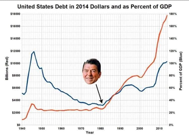
This meme juxtaposes a graph showing the US national debt in 2014 dollars and as a percentage of GDP with a photo of Ronald Reagan's face. The graph shows a significant increase in the debt-to-GDP ratio, implying that the US is increasingly reliant on debt. The image is captioned "Reaganomics" and "Trickle Down Economics".
detailed-analysis (gemma3-27b-vision)
Okay, let's break down this image through several theoretical lenses. It's a visually striking piece, ripe for analysis.
Visual Description
The image presents a line graph charting US national debt from 1940 to roughly 2015. The left y-axis shows debt in billions of dollars (red line), while the right y-axis shows debt as a percentage of Gross Domestic Product (GDP, blue line).
- Lines: The red line (absolute debt) displays a significant increase starting around 1980, escalating sharply in the 2000s. The blue line (debt as % of GDP) follows a similar pattern, though it's less dramatic. Both lines show a period of decrease and stabilization for much of the mid-20th century before diverging upwards.
- Image Overlay: Superimposed onto the graph, around 1980, is a photograph of Ronald Reagan. An arrow connects the image to the intersection of the two lines indicating the beginning of the substantial debt increase.
- Overall Impression: The chart implies a causal relationship between Reagan's presidency and the subsequent increase in national debt. The visual rhetoric is strongly suggestive, essentially framing Reagan as the source of the problem.
Foucauldian Genealogical Discourse Analysis
A Foucauldian approach examines how "truth" about debt is constructed through discourse (language, practices, institutions) and power dynamics.
- Discourse of Debt: The image participates in a specific discourse around national debt. It frames debt not merely as an economic fact, but as a problem with identifiable causes (Reagan). It utilizes the visual language of cause-and-effect to assert this problem.
- Power/Knowledge: The graph represents a particular regime of truth about debt. It assumes that the data and the visual representation are objective and neutral. However, as Foucault would argue, this "objectivity" is always constructed through power relations. Who collected this data? What choices were made in its presentation? What perspectives are excluded? This image presents a specific framing and therefore a specific kind of power.
- Genealogy: A genealogical analysis would trace the historical development of the concepts and practices around national debt. How did the understanding of debt change over time? What institutional mechanisms (e.g., federal reserve, treasury department) shaped this discourse? The Reagan-era inflection point is presented as a 'rupture' or significant moment in this historical development.
- Disciplinary Power: The graph subtly disciplines our understanding of debt by offering a simplified narrative. It encourages us to see debt as a manageable problem with identifiable solutions (e.g., holding Reagan responsible). This shapes how we think, and act, around economic policy.
Critical Theory
Critical Theory focuses on how power structures are embedded in social norms and institutions.
- Ideology: The image can be seen as reinforcing a specific ideological viewpoint. By associating Reagan with rising debt, it promotes a narrative about the dangers of conservative economic policies. It implicitly suggests that alternative policies would have prevented this outcome.
- Hegemony: If this image gains traction, it contributes to a hegemonic understanding of debt—one that is widely accepted as "common sense." This can limit critical discussion of the complex factors that contribute to national debt (e.g., wars, social programs, global economic trends).
- Critique of Enlightenment Rationality: The graph relies on the assumption that numbers and data provide objective truth. However, Critical Theory questions the very notion of objective rationality. Numbers are always interpreted through subjective frameworks and power relations.
- Emancipation: While seemingly a straightforward presentation of data, the underlying message could be a call to action. It implicitly encourages viewers to question existing power structures and demand accountability from political leaders.
Marxist Conflict Theory
Marxist theory highlights class struggle as the driving force of history.
- Capitalist Accumulation: National debt, from a Marxist perspective, is intrinsically linked to the process of capitalist accumulation. Debt allows the state to finance projects that benefit the ruling class (e.g., wars, infrastructure projects) and maintain their control over the means of production.
- Class Warfare: The chart implicitly frames the problem of debt as a matter of political leadership. However, a Marxist analysis would focus on the underlying class structures that generate and benefit from debt. Who bears the burden of debt repayment? Who profits from it?
- State as Instrument of the Ruling Class: The image suggests that Reagan's policies were detrimental to the nation. A Marxist would argue that all state policies—regardless of the president—ultimately serve the interests of the capitalist class.
- Crisis of Capitalism: The rising debt could be interpreted as a symptom of a deeper crisis within the capitalist system.
Postmodernism
Postmodernism challenges grand narratives and emphasizes the subjectivity of truth.
- Deconstruction of Truth: A postmodern analysis would question the image's claim to objectivity. The graph is not a neutral representation of reality but a constructed narrative with a specific agenda.
- Rejection of Grand Narratives: The image relies on a simplified cause-and-effect relationship (Reagan = rising debt). Postmodernism would reject this as an oversimplification. Reality is far more complex and fragmented.
- Intertextuality: The image gains meaning through its reference to the historical figure of Ronald Reagan and the wider discourse around US economic policy.
- Simulation and Hyperreality: The graph can be seen as a simulation of economic reality. It presents a simplified model that may not accurately reflect the underlying complexities.
Important Note: This is just one possible interpretation of the image. Other theoretical frameworks could also be applied, and the meaning of the image is ultimately open to debate.
simple-description (llama3.2-vision)
This meme is a humorous comparison of the national debt in the United States, presented in a graph with two lines representing the debt in dollars and as a percentage of the country's GDP. The text "In 2014 dollars and as a percentage of GDP" appears at the top of the graph. The meme pokes fun at the idea that the national debt is so large that it's hard to even visualize, with the image of Ronald Reagan's face in the middle of the graph, implying that he's the one who caused the debt to grow so much.
tesseract-ocr
United States Debt in 2014 Dollars and as Percent of GDP 18000 100% $1600 160% $1400 140% $12000 120% _ 3 g a @ $10000 100% a. @ 5 2 e 2 ss000 9 ox © a e i 8 38000 ox & 4000 \ 40% ‘$2000 20% so 0% 1940 1950 1960 1970 41980 1990 2000 2010 Year