First Seen
2023-05-10T21:03:33+00:00
simple-description (llama3.2-vision_11b)
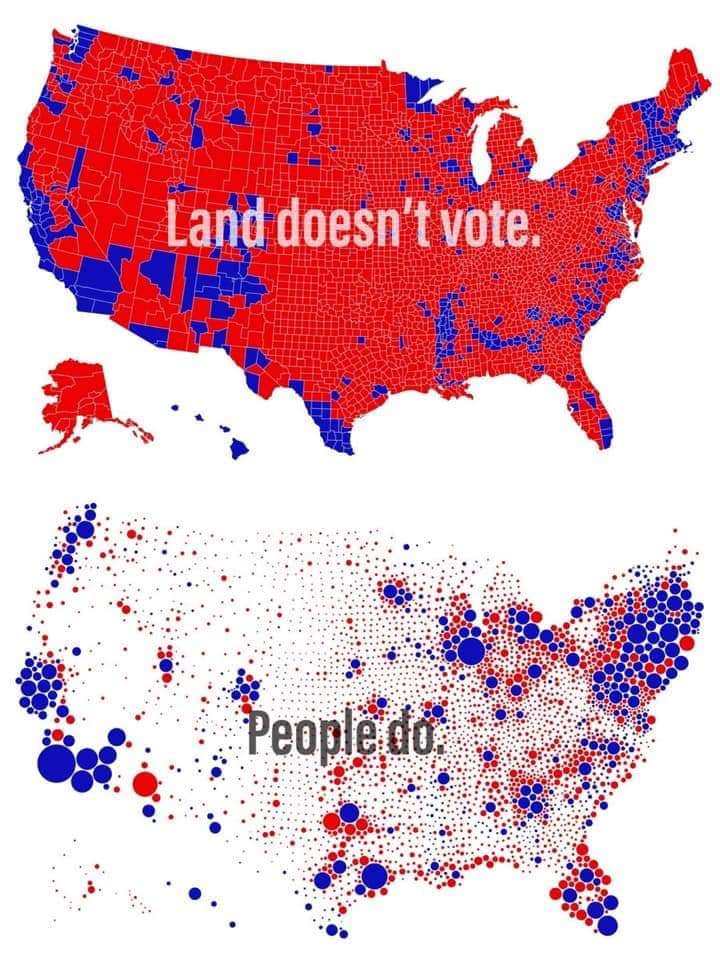
The meme is a satirical representation of the 2020 US presidential election. It shows a map of the United States with red and blue states, but instead of indicating the winner of each state, it says "Land doesn't vote" and "People do." The image is meant to be humorous and ironic, implying that the election's outcome was not determined by the land (red states) but by the people (blue states) who voted.
detailed-analysis (gemma3-27b-vision)
Here's an analysis of the image across the requested theoretical frameworks. Not all frameworks will apply equally, and some may not be relevant at all.
Visual Description
The image is a diptych, presenting two contrasting maps of the United States. The top map depicts a traditional county-by-county election map, heavily segmented and colored red and blue. Red predominates, suggesting a strong conservative lean in many areas. The map is dense and visually emphasizes place – the geographic divisions of counties. Overlaid on the map is the text "Land doesn’t vote.”
The bottom map radically departs. Instead of counties, it uses a scatterplot representation. Each dot represents a person, with color indicating party affiliation (red and blue). The size of the dot may be relative to population density, but the emphasis is on the individual rather than the geographic unit. The text “People do” is overlaid.
The contrast between the two maps is stark. The top map appears static and focused on territorial divisions, while the bottom map is dynamic and emphasizes individual agency. The overall effect is a pointed statement about electoral representation and how we visualize political power.
Foucauldian Genealogical Discourse Analysis
This image can be examined through a Foucauldian lens by exploring the discourses surrounding elections and political representation. The traditional election map (top) constructs a reality where political power is inherently tied to territory. This is a discourse of place and ownership—the land as a basis for political legitimacy. It operates through practices like gerrymandering (implicit in the detailed county breakdown) and the constant emphasis on “battleground states.” These practices produce the idea that political power resides in geographic areas, rather than in the people who live within them.
The bottom map disrupts this discourse. It de-emphasizes territory and instead focuses on the individual voter as the fundamental unit of power. This is a counter-discourse, challenging the established ways of visualizing and understanding political authority. The statement "People do" is a key element in this disruption. It asserts agency and shifts the focus away from the impersonal “land” to the active “people.”
A genealogical approach would trace the historical development of these discourses. How did the county-based election map become the dominant way of representing electoral outcomes? What power relations have shaped this visual language? The image suggests that this form is not neutral but actively contributes to a specific construction of political power.
Critical Theory
The image invites a critical examination of the assumptions underlying electoral representation. The traditional map, according to critical theory, can be seen as perpetuating a reified view of politics. It emphasizes the "what" (the counties colored red or blue) over the "who" (the people making the choices). It obscures the underlying social forces—economic inequalities, systemic biases—that shape those choices.
The bottom map, in contrast, offers a potential moment of demystification. By focusing on the individual voter, it attempts to reveal the human agency often obscured by the abstract language of electoral maps. However, it’s important to note that even the scatterplot can be deceptive. It does not reveal anything about why people vote as they do, and it can still conceal underlying power dynamics.
This image can be read as a critique of the ways in which political representation is often reduced to simplistic territorial divisions, obscuring the complexities of human motivations and the deeper structural forces that shape political outcomes.
Marxist Conflict Theory
From a Marxist perspective, the image highlights the conflict between the inherent abstraction of territory and the real material conditions of people’s lives. The traditional map reinforces the idea that land (and the wealth derived from it) is a key source of power. The concentration of red areas could be interpreted as a visual representation of the distribution of economic and political control—areas rich in resources or dominated by capitalist interests.
The emphasis on “people” in the bottom map can be seen as a call for a re-emphasis on the laboring classes as the true source of political power. It challenges the notion that political representation is simply about dividing up territory, arguing that it should be about reflecting the needs and interests of the people who create wealth.
The image implicitly critiques the way in which electoral maps often mask underlying class divisions and economic inequalities. It suggests that a more accurate representation of political power would focus on the material conditions of people’s lives, rather than on the abstract divisions of territory.
Queer Feminist Intersectional Analysis
This image, while not explicitly centered on gender or sexuality, can be examined through an intersectional lens. The traditional map can be seen as reinforcing dominant power structures that historically exclude and marginalize certain groups. The focus on geographic territories can obscure the ways in which different communities within those territories experience political power differently.
The emphasis on “people” can be interpreted as a call for more inclusive and equitable forms of representation. It highlights the importance of recognizing the diverse experiences and needs of all individuals, rather than simply aggregating them into geographic units.
From a queer feminist perspective, the image could be seen as challenging the ways in which dominant narratives often prioritize the interests of certain groups (e.g., landowners, dominant economic interests) over the needs of marginalized communities. By shifting the focus to the individual, it opens up the possibility of a more nuanced and inclusive understanding of political power.
Disclaimer: These are interpretations and there's room for other valid readings. The strength of each analysis depends on the assumptions you bring to the image.
simple-description (llama3.2-vision)
This meme is a visual representation of the 2016 US presidential election, with red indicating areas that voted for Republican candidate Donald Trump and blue indicating areas that voted for Democratic candidate Hillary Clinton. The text "Land doesn't vote" is a commentary on the fact that many areas with a high percentage of rural, conservative voters were able to influence the election's outcome. The second image shows a similar map of the 2012 presidential election, with "People do" suggesting that the election's outcome was influenced by the votes of urban, liberal areas.
tesseract-ocr
Eee _ 7 pes . a x A bargin. | ” sue Os ie ie SiR adhoc ie elit ee! — “= raat es oe & . xe ' ~s pS \ YY % wer ee deg, ; Poonledd