First Seen
2023-05-10T21:03:33+00:00
simple-description (llama3.2-vision_11b)
From the perspective of the Anti-Corporations category, this meme is a satirical commentary on the alleged manipulation of oil prices by corporations. The meme features a graph comparing the prices of oil and gasoline, with the latter skyrocketing to absurdly high levels. The text "I'm not paying 10 dollars for gas when I can just burn it for free" is a tongue-in-cheek commentary on the absurdity of the situation.
detailed-analysis (gemma3-27b-vision)
Okay, let's break down this graph of oil and gasoline prices through various theoretical lenses. I'll apply the ones that are relevant, and explain why others might not be strongly applicable.
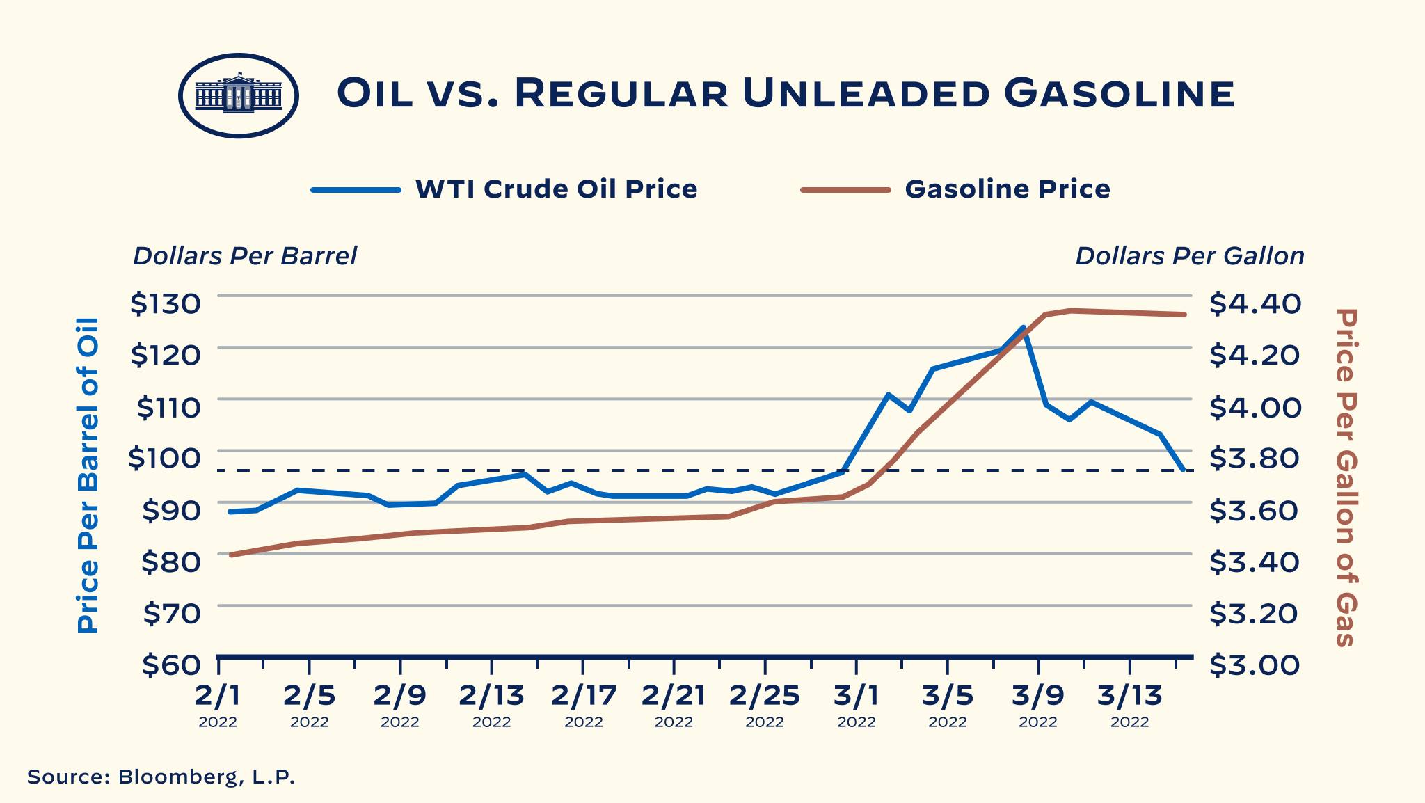
Visual Description
The graph depicts the price trends of West Texas Intermediate (WTI) crude oil (blue line) and regular unleaded gasoline (red line) from January 1st, 2022, to March 13th, 2022. The y-axis is dual-scaled: one side represents the price of oil per barrel (in dollars) and the other represents the price of gasoline per gallon (also in dollars). The x-axis marks dates in 2022.
Key Trends:
- Oil Price (Blue Line): Starts around $82/barrel and initially remains relatively stable. Experiences a significant increase starting around February 24th, peaking at over $120/barrel around March 7th. It then declines slightly to approximately $105/barrel on March 13th.
- Gasoline Price (Red Line): Begins around $3.40/gallon, with some fluctuations. Shows a steeper increase starting around February 24th, reaching a peak of over $4.20/gallon around March 7th. Gasoline price then experiences a moderate decline toward $4.00/gallon on March 13th.
- Correlation: Gasoline prices generally follow the trend of oil prices, but with a delayed and often amplified reaction. The slope of the gasoline line seems generally steeper than the oil line, suggesting consumers are feeling the impact more acutely.
Foucaultian Genealogical Discourse Analysis
A Foucauldian approach emphasizes how 'truth' about oil and gas prices is constructed through discourse and power relations. The graph itself is a discourse, a way of framing and presenting information about these commodities.
- Power/Knowledge: The very act of tracking and graphing these prices asserts a form of power – the power to define what is 'important' and to shape perceptions. Bloomberg, L.P. (the source) holds power in defining this 'truth.' The graph suggests that price is the primary metric of importance. Other factors (environmental impact, geopolitical concerns, accessibility, etc.) are rendered invisible.
- Genealogy: A genealogical investigation would look at the historical development of this method of price tracking. How did we arrive at this specific way of quantifying and visualizing oil and gas? What earlier methods were displaced? This graph represents an ordering of oil and gasoline, framing it as a rational economic force that can be neatly measured.
- Discipline: By presenting price fluctuations as objective facts, this graph contributes to the discipline of market forces. It shapes understanding of economic 'reality', and positions consumers as subjects of these forces. This graph's implicit narrative is 'prices go up, prices go down', encouraging a passive acceptance of market fluctuations.
Marxist Conflict Theory
This graph is a prime example of how conflict inherent in capitalist systems manifests in commodity pricing.
- Capital & Labor: The price of oil and gasoline represents the value extracted from the labor of those involved in the entire supply chain: oil workers, refinery employees, transportation personnel, gas station attendants, etc. Price increases benefit the owners of capital (oil companies, refineries) while potentially squeezing the working class who must pay more for essential fuel.
- Commodity Fetishism: The graph obscures the real social relations of production. We see prices, but not the exploitation, environmental degradation, and political maneuvering that contribute to them. It creates a 'fetish' around the commodity, making it appear as if price is solely determined by supply and demand, rather than by complex social and political factors.
- Imperialism/Geopolitics: The sharp increase in oil prices around February 24th (likely coinciding with the Russia-Ukraine war) illustrates the role of geopolitical conflict in shaping commodity prices and generating profit. This highlights the exploitative nature of resource extraction and the ways in which conflict can be used to benefit those in power.
Postmodernism
A postmodern lens might challenge the idea of a singular, objective 'truth' about oil and gas prices.
- Deconstruction of Meaning: The graph presents data as inherently meaningful, but a postmodern approach would question this assumption. What assumptions are embedded in this representation? What is being excluded? The graph focuses solely on price, ignoring qualitative factors like the lived experiences of those affected by price increases, or the environmental costs of extraction.
- Simulation & Hyperreality: The graph is a simulation of reality, a representation of a complex system. It can become detached from the actual material conditions it represents. The constant tracking and reporting of prices can create a hyperreality where price becomes the defining characteristic of oil and gas, overshadowing other important considerations.
- Rejection of Meta-Narratives: The graph implicitly supports the meta-narrative of economic growth and market efficiency. Postmodernism questions such overarching narratives, arguing that they are socially constructed and serve to legitimize power structures.
Queer Feminist Intersectional Analysis
This lens highlights how power dynamics and systemic inequalities intersect to shape the impact of oil and gas prices on different communities.
- Unequal Burden: The rising cost of gasoline disproportionately affects those who are already marginalized: low-income communities, people of color, disabled individuals, and those living in rural areas with limited transportation options. These communities may lack the resources to adapt to higher fuel costs, leading to increased economic hardship and limited access to essential services.
- Intersectional Vulnerability: A queer feminist analysis would examine how multiple forms of oppression (e.g., race, class, gender, sexual orientation) intersect to create unique vulnerabilities. For example, LGBTQ+ individuals experiencing homelessness are particularly vulnerable to the effects of rising gas prices, as they may rely on public transportation or face barriers to employment.
- Gendered Impacts: The rising cost of fuel can exacerbate gender inequalities, as women often shoulder a disproportionate share of caregiving responsibilities and may be more likely to rely on public transportation. It could also impact women's access to reproductive healthcare and other essential services.
- Environmental Justice: The graph doesn’t show the environmental impact of oil extraction and consumption, but an intersectional lens highlights how marginalized communities are disproportionately exposed to pollution and the negative effects of climate change.
In conclusion: This graph, while seemingly straightforward, is a complex artifact that embodies various social, political, and economic forces. Applying different theoretical frameworks allows us to see beyond the numbers and reveal the underlying power dynamics and inequalities that shape our world.
simple-description (llama3.2-vision)
This meme is a humorous comparison between the prices of oil and gasoline, highlighting the significant difference in cost between the two. The image shows a graph with the title "Oil vs. Gasoline: Where's the Money Going?" and a caption that reads "Oil: $70/bbl Gas: $3.50/gal" (no actual numbers are provided in the meme). The meme is likely poking fun at the disparity between the high price of oil and the relatively low price of gasoline, implying that the money is somehow being lost or mismanaged.
tesseract-ocr
OIL VS. REGULAR UNLEADED GASOLINE —— WTI Crude Oil Price —— Gasoline Price Dollars Per Barrel Dollars Per Gallon _ $130 $4.40 a 0 ; =. 5 $120 $4.20 6 7 $110 $4.00 ° a $100 -_______._u222 LLL eee fooo.2 2 tN. $3.80 @ a o 5 $90 $3.60 6 oO = o $80 $3.40 9 YL a $70 $3.20 © an $60 ROOT Tt S300 2/1 2/5 2/9 2/13 2/17 2/21 2/25 3/1 3/5 3/9 3/13 2022 2022 2022 2022 2022 2022 2022 2022 2022 2022 2022 Source: Bloomberg, L.P.