First Seen
2023-05-10T21:03:34+00:00
simple-description (llama3.2-vision_11b)
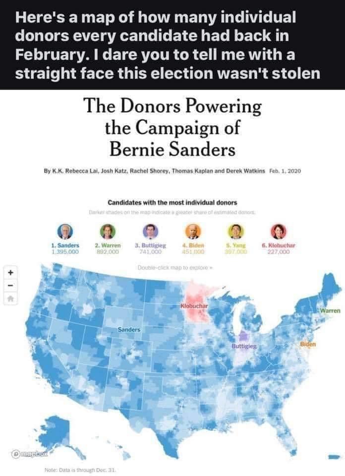
The meme is a screenshot of a 2020 article from The New York Times, featuring a map of the US with a red "Biden" marker in the middle of the country. The text above the map reads "The Donors Powering the Campaign of Bernie Sanders" and below it, "Here's a map of how many individual donors every candidate had back in February. I dare you to tell me with a straight face this election wasn't stolen." The meme is a commentary on the 2020 US presidential election, specifically the issue of campaign finance and the influence of big donors.
detailed-analysis (gemma3-27b-vision)
Okay, let's break down this image through the requested theoretical lenses. It’s a bit dense to apply all of them, as they overlap, but here's a detailed breakdown, emphasizing relevance.
Visual Description
The image is a map of the United States, visually representing the distribution of individual donors to various presidential candidates as of February 2020. It utilizes a color-coded heatmap to show the concentration of donors for each candidate in different states. The top five candidates represented are Bernie Sanders, Elizabeth Warren, Pete Buttigieg, Joe Biden, and Amy Klobuchar, with their total number of individual donors listed. The map utilizes a gradient of color to denote intensity - stronger shades indicating a higher concentration of donors. The map is titled "The Donors Powering the Campaign of Bernie Sanders", but the data actually includes the distribution for all the listed candidates. There is a note at the bottom indicating data up through Dec 31. A text introduction states "Here's a map of how many individual donors each candidate had in February. I dare you to tell me with a straight face this election wasn't stolen".
Foucauldian Genealogical Discourse Analysis
This image is deeply embedded within a discourse about electoral legitimacy and the power dynamics within political campaigns. A genealogical approach (tracing the historical development of this discourse) would reveal how discussions of campaign finance have evolved. Historically, concerns about funding have often centered around large corporate donations and PACs. This image, however, focuses on individual donors.
Foucault would be interested in how this visualization produces certain truths. The map doesn’t reveal why individuals donated, only where. This absence allows for interpretive leaps, especially given the provocative text introduction ("this election wasn't stolen"). The map, therefore, functions as a technology of power, constructing a narrative about the geographical bases of support for each candidate, potentially contributing to claims of fraud or unfairness. The color-coding itself is a form of categorization, creating divisions and hierarchies. The map is not neutral; it actively participates in the construction of meaning and can be used to justify specific political positions.
Critical Theory
From a Critical Theory perspective, the image highlights the power structures inherent in the political process. The very framing of the image – focusing on who donates and where – reveals a concern with the distribution of resources and influence. While focusing on individual donors might seem less problematic than corporate donors, it still underscores the fact that access to political participation is not equal. Individuals with disposable income have a greater ability to contribute, thereby amplifying their voice in the political arena.
The map can be read as a manifestation of the "culture industry" – a system that produces and disseminates information that reinforces existing power relations. By visualizing donor data, the map contributes to the spectacle of politics, focusing on quantifiable metrics rather than substantive issues. The provocative text further exemplifies this, reducing complex political dynamics to a simplistic claim of "stolen" elections.
Marxist Conflict Theory
From a Marxist perspective, the map clearly illustrates the conflict over resources and power within the political sphere. The distribution of donors represents a form of capital (both financial and social) that is unevenly distributed across the country. The candidates who attract the most donors have a distinct advantage in terms of resources, allowing them to fund advertising, campaign staff, and other essential activities.
The map can be interpreted as a visualization of the base and superstructure. The economic base (the distribution of wealth and resources) shapes the political superstructure (the electoral process). The uneven distribution of donors reflects broader economic inequalities, which in turn influence the outcome of elections. The claim of a "stolen" election is then a manifestation of this class conflict – a desperate attempt by those who feel disenfranchised to challenge the existing power structures.
Postmodernism
A postmodern reading of this image would focus on its inherent instability of meaning and the constructed nature of reality. The map is not a "truthful" representation of political sentiment; it is a simulation of it. The color-coding and visualization techniques are arbitrary and could be presented in countless other ways, each producing a different interpretation.
The provocative introduction ("this election wasn't stolen") further destabilizes the image, introducing a layer of skepticism and challenging the notion of objective truth. From a postmodern perspective, the claim of a stolen election is not necessarily a factual assertion but a narrative constructed to serve a particular purpose. The image, therefore, is a self-referential system of signs, constantly shifting and challenging its own meaning.
Queer Feminist Intersectional Analysis
While not the primary focus of the map, an intersectional lens can highlight potential inequalities within the donor base. Who can afford to donate? What demographics are more likely to donate to specific candidates? We need to consider the intersections of class, race, gender, and sexual orientation to understand the full picture.
A queer feminist approach might question the systems of power that privilege certain groups and exclude others from participating in the political process. The map doesn’t reveal this data, but it prompts us to ask critical questions about the accessibility of political participation and the ways in which certain identities are marginalized within the donor base. It is possible that certain candidates are primarily supported by donors from specific socioeconomic backgrounds, thus perpetuating existing inequalities.
Let me know if you would like a more detailed exploration of any of these theoretical lenses!
simple-description (llama3.2-vision)
This meme is a humorous commentary on the 2020 US presidential election. It features a map of the United States with a red and blue color scheme, indicating which states were won by each presidential candidate. The text above the map reads: "Here's a map of how many individual donors every candidate had back in February. I dare you to tell me with a straight face this election wasn't stolen."
tesseract-ocr
(gee Mtl Memmi mice lUte lt eliCem el amerlatel (el icMarleM orl @ in) February. | dare you to tell me with a straight face this election wasn't stolen The Donors Powering the Campaign of Bernie Sanders Candidates with the most individual donors: 0 88 @ @ @ -