First Seen
2023-05-10T21:03:34+00:00
simple-description (llama3.2-vision_11b)
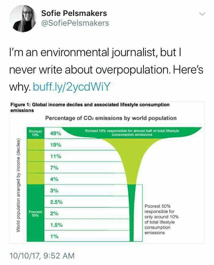
The meme is a humorous commentary on the issue of overpopulation, specifically the idea that the world's resources are being consumed by a small percentage of the population. The image shows a graph illustrating the distribution of wealth and consumption, with the top 1% of the population responsible for the majority of carbon emissions. The meme's text reads "I'm an environmental journalist, but I never write about overpopulation. Here's why."
detailed-analysis (gemma3-27b-vision)
Okay, here's an analysis of the image, broken down into the requested sections, with explanations of how each lens applies (or doesn't). I'll also provide a general overview first.
General Overview
The image is a tweet from environmental journalist Sofie Pelsmakers. The tweet proclaims she never writes about "overpopulation" and links to an article explaining why. The image itself is a visualization of CO2 emissions distributed across global income deciles (10% segments). The graphic shows a highly unequal distribution: the richest 10% of the global population are responsible for nearly half (49%) of total consumption emissions, while the poorest 50% are responsible for only around 10%. This is a data-driven argument against focusing on population size as the primary driver of climate change and points towards the significant role of consumption patterns within wealthy populations.
1. Visual Description
- Type: Infographic/Data Visualization. It’s designed to convey information at a glance.
- Layout: Vertical stacked bars, each representing a decile of the global population arranged from richest to poorest (top to bottom). The length of each bar visually represents the percentage of total consumption emissions attributable to that decile.
- Color Scheme: Green gradient from lighter to darker. This creates a visual flow and emphasizes the declining percentage of emissions as we move down the income scale. The green also evokes environmental concerns, tying the visualization to the topic.
- Text: Clearly labelled percentages for each decile. Annotations highlight the stark disparities (Richest 10% = 49%; Poorest 50% = ~10%).
- Overall Impression: The graphic is designed to be impactful, using visual contrast to highlight the gross inequality in carbon emissions and to challenge the narrative that population size is the central problem.
2. Foucauldian Genealogical Discourse Analysis
This lens is very relevant. Foucault would be interested in how the discourse around “overpopulation” has been constructed and how it functions as a form of power.
- Power/Knowledge: The framing of "overpopulation" isn't a neutral scientific observation. It is an historically constructed discourse with implications for power. Pelsmakers’ tweet actively challenges this discourse. She suggests this discourse serves to deflect attention away from the responsibility of wealthy nations and individuals. The data presents a “counter-discourse” challenging the dominant narrative.
- Genealogy: A genealogical approach would trace the history of the "overpopulation" narrative. Who created it? What historical conditions gave rise to it? What institutions and practices perpetuate it? Pelsmakers implicitly suggests it has roots in colonial and neo-colonial patterns of blame and control. (Shifting blame to those with less, rather than those with more).
- Disciplinary Power: The "overpopulation" narrative can function as a form of disciplinary power. It can justify policies that restrict reproductive rights, limit access to resources for marginalized communities, or promote eugenics.
- Normalisation: The focus on overpopulation normalises the status quo. It avoids confronting the unsustainable consumption patterns of affluent societies.
3. Critical Theory (Frankfurt School)
Critical Theory would analyze how this data reveals systemic problems within capitalism.
- Ideology: The emphasis on overpopulation (as opposed to unequal distribution of resources and unsustainable consumption) can be seen as part of a larger ideological system that legitimizes the existing social order. It masks the inherent contradictions of capitalism.
- Commodification: The image indirectly points to the commodification of everything within capitalist society. The relentless drive for economic growth and consumption fuels emissions, and this is unequally distributed.
- Rationality and Domination: Horkheimer and Adorno’s concept of “instrumental rationality” is relevant. The pursuit of profit and efficiency, without regard for social or environmental consequences, is at the heart of the problem. The graphic exposes the consequences of this unchecked rationality.
- Critique of Enlightenment: The focus on population control can be seen as an extension of Enlightenment rationality that seeks to control and manage nature and society. Critical theorists would question the underlying assumptions of this control.
4. Marxist Conflict Theory
This is highly applicable.
- Class Struggle: The data directly demonstrates a class-based disparity in emissions. The richest 10% are driving the majority of environmental damage, while the poorest 50% contribute minimally. This reinforces the Marxist idea that conflict arises from unequal control of resources.
- Means of Production: The graphic implicitly points to the relationship between the means of production (factories, industries, etc.) and consumption. The wealthiest segments of the population control the vast majority of these means, leading to disproportionate emissions.
- Exploitation: The poorest 50% are disproportionately impacted by climate change while contributing the least to the problem. This highlights the Marxist concept of exploitation.
- False Consciousness: The dominant narrative about overpopulation can be seen as a form of false consciousness, obscuring the true source of the problem (unequal power and resource distribution).
5. Postmodernism
While less central than the previous lenses, Postmodernism offers some insights.
- Meta-Narratives: Pelsmakers’ challenge to the “overpopulation” narrative can be understood as a rejection of a grand, universalizing meta-narrative. It challenges the idea that there's a single, simple solution to complex environmental problems.
- Deconstruction: A postmodern analysis might deconstruct the concept of “overpopulation” itself. What does it mean? Who defines it? What are the underlying assumptions?
- Relativism: Postmodernism doesn’t necessarily offer a solution, but it emphasizes the importance of acknowledging multiple perspectives and challenging dominant truths.
- Simulacra and Simulation: The narrative of overpopulation can be viewed as a simulacrum, a copy without an original. The image highlights that the true issue is not simply the number of people, but rather the patterns of consumption and the systems that drive them.
6. Queer Feminist Intersectional Analysis
This lens is relevant, but requires some nuance.
- Intersectionality: The graphic doesn't explicitly show intersectional dynamics (race, gender, sexuality, etc.), but it’s important to consider how these factors interact with class to amplify environmental vulnerability. For example, poor women of color are likely to be disproportionately affected by climate change and have the least access to resources to mitigate its effects.
- Eco-feminism: This lens would emphasize the connection between the domination of nature and the domination of women. The exploitative relationship with the environment mirrors patriarchal structures of power.
- Queer Ecology: It challenges the heteronormative assumptions in environmental discourses and highlights the importance of diverse perspectives in addressing environmental issues.
- Reproductive Justice: The focus on population control (often historically tied to eugenics and control over women’s bodies) can be viewed through the lens of reproductive justice, which emphasizes the right to bodily autonomy and reproductive freedom.
In conclusion, the image is a powerful visual argument that can be analyzed through various critical lenses, each offering unique insights into the complex relationship between inequality, consumption, and environmental sustainability. The Foucauldian, Marxist, and Critical Theory perspectives are particularly strong in interpreting the underlying power dynamics and systemic issues highlighted by the graphic.
simple-description (llama3.2-vision)
The meme is a humorous commentary on the wealth gap between the world's richest and poorest. It uses a chart to illustrate the percentage of global wealth held by the top 1% of the population, and the bottom 50% of the population. The text "I'm an environmental journalist, but I never write about overpopulation" is a tongue-in-cheek commentary on the irony of an environmental journalist who doesn't write about the issue of overpopulation, despite being an environmental journalist.
tesseract-ocr
Sofie Pelsmakers Vv @SofiePelsmakers I'm an environmental journalist, but | never write about overpopulation. Here's why. buff.ly/2yedWiY eee 1: Global income deciles and associated lifestyle consumption Percentage of COz emissions by world population 3 fom 0 —— ; — ; : 3% g 25% Poorest 50% & [eal oniy around 10% 5 1.5% cemneion 1% emissions 10/10/17, 9:52 AM