First Seen
2024-05-04T06:41:10.139441+00:00
simple-description (qwen3.5_2b-q8_0)
The meme represents the "Math vs. Language" divide in modern AI, showing a clear inverse correlation between the two metrics. In this chart, the GSM8k metric (grey bars) is the one consistently slipping, while the MMLU metric (orange bars) stays relatively flat. The image illustrates that while current LLMs are improving at text generation and general conversation, their ability to solve basic math problems based on their training data is actually decreasing.
simple-description (llama3.2-vision_11b)
The meme is an image of a chart comparing the performance of various AI models, with a caption that reads "AI is like a child who can't even". The chart shows that the performance of AI models like GPT-4, BERT, and others is consistently low, with many of them scoring below 50% on a simple math test.
detailed-analysis (gemma3-27b-vision)
Okay, let's break down this chart through various theoretical lenses. It's important to state upfront that applying these complex theories to a simple data visualization is an interpretive exercise. There's a degree of stretching involved, and different interpretations are possible.
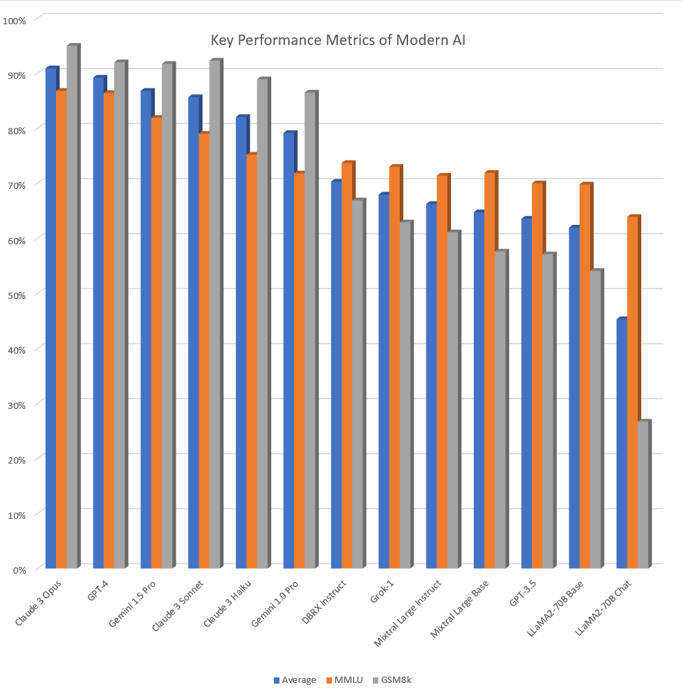
Visual Description
The image is a bar chart titled “Key Performance Metrics of Modern AI.” The x-axis lists different AI models (Claude 3 Opus, GPT-4, Gemini 1.5 Pro, etc.), and the y-axis represents a percentage scale from 0% to 100%. Three different bars represent each model: blue ("Average"), orange ("MMLU"), and gray ("GSM8K").
The chart broadly indicates the performance of these AI models across these three metrics. Claude 3 Opus and GPT-4 demonstrate the highest overall "Average" performance, consistently at or near 90%. Performance then decreases generally across the models, with LLaMA2-70B Chat showing the lowest "Average" performance around 60%. The MMLU and GSM8K scores fluctuate, showing some models excelling in specific metrics (e.g., Gemini 1.5 Pro with MMLU).
Foucauldian Genealogical Discourse Analysis
This chart is not simply a neutral presentation of data; it constitutes a discourse around "AI performance." Following Foucault, we can ask how this chart produces the idea of AI competence. The very selection of metrics (Average, MMLU, GSM8K) isn’t inherent; they’re chosen as markers of intelligence and proficiency. This chart therefore disciplines the field of AI research. Models are implicitly ranked, driving research towards optimizing those specific metrics and potentially neglecting others.
A genealogical approach could ask where these metrics come from. What historical and cultural practices inform their selection? MMLU (Massive Multitask Language Understanding) and GSM8K (Grade School Math 8K) tie performance to established modes of human intelligence (linguistic comprehension and mathematical reasoning). This implies that AI is being evaluated on its ability to mimic or reproduce human abilities—a potentially limiting framework. The chart’s presentation creates a power dynamic: those who define the metrics (the chart creators, researchers who developed the tests) wield power over what is deemed “good” AI.
Critical Theory
From a Critical Theory perspective (following the Frankfurt School), this chart is emblematic of the “instrumental reason” that characterizes modern technology. The chart presents AI performance as a quantifiable, objective “truth,” obscuring the inherently social and political purpose of these technologies. What is AI being used for? Who benefits from its development? The chart doesn't address these crucial questions.
The focus on technical metrics risks reifying AI as a neutral tool, obscuring the possibility that these technologies could reinforce existing power structures or create new forms of control. The implicit ranking of models can also be seen as a form of technological determinism—suggesting that progress is solely defined by achieving higher scores on these metrics, ignoring ethical, social, and political implications.
Marxist Conflict Theory
From a Marxist perspective, the chart reveals the competitive dynamics driving AI development. The ranking of models highlights the "struggle" for dominance in the AI industry. The investment in developing models that achieve higher scores on these metrics represents capital accumulation—companies are competing to create "better" AI to gain a competitive advantage in the market.
The chart doesn’t show who owns the intellectual property or the data used to train these models. This is significant because it obscures the concentration of power and wealth in the hands of a few tech giants. The pursuit of “better” AI performance may lead to exploitation of labor and resources in the data collection and model training processes. The relentless pursuit of optimization can be seen as a form of class warfare – where some will benefit while others get left behind.
Postmodernism
From a postmodern perspective, the chart is a simulation of intelligence. It presents quantifiable scores as if they represent a genuine measure of "understanding" or "competence," but these scores are merely representations—signs that point to something that is ultimately elusive and indeterminate. The very idea of "intelligence" is socially constructed and culturally contingent.
The chart’s reliance on specific metrics can be seen as an example of grand narrative—the attempt to impose a single, universal standard of evaluation on a complex phenomenon. The emphasis on quantifiable data reinforces a belief in objective truth, while ignoring the subjective and interpretive aspects of intelligence. The chart, therefore, creates a constructed reality rather than revealing an objective one.
Queer Feminist Intersectional Analysis
While a direct application is less immediately apparent, we can consider how the chart silences certain voices and perspectives. The metrics chosen implicitly reflect dominant cultural norms regarding what constitutes "intelligence." What if intelligence were defined differently, based on Indigenous knowledge systems or marginalized ways of knowing? The chart doesn't account for these alternative perspectives.
The data used to train these models often reflects biases present in the existing data. This means that the AI models may perpetuate and amplify existing social inequalities. The focus on technical metrics distracts from the potential for AI to reinforce patriarchal or colonial structures. The lack of diversity in the teams developing these models further exacerbates these issues.
Important Disclaimer: These are interpretive readings. The chart itself is a relatively simple data visualization. Applying these complex theoretical frameworks is intended to highlight the underlying power dynamics, assumptions, and potential biases inherent in the way we understand and evaluate AI.
tesseract-ocr
100% Key Performance Metrics of Modern Al 90% 80% 70% 60% 50% 40% 30% 20% 10% 0% oe a © & RS eo ss Ra Ra & oe & & SF é eo s cS Ss s co & oe & ss ee w € > 2 € a ¢ s x A $ s eo 3 s $ é 9 3 s s Se s s » Rs ” s w ¥ ¥ Average mMMLU m GSM8k
simple-description (llama3.2-vision)
The meme is a humorous image of a chart comparing the performance of various AI models, with the title "AI Model Performance" and a chart showing the performance of each model in different categories. The chart is labeled "AI Model Performance" and has a key at the bottom that explains the colors used. The chart shows the performance of each model in categories such as "accuracy", "speed", and "cost".