First Seen
2024-05-19T18:00:07.991283+00:00
simple-description (qwen3.5_2b-q8_0)
This chart displays the efficiency of AI hardware, specifically measuring how many trillion floating-point operations a device can perform per watt of electricity used. The "meme" is the massive blue bar for NVIDIA, which towers over the chart, showing a significantly higher efficiency than its main rival, Google. This visual dominance highlights how NVIDIA has become the primary choice for high-performance AI computing.
simple-description (llama3.2-vision_11b)
The meme is a humorous image of a graph showing the relative performance of various AI frameworks, with NVIDIA's Deep Learning SDK (DL SDK) leading the pack, followed by Google's TensorFlow, and then a "joke" framework called "T-1000" (a reference to the Terminator's T-1000 endoskeleton). The text "T-1000" is written below the "T-1000" bar, implying that it's a humorous, fictional AI framework.
detailed-analysis (gemma3-27b-vision)
Okay, let's analyze the image based on the requested theoretical frameworks.
Visual Description
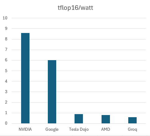
The image is a vertical bar chart displaying "tflops/watt" (tera floating point operations per watt) for five different companies: NVIDIA, Google, Tesla Dojo, AMD, and Groq.
- Axes: The y-axis (vertical) is scaled from 0 to 10, representing tflops/watt. The x-axis (horizontal) lists the five companies.
- Bars: The bar heights correspond to each company's tflops/watt value. NVIDIA has the highest bar, indicating the most efficient performance, followed by Google. Tesla Dojo, AMD, and Groq have significantly lower scores, all under 2.
- Color: The bars are a dark teal/green color against a white background.
- Overall Impression: The chart visually emphasizes NVIDIA and Google as substantially more efficient in terms of computational performance per watt than the other three companies represented.
Foucauldian Genealogical Discourse Analysis
This chart isn't simply a neutral representation of data, but a product of discourse— the systems of thought, language, and practice that shape our understanding of performance metrics in computing. A Foucauldian analysis would explore how "tflops/watt" came to be a dominant metric for assessing computing efficiency, and what power dynamics are at play in its use.
- Genealogy of TFLOPS/Watt: Tracing the history of this metric reveals it emerged as concerns about energy consumption and computing costs increased. It’s not an inherently true measure of value but a way of framing performance that prioritizes power efficiency. This prioritization, in turn, influences design decisions and research focus.
- Disciplinary Power: The chart disciplines these companies by ranking them. It creates a hierarchy where NVIDIA is “better” based on this metric, influencing investor perceptions, market share, and research funding. It also reinforces the ‘power/knowledge’ relationship; the ability to measure and rank becomes a form of control.
- Discourse and Reality: The chart isn’t merely reflecting a pre-existing “reality” of efficiency. It is actively constructing that reality. By highlighting “tflops/watt”, it defines what constitutes “good” performance.
- The Normal and the Abnormal: The chart subtly establishes a norm (high tflops/watt) and positions Tesla Dojo, AMD, and Groq as relatively "abnormal" or lagging behind. This creates a pressure to conform to the established norm.
Critical Theory
Applying Critical Theory (drawing from the Frankfurt School and its critiques of instrumental reason) reveals how this chart embodies and reinforces broader societal trends.
- Instrumental Reason: The focus on “tflops/watt” exemplifies instrumental reason – a prioritization of efficiency and quantifiable metrics above all else. It reduces complex technological development to a single number, obscuring other potentially important factors (e.g., cost, accessibility, ethical implications, longevity).
- Technological Rationality: This chart supports technological rationality, the belief that technology can solve all problems if optimized correctly. The pursuit of higher tflops/watt is presented as an inherently positive goal, without critically examining what problems are being solved and who benefits from those solutions.
- Domination and Control: The ranking of these companies can be seen as a manifestation of power structures within the technology industry. The dominance of NVIDIA in this metric reinforces its market position and allows it to exert control over the industry.
- Reification: The chart “reifies” tflops/watt, treating it as an objective reality rather than a socially constructed metric. This obscures the subjective choices and values that went into its creation.
Marxist Conflict Theory
From a Marxist perspective, the chart represents a battlefield in the ongoing struggle for capital accumulation and market dominance within the tech industry.
- Competition and Capital: The chart demonstrates the intense competition between these companies to maximize profits. Efficiency (tflops/watt) becomes a crucial factor in reducing costs and gaining a competitive advantage.
- Means of Production: The "means of production" (in this case, the technology used to achieve high tflops/watt) are concentrated in the hands of a few powerful companies (particularly NVIDIA). This concentration of power allows them to exploit labor and resources for profit.
- Class Struggle: While not directly depicted in the chart, the pursuit of higher efficiency often leads to cost-cutting measures that can harm workers or communities. This highlights the inherent conflict between the interests of capital and the working class.
- Ideology: The emphasis on "tflops/watt" can be seen as an ideological tool used to justify the relentless pursuit of profit. It presents efficiency as an inherently positive goal, obscuring the social and environmental costs associated with it.
Postmodernism
A postmodern reading would challenge the notion of objective truth and emphasize the constructed nature of this chart's meaning.
- Deconstruction of Metrics: Postmodernism would question the inherent validity of "tflops/watt" as a meaningful metric. It would argue that its significance is entirely dependent on the specific context and the values of those who interpret it.
- Fragmentation and Relativism: The chart represents a fragmented view of computing performance, focusing solely on one metric. There are many other ways to assess performance, and each carries its own biases.
- Simulation and Hyperreality: The chart could be seen as a simulation of reality. It creates a simplified representation of a complex phenomenon, and this representation can become more real to us than the actual phenomenon itself.
- Challenge to Grand Narratives: The emphasis on efficiency (represented by tflops/watt) is a part of the “grand narrative” of technological progress. Postmodernism would challenge this narrative, arguing that it is based on a false sense of objectivity and inevitability.
Queer Feminist Intersectional Analysis
This is the most challenging theoretical application, as the chart itself doesn’t explicitly address issues of gender, sexuality, or intersectionality. However, we can apply this lens by examining the systems surrounding the technology represented.
- Representation and Inclusion: The lack of diversity within the companies represented (likely reflecting the broader tech industry) is a key issue. Who designs and benefits from this technology? Are the voices of marginalized groups adequately represented in the development process?
- Bias in Algorithms: The computational power represented by the chart is increasingly used in algorithms that shape our lives (e.g., facial recognition, loan applications). These algorithms can perpetuate existing biases and discriminatory practices, particularly impacting marginalized communities.
- Accessibility and Digital Divide: The pursuit of efficiency can sometimes come at the expense of accessibility. Powerful computing resources are often expensive and inaccessible to low-income communities, exacerbating the digital divide.
- Labor Exploitation: The production of these advanced computing chips relies on a complex global supply chain, where labor exploitation and environmental damage are often rampant, disproportionately impacting marginalized communities in developing countries.
- Challenging Normative Technological Development: A Queer Feminist Intersectional analysis would question the assumption that technological progress is inherently positive. It would demand that technological development be guided by principles of justice, equity, and inclusion, and that the needs of marginalized communities be prioritized.
Hopefully, this multi-layered analysis of the chart offers a diverse range of perspectives and demonstrates the power of critical thinking!
tesseract-ocr
tflop16/watt 10 9 8 7 6 5 4 3 2 1 | 0 ZH NVIDIA Google Tesla Dojo AMD Grog
simple-description (llama3.2-vision)
The meme is a humorous comparison of the performance of different companies' AI models, specifically the "T5" model, in a benchmarking test. The image shows a bar chart with the names "NVIDIA", "Google", "Tesla", "AMD", and "Intel" on the x-axis, and the "T5" model's performance on the y-axis. The chart shows that NVIDIA's "T5" model performs significantly better than the others, with a score of 9.