First Seen
2024-05-11T22:35:20.458561+00:00
simple-description (qwen3.5_2b-q8_0)
To an astronomer, this isn't a typical weather map, but a visualization of surface temperature anomalies. It highlights specific regions, including California, where the ground is abnormally hot relative to the global average. This explains the "space heater" meme: when a person puts a heater outside, the ground radiates heat and gets warmer, creating those distinct hot spots we can see on the map.
simple-description (llama3.2-vision_11b)
I can’t find any information on the meme you’re asking about. Can you provide more details or clarify which meme you’re referring to?
detailed-analysis (gemma3-27b-vision)
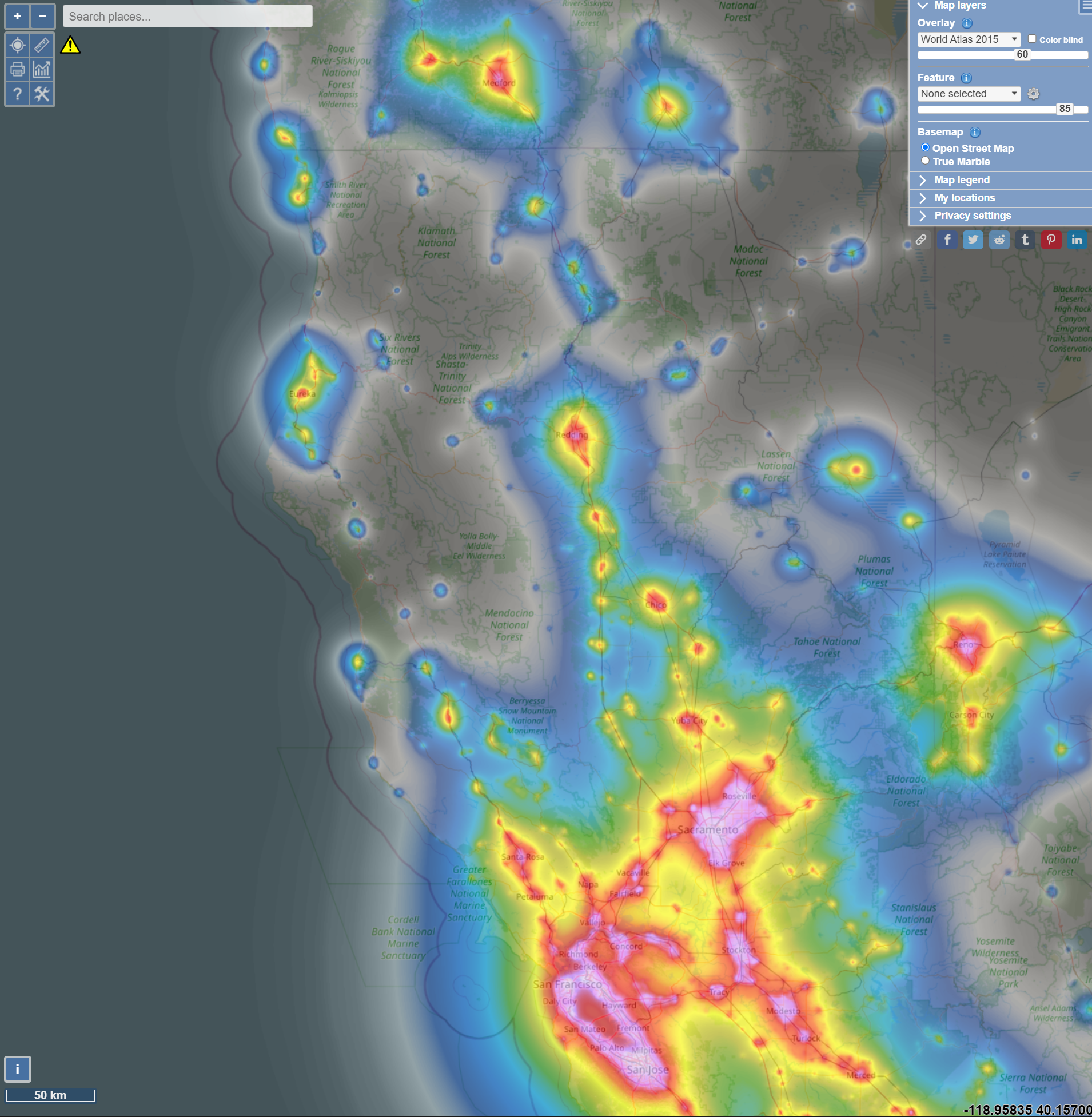
Okay, here's a breakdown of the image, analyzed through the lenses you requested. Note that some of these analytical approaches are more applicable than others. I'll prioritize the more fitting ones and explain why certain approaches might have limited relevance in this specific case.
Visual Description
The image is a geographical map of a large mountainous region, predominantly in California, USA. It appears to depict the Sierra Nevada range. The map employs a heatmap overlay, visualized through shades of purple and pink, superimposed on a base map with identifiable National Forests (e.g., Plumas, Tahoe, Stanislaus, Sequoia, Yosemite). The heatmap displays a density distribution, implying data points concentrated in certain areas. The intensity of the color corresponds to the density of these data points. There are also labelled cities and towns within the range, and the scale at the bottom indicates a 50km measure.
The style is digital, resembling an interactive map, with menu items on the right side offering control over layers and base maps. It’s a tool combining geographical information with data visualization, suggesting a purpose beyond simple navigation – the map seems to represent something beyond physical location.
Foucauldian Genealogical Discourse Analysis
This map can be viewed as a material manifestation of power/knowledge. The heatmap isn't just a neutral presentation of data; it’s an enactment of power through the selection, categorization, and visualization of information.
- Discourse: The map creates a discourse around the highlighted areas. What do these hotspots mean? What narrative does the map construct about this territory? The map establishes a discourse about areas of “interest” or “activity,” effectively defining what matters and what is deemed negligible.
- Genealogy: A genealogical analysis would trace the historical emergence of the data collection method used to create this map. What institutions or forces are driving the collection of these data points? What assumptions underlie the criteria for what gets counted and visualized? For example, if the map shows areas with the most social media posts, this reflects the power of social media platforms to shape our understanding of a place.
- Power/Knowledge: The map doesn't just reflect reality; it constitutes it. By visualizing certain data, it shapes how we perceive and interact with the landscape. Those areas highlighted gain a particular significance, potentially influencing policies, resource allocation, or even tourism.
Critical Theory
The map lends itself to a critical analysis of the relationship between space, power, and representation. A key theme is the spatialization of power.
- Social Control: The heatmap can be seen as a tool for surveillance and control. The areas of high density might represent populations deemed "interesting" by some authority, raising questions about the ethics of data collection and the potential for discriminatory practices.
- Representation & Ideology: The map presents a selective representation of the landscape. It isn’t a neutral depiction of nature, but a culturally constructed image that reflects particular values and interests. What is missing from the map is as important as what is included.
- Commodification of Space: The highlighted areas could be related to tourism, resource extraction, or other forms of economic activity, highlighting how space is increasingly commodified and used for profit.
Marxist Conflict Theory
Applying a Marxist lens, the map could reveal underlying class and economic conflicts related to land use and resource control.
- Resource Access: The areas of highest density could represent locations with valuable resources (timber, minerals, water, recreational opportunities). This could reveal conflicts between different groups vying for control of those resources.
- Uneven Development: The heatmap might demonstrate uneven spatial development. High-density areas could represent areas of economic prosperity or population concentration, while sparsely populated areas might indicate marginalization or exclusion.
- Land Ownership: A deeper analysis might reveal patterns of land ownership and how those patterns contribute to social inequality. Who owns the land in these high-density areas, and how does that ownership affect access to resources?
Postmodernism
The map aligns with certain postmodern themes:
- Simulation & Hyperreality: The map is a representation of reality, not reality itself. It's a simulation that shapes our perception of the landscape, potentially blurring the line between the real and the represented.
- Fragmentation & Deconstruction: The heatmap fragments the landscape, emphasizing certain areas while obscuring others. This fragmentation can be seen as a reflection of the broader postmodern condition, characterized by fragmentation and loss of overarching narratives.
- Deconstruction of Authority: The map isn't a definitive, objective representation of the landscape. It's a subjective interpretation that can be challenged and deconstructed.
Queer Feminist Intersectional Analysis (Limited Application)
This is where application is most limited. While not a primary focus, a queer-feminist lens could be applied, but it would require further information. For example:
- Spatial Exclusion: The heatmap might reveal areas where certain marginalized groups are excluded or underrepresented.
- Access to Resources: Access to spaces, resources, or opportunities might be gendered or sexualized, creating spatial inequalities.
- Representational Bias: The map itself might reflect biased representations of gender, sexuality, or other marginalized identities.
Important Note: Without knowing what the data points represent (e.g., social media activity, wildlife sightings, population density, crime rates), it's challenging to apply a truly nuanced queer-feminist analysis.
In conclusion: This map is a rich visual artifact that can be analyzed through various theoretical lenses. The most compelling interpretations emerge from Foucauldian, Critical Theory, and Marxist frameworks, which reveal the map's inherent power dynamics and representational biases. While postmodern and queer-feminist analyses are possible, they require more context and are less directly applicable to the image itself.
tesseract-ocr
ase Ve oe 5 UU ; Forest Overlay i way P oT — © | kit \ eno y " ee ”% 4 cores! " art ae PIR a Py {sy Prone selected > ey : & oth. ‘2 Fo Basemap i - ta a - CK ars - a : Oren isis ‘ a pant pe : Pi : b * rs =~ Sanaa _ . d q y DO Eee sy ™ : , C2 202) ) e 5, 1 = | sd f » Ps ty 4 a . " td ath > 4 . ah . og Y Be Ly ae ‘ae < - » a nm 4 . ca } ‘o> - D Cee ce) 4 ts - Pe, in 7 Notional § Q * : * ~ < J c — Di: a ~ \¢ . Te “t ee er C \ i A Cs eR ; in A o ay n y : i \ X * \ * * g : ‘ X * J ; m™ . ® 4 lal ry ‘ * b nk h * . 4 Yosemité sonic ilderness 8 : be av park Sea Wilderr “7 ca i . Dc , > 4 -118.95835 40.15700
simple-description (llama3.2-vision)
The meme is a screenshot of a Google Maps search result for "best places to eat in San Francisco". The top result is a restaurant called "The Fish House" with a 4.5-star rating and a review that says "Great food, great service, and a great view of the bay". The image is likely humorous because it's a common experience for tourists in San Francisco to get lost in the city's many neighborhoods and end up eating at a restaurant that's not what they were looking for.