First Seen
2023-08-15T22:02:16+00:00
simple-description (qwen3.5_2b-q8_0)
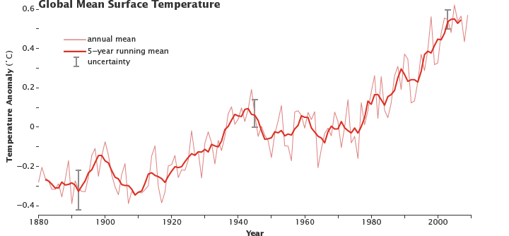
This graph, often circulated online as a viral visual, actually illustrates a critical scientific reality: global warming. It plots the "global mean surface temperature" anomaly, showing that while yearly temperature fluctuations are jagged and unpredictable, the long-term trend is a clear and steady rise from 1880 to the present.
The chart tracks the "annual mean" and a "5-year running mean," and includes a section for "uncertainty" represented by the error bars, emphasizing that despite short-term variability, the global warming trend has been consistent over centuries.
simple-description (llama3.2-vision_11b)
The meme is an image of a graph showing the difference between the average global temperature and the average temperature in the past. The graph is titled "Global Warming" and has a red line showing the increase in temperature over time. The text "We're not even at 2C yet" is written above the graph, implying that the current temperature is still below the 2C threshold set by the Paris Agreement.
detailed-analysis (gemma3-27b-vision)
Okay, here's an analysis of the provided graph ("Global Mean Surface Temperature") through the lenses you requested. I'll only include sections where the lens is meaningfully applicable. Given the nature of the graph, some lenses are more relevant than others.
Visual Description
The graph displays global mean surface temperature anomalies (deviations from a baseline temperature) from 1880 to approximately 2020. The x-axis represents the year, and the y-axis shows the temperature anomaly in degrees Celsius.
There are two lines depicted: a thinner line representing the annual mean temperature anomaly and a thicker line representing a 5-year running mean, which smooths out short-term fluctuations. Error bars indicating uncertainty are also present, most prominently towards the earlier part of the graph.
The graph shows a general upward trend, particularly from the mid-20th century onwards. Early data (1880-1950) exhibits more variability, with periods of warming and cooling. From around 1950, the trend becomes increasingly pronounced and consistent, indicating a significant and accelerating warming of the planet. The most recent decades show the highest temperature anomalies recorded.
Foucauldian Genealogical Discourse Analysis
This graph, as a visual representation of climate data, is not simply an objective depiction of reality; it’s a product of discourse. A Foucauldian analysis would explore how the very categories of ‘temperature anomaly’, ‘global mean’, and ‘climate change’ have been constructed through specific historical power/knowledge regimes.
- Power/Knowledge: The creation of this graph requires scientific institutions, monitoring networks, and analytical techniques. These are not neutral entities; they operate within power structures that define what counts as legitimate knowledge about the climate. The graph performs that knowledge.
- Genealogy: The graph's lineage can be traced back to the development of meteorological instruments, statistical methods, and the very idea of a global climate system. Examining this genealogy reveals the assumptions and exclusions inherent in constructing our understanding of climate. For example, what pre-scientific ways of understanding weather patterns were displaced by this data-driven approach?
- Disciplinary Power: The graph functions as a tool for exercising disciplinary power. It "normalizes" the idea of a predictable, measurable climate, and defines deviations from that norm as “anomalies.” This creates a framework for intervention—policies aimed at preventing “dangerous” anomalies.
- The Episteme: The graph is reflective of a modern episteme (a system of thought) focused on quantification, prediction, and control. It assumes that understanding the climate requires reducing it to measurable variables.
Critical Theory
From a critical theory perspective (particularly drawing on the Frankfurt School), this graph reveals a deeper crisis beyond mere environmental change. It’s symptomatic of a systemic rationalization and instrumentalization of nature.
- The Domination of Nature: The graph represents a project of knowing and controlling nature. By quantifying and analyzing temperature anomalies, we are attempting to dominate and predict the natural world for human purposes.
- Instrumental Reason: The emphasis on quantification and measurement reflects the dominance of “instrumental reason” – a form of rationality focused on means-ends calculations without questioning the ends themselves. The graph doesn’t ask why we want to control the climate, only how to do it.
- Commodification of Nature: The data generated by this graph feeds into economic calculations (cost-benefit analyses of climate mitigation) and potentially market-based solutions (carbon trading). This contributes to the commodification of nature, treating it as a resource to be exploited and managed.
- The Loss of Experience: The abstract quantification of temperature anomalies risks losing the lived experience of weather and climate. It replaces qualitative understanding with quantitative data.
- One-Dimensionality: The graph’s focus on a single metric (temperature anomaly) can contribute to a “one-dimensional” worldview that ignores other important dimensions of the climate crisis, such as social justice, biodiversity loss, and cultural impacts.
Marxist Conflict Theory
From a Marxist perspective, the graph is not simply a neutral representation of a natural phenomenon, but a manifestation of the inherent contradictions of capitalism.
- Ecological Crisis as a Class Issue: The warming trend depicted in the graph is not evenly distributed in its impacts. The poorest and most marginalized communities are disproportionately affected by climate change (e.g., through extreme weather events, food insecurity). The graph implicitly reveals this inequality, as it represents a systemic problem rooted in the unequal distribution of wealth and power.
- Capital Accumulation and Environmental Degradation: The industrial activities driving climate change are driven by the pursuit of capital accumulation. The graph is a visual consequence of a system that prioritizes profit over environmental sustainability.
- The Commodification of Nature: The attempt to "solve" climate change through market-based mechanisms (carbon trading, carbon offsets) is seen as a further commodification of nature and a way for corporations to profit from the crisis.
- The State as an Agent of Capital: The policies and regulations aimed at addressing climate change often serve the interests of capital rather than prioritizing the needs of the environment and the working class.
- Systemic Change Required: The graph suggests that addressing climate change requires fundamental systemic changes to the capitalist mode of production, not simply technological fixes or market-based solutions.
Postmodernism
A postmodern analysis would challenge the idea of this graph as a single, objective truth.
- Deconstruction of "Truth": Postmodernism questions the possibility of objective truth. The graph represents data, but it’s a constructed representation, shaped by the methodologies, assumptions, and biases of the scientists and institutions that created it.
- Narratives and Discourse: The graph is part of a larger narrative about climate change. Different actors (scientists, politicians, activists, corporations) construct different narratives, and the graph can be used to support or challenge those narratives.
- Fragmented Knowledge: Postmodernism emphasizes the fragmentation of knowledge. The graph focuses on a single variable (temperature anomaly), ignoring other important aspects of the climate system. It presents a partial, incomplete picture.
- Power/Knowledge: (similar to Foucauldian analysis) The graph is not simply a neutral description of reality, but a tool for exercising power and shaping knowledge. It establishes certain ways of knowing the climate as legitimate and others as illegitimate.
- Hyperreality: The graph is a simulation of reality, a representation of a complex system. This representation can become more real than the actual experience of climate change.
I hope this detailed analysis, incorporating multiple theoretical lenses, provides a comprehensive understanding of the graph. Let me know if you'd like any of these sections expanded further.
tesseract-ocr
o.¢-Global Mean surface lemperature h - \ a) annual mean WV oo 84 5-year running mean | 2 T. uncertainty \ iy 2 - hy | E 02. At 9 so? \ i "\] 2 | 1 WM v - A \ hMPV £ yO | OW || Wy 2 o- NL YV x \\f ™ fi e - ah \ I aw Vy Very 5 Mn\ /\ val Y \ tl \ & { AY \ y -o2-- | _ Jf [\ dt \ J Kh V/V \ TN VE \ 0.4 ' / . 1880 1S00~—~~SCS2OSSSCSaOS SCO ~SCSBOS SCO Vear
simple-description (llama3.2-vision)
This meme is a graph of global mean surface temperature anomalies, with a red line representing the annual mean and a blue line representing the 5-year running mean. The text "In 2016, we had a record global temperature" appears above the graph, and the caption "Record" is written in a small font at the top of the image. The graph shows a sharp spike in temperature in 2016, indicating a record-breaking year for global temperatures.