First Seen
2023-08-14T18:14:41+00:00
simple-description (qwen3.5_2b-q8_0)
This infographic acts as a visual metaphor for a societal collapse, charting a steady, accelerating rise in recorded disasters from 1923 to 2023. The data suggests a civilization that is slowly fracturing under the weight of natural threats, with a single year (2019) registering 1,452 distinct events. By defining a disaster as 10+ killed or an emergency, the image frames the statistics as a massive systemic failure rather than isolated accidents.
simple-description (llama3.2-vision_11b)
The meme is a humorous illustration of a graph showing the rapid increase in climate-related disasters (floods, storms, droughts) over the years. The text "Collapse" is written in a bold font at the top of the graph, implying that the world is on the brink of collapse due to climate change. The graph's steep upward trend suggests that climate-related disasters are becoming more frequent and severe, with no end in sight.
detailed-analysis (gemma3-27b-vision)
Okay, let's break down this graph with the requested theoretical frameworks. I'll assess if each framework applies meaningfully to the data presented and provide analysis accordingly.
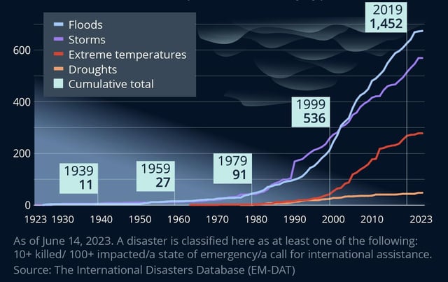
Visual Description
The graph depicts the number of recorded disasters from 1923 to June 2023. Disasters are classified based on whether they resulted in 10+ deaths, impacted 100+ people, triggered a state of emergency, or prompted a call for international assistance. The data is broken down into four categories: Floods (blue line), Storms (orange line), Extreme Temperatures (red line), and Droughts (brown line). A cumulative total of disasters is represented by a grey line.
Key trends:
- Overall Increase: There is a clear and dramatic increase in the total number of disasters over time, particularly from around 1970 onwards.
- Floods Dominance: Floods are the most frequent type of disaster recorded, consistently exceeding other categories.
- Increasing Storms & Extreme Temperatures: Storms and extreme temperatures also show consistent increasing trends.
- Droughts Relatively Lower: Droughts represent the smallest proportion of recorded disasters, though there is still an upward trend.
- Cumulative Escalation: The cumulative total line underlines the significant and accelerating increase in overall disaster frequency.
Foucauldian Genealogical Discourse Analysis
This graph is deeply resonant with Foucauldian concepts. The data isn't just about disasters; it’s about the discourse of disaster.
- Power/Knowledge: The graph is produced by a specific institution (The International Disaster Database, EM-DAT), which defines what constitutes a “disaster”. This definition is not neutral. It’s a form of power/knowledge – shaping how we understand, categorize, and respond to events. The criteria (10+ killed, 100+ impacted, emergency, international call) actively construct the “disaster” category, bringing certain events into visibility while obscuring others.
- Genealogy: A genealogical approach would trace the historical emergence of this disaster discourse. Why are these criteria used? How have definitions of disaster changed over time? The visible uptick in recorded disasters post-1970 likely isn't solely due to more disasters occurring, but also to improvements in data collection, reporting mechanisms, and a growing awareness (and subsequent classification) of events that might previously have been considered "natural" or localized.
- Disciplinary Power: The data collection and dissemination practices of EM-DAT represent a form of disciplinary power. By identifying, categorizing, and quantifying disasters, it creates a framework for intervention and control. This framework can shape disaster relief efforts, resource allocation, and policy-making.
- Normalization: The increasing number of disasters, when presented graphically, can ironically lead to a form of normalization. The sheer scale of the problem can be overwhelming, making it difficult to recognize the exceptional and devastating nature of each individual event.
Critical Theory
Critical theory, particularly Frankfurt School thought, sees this graph as evidence of systemic failures.
- Instrumental Reason: The graph can be viewed through the lens of “instrumental reason,” where efficiency and quantifiable metrics (like the number of disasters) are prioritized over human well-being. The focus on counting and categorizing disasters, while seemingly objective, can obscure the underlying social and political conditions that contribute to vulnerability.
- Domination & Control: The graph suggests a world where certain populations are disproportionately exposed to environmental risks. This can be linked to broader patterns of domination and control – economic exploitation, political marginalization, and unequal access to resources.
- Commodification of Crisis: The data collection itself, and its use in policy-making, can be seen as a form of commodification of crisis. Disasters become data points, used to justify certain interventions or policies, rather than being understood as complex social and environmental events with profound human consequences.
- Loss of Critical Consciousness: The graph, in its detached presentation of data, can contribute to a loss of critical consciousness. It encourages a passive acceptance of the increasing frequency of disasters, rather than prompting critical reflection on the underlying causes.
Marxist Conflict Theory
From a Marxist perspective, this graph highlights the inherent contradictions of capitalism.
- Environmental Degradation as a Result of Capitalist Production: The increasing frequency of disasters can be directly linked to the destructive consequences of capitalist production – deforestation, pollution, greenhouse gas emissions, and the exploitation of natural resources.
- Class Inequality & Vulnerability: The graph implicitly reveals how class inequality exacerbates disaster vulnerability. Marginalized communities, who often bear the brunt of environmental damage, have fewer resources to prepare for or recover from disasters.
- Capitalism's Drive for Profit over Sustainability: The relentless pursuit of profit incentivizes unsustainable practices that increase environmental risks. The graph is evidence of the long-term costs of prioritizing short-term economic gains over long-term ecological sustainability.
- Conflict Over Resources: As environmental resources become scarcer, conflict over their control is likely to intensify. The graph can be seen as a symptom of these underlying conflicts.
Postmodernism
A postmodern reading challenges the notion of objective truth and emphasizes the constructed nature of reality.
- Rejection of Grand Narratives: Postmodernism would reject the idea that there is a single, overarching explanation for the increasing frequency of disasters (e.g., climate change). It would emphasize the multiplicity of factors at play and the subjective experiences of those affected.
- Deconstruction of Categories: The graph relies on categories like “flood,” “storm,” and “drought.” A postmodern analysis would deconstruct these categories, arguing that they are social constructs that shape our understanding of reality.
- Emphasis on Local Narratives: Postmodernism would prioritize local narratives and perspectives over global generalizations. The graph presents a broad overview, but it obscures the unique experiences of individuals and communities impacted by disasters.
- Simulation and Hyperreality: Some postmodern theorists might argue that the increasing frequency of disasters is a form of simulation, a hyperreal experience that blurs the line between reality and representation. The graph itself is a representation of disasters, and it can contribute to a sense of detachment from the real-world consequences.
Queer Feminist Intersectional Analysis
This analysis would highlight how intersecting systems of oppression—based on gender, sexuality, race, class, and ability—shape disaster vulnerability and resilience.
- Gendered Impacts: Disasters disproportionately affect women and gender non-conforming individuals. They often face increased risks of violence, sexual exploitation, and limited access to resources during and after disasters.
- Racialized Vulnerability: Communities of color are disproportionately exposed to environmental hazards and have fewer resources to prepare for or recover from disasters, due to historical and ongoing patterns of systemic racism.
- Queer & Trans Exclusion: LGBTQ+ individuals may face discrimination and exclusion in disaster relief efforts, and their specific needs may not be addressed.
- Intersectionality & Resilience: An intersectional analysis recognizes that individuals and communities face multiple and intersecting forms of oppression. It also highlights the resilience and agency of marginalized groups in the face of adversity. This analysis will examine who is most affected by disasters and how to create more equitable disaster preparedness and relief efforts.
I hope this detailed breakdown provides a comprehensive analysis of the graph through the various theoretical frameworks requested. Let me know if you would like me to elaborate on any specific aspect or framework!
tesseract-ocr
bee — B32] OUTS — y RS crs hcl eess = Stns = Cumulative total 400 1999 536 200 eee 1979 1939 1959 91 ZA 11 27 — 0 ee YO} Tg NaC Oren em ee este ee Seen may a ere ds lea urea ac Amey oae he een ec Ur ecco IN marr four BPE ene (cA VED)
simple-description (llama3.2-vision)
This meme is a chart showing the rising temperatures over the years, with a focus on the increase in extreme temperatures. The chart is divided into four categories: floods, storms, droughts, and temperatures. The text in the image reads: "As of June 14, 2023. A disaster is classified here as at least one of the following: 10+ killed/100+ injured/a state of emergency declared/ a call to international assistance requested."