First Seen
2024-01-28T09:15:32.727568+00:00
simple-description (qwen3.5_2b-q8_0)
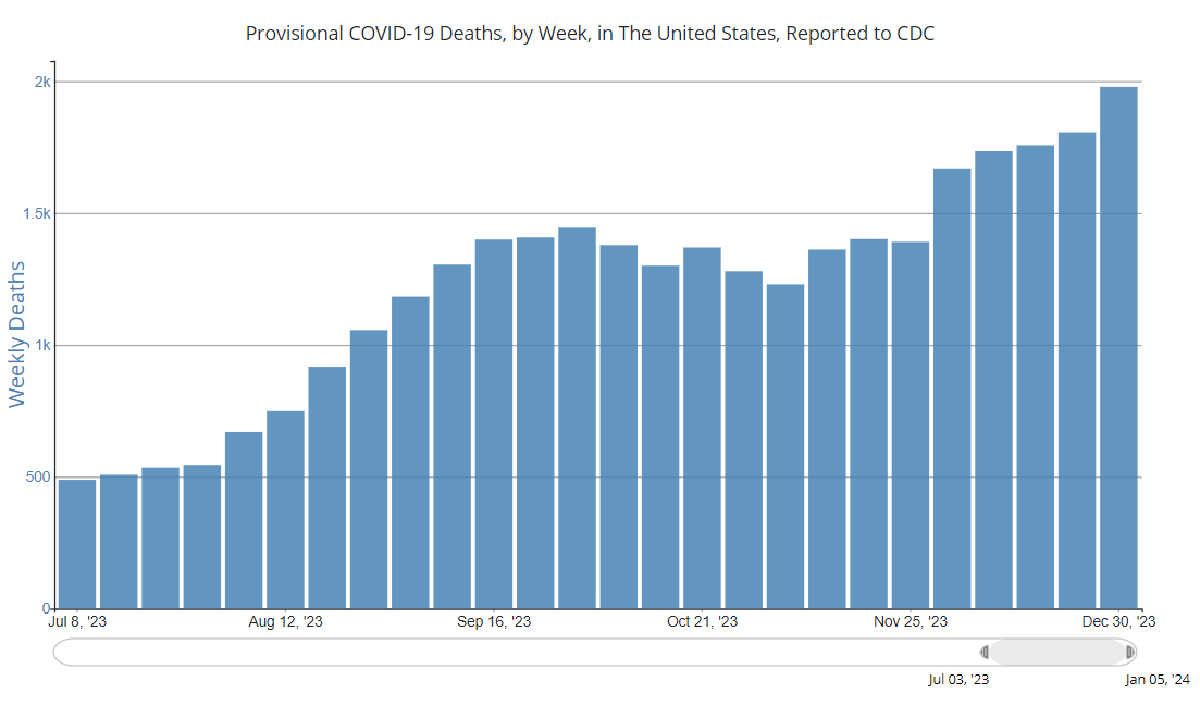
This chart displays the weekly number of COVID-19 deaths in the United States, reporting on data from mid-July 2023 through late December 2023. It features blue bars that represent the count of weekly deaths, which steadily climb from under 500 in July all the way up to nearly 2,000 at the end of the visible period.
The "meme" in this image is a "bar chart that isn't a bar chart" joke. Just like the famous viral "bar chart of coronavirus" meme, it visually depicts a spike in the number of deaths. The humor comes from the fact that the blue bars keep rising higher and higher at the end of the timeline, reaching a peak of almost 2,000. This creates a misleading impression that the death toll is still ramping up at the close of the data, whereas the actual "coronavirus" meme usually shows a sharp rise followed by a drop to a "normal" baseline.
simple-description (llama3.2-vision_11b)
This meme is a humorous take on the COVID-19 pandemic, specifically the surge in deaths in the US during that time. The meme shows a graph of COVID-19 deaths in the US, with a large spike in the spring of 2020. The text "2020" is written above the spike, implying that the pandemic was a major event in that year.
detailed-analysis (gemma3-27b-vision)
Okay, let's break down this chart of provisional COVID-19 deaths in the US, looking at it through the lenses you've requested. It's important to note that these interpretations are theoretical and apply the concepts to the representation of the data, not necessarily definitive truths about the data itself.
1. Visual Description
The chart is a bar graph displaying provisional COVID-19 deaths per week in the United States, reported to the CDC, from July 8, 2023, to January 5, 2024. The y-axis represents the number of weekly deaths, ranging from 0 to 2000 (approximately). The x-axis displays the weeks from July 8, 2023, to January 5, 2024. The bars are uniformly blue.
- Trend: The primary characteristic is a consistently increasing trend in weekly deaths over the observed period. Initially, the weekly deaths fluctuate between 500-700. As the graph progresses, the numbers climb steadily, reaching a peak of approximately 1900 deaths in the last week displayed.
- Shape: The visual progression is a noticeable upward slope, resembling a hill or a rising wave. It’s not linear; the rate of increase seems to accelerate later in the observed period.
- Data Representation: The chart aggregates deaths into weekly totals, obscuring potential daily or regional fluctuations. It is provisional, indicating that the data may be subject to change.
2. Foucauldian Genealogical Discourse Analysis
Applying Foucault, we can examine how the very category of "COVID-19 deaths" is constructed and what power dynamics are at play in its categorization and presentation.
- Discourse & Power: The chart is a product of a medical-scientific discourse. The CDC, as an authority, defines what constitutes a "COVID-19 death." This definition isn’t natural; it’s a constructed category, and it holds power. Those deaths are made visible through this classification system, meaning those who don’t fit the definition may not be counted or acknowledged in the same way.
- Genealogy: A genealogical analysis would trace the historical conditions that led to this specific mode of tracking deaths. What historical precedents of public health surveillance shaped this system? What political and economic considerations influenced the CDC’s definition of a "COVID-19 death?" What prior systems of categorization existed, and how did they evolve?
- Biopower: This chart exemplifies biopower – the ability to manage and control populations through knowledge about their health and life. The CDC’s collection and presentation of this data are an exercise of biopower, influencing public health policy, individual behavior, and resource allocation.
- Normalization: The presentation of this data as a “normal” statistical report normalizes the ongoing deaths, potentially desensitizing the public to the scale of the loss. The seemingly objective nature of the chart masks the human tragedies it represents.
3. Critical Theory
Drawing on Critical Theory (Habermas, Horkheimer, Adorno), we can examine how the chart contributes to systems of domination and the suppression of critical thought.
- Instrumental Reason: The chart represents a reliance on “instrumental reason” – a focus on quantifiable data (the number of deaths) as a means to achieve specific ends (public health management). While seemingly objective, this focus can obscure deeper, systemic issues contributing to those deaths. The chart doesn't tell us why these deaths are happening – what social, economic, or political factors are at play.
- The Culture Industry: One could argue the chart is a part of the “culture industry”, presenting a simplified, digestible version of a complex reality, designed to maintain the status quo. It focuses on numbers, potentially diverting attention from the underlying structures of inequality that make certain populations more vulnerable to the virus.
- Loss of Emancipation: The increasing trend in deaths represented in the chart can be seen as evidence of a lack of societal progress. Despite advances in medical science, the chart suggests a failure to adequately address the social determinants of health, leaving vulnerable populations exposed.
4. Marxist Conflict Theory
From a Marxist perspective, the chart reveals class and power dynamics contributing to unequal health outcomes.
- Material Conditions: The rise in deaths isn't simply a medical phenomenon; it's a result of material conditions. The chart can be read as a reflection of socioeconomic inequalities. Certain classes may have greater exposure to the virus due to their jobs (essential workers), living conditions (crowded housing), and limited access to healthcare.
- Exploitation: The fact that deaths are increasing could be linked to the exploitation of labor, where workers are forced to continue working even during a pandemic, putting their health at risk.
- False Consciousness: The presentation of this data as a purely medical issue could contribute to “false consciousness,” preventing the public from recognizing the systemic causes of the pandemic and the need for radical social change.
5. Postmodernism
Postmodern analysis would challenge the notion of objective truth and question the authority of the data itself.
- Deconstruction: A postmodern approach would “deconstruct” the chart, exposing the underlying assumptions and biases embedded in its construction. What narratives are being promoted through this representation of data? Who benefits from this particular framing?
- Simulacra and Simulation: The chart could be seen as a “simulacrum” – a copy without an original. The numbers themselves become detached from the actual human suffering they represent, creating a hyperreality.
- Relativism: A postmodern perspective would challenge the idea that this data is inherently more “true” than other ways of knowing about the pandemic. Stories, experiences, and qualitative data are equally valid forms of knowledge.
6. Queer Feminist Intersectional Analysis
This lens emphasizes how intersecting systems of oppression (based on gender, sexuality, race, class, etc.) shape vulnerability and health outcomes.
- Intersectionality: The chart doesn't reveal who is dying. Queer, trans, and BIPOC communities are disproportionately affected by the pandemic due to historical and ongoing discrimination, lack of access to healthcare, and economic marginalization.
- Care Work & Gender: Women, especially women of color, bear a disproportionate burden of care work, increasing their exposure to the virus.
- Visibility and Erasure: Queer and trans individuals may face erasure in data collection due to lack of inclusive categories, making it difficult to assess their specific vulnerability.
- Challenging Normative Health Models: A Queer Feminist analysis would question the normative, often cisgender and heterosexual, assumptions embedded in public health models and advocate for more inclusive and responsive approaches.
Important Caveats: These interpretations are theoretical and based on applying complex concepts to a single visual representation. A deeper analysis would require more contextual information about the data collection methods, the CDC’s objectives, and the broader social and political landscape.
tesseract-ocr
Provisional COVID-19 Deaths, by Week, in The United States, Reported to CDC 2k 1.5k wv $ % o a Dik z o © = 500 Jul 8, '23 Aug 12, '23 Sep 16, '23 Oct 21, '23 Nov 25, 23, Dec 30, 28 4 D Jul 03, 23 Jan 05, 24
simple-description (llama3.2-vision)
This meme is a chart showing a dramatic increase in COVID-19 deaths in the United States, with a sharp spike in the last week of 2022. The chart has a caption that reads "COVID-19 deaths: 2022: 0, 2023: 100,000+ and rising".