First Seen
2023-12-11T00:12:00+00:00
simple-description (qwen3.5_2b-q8_0)
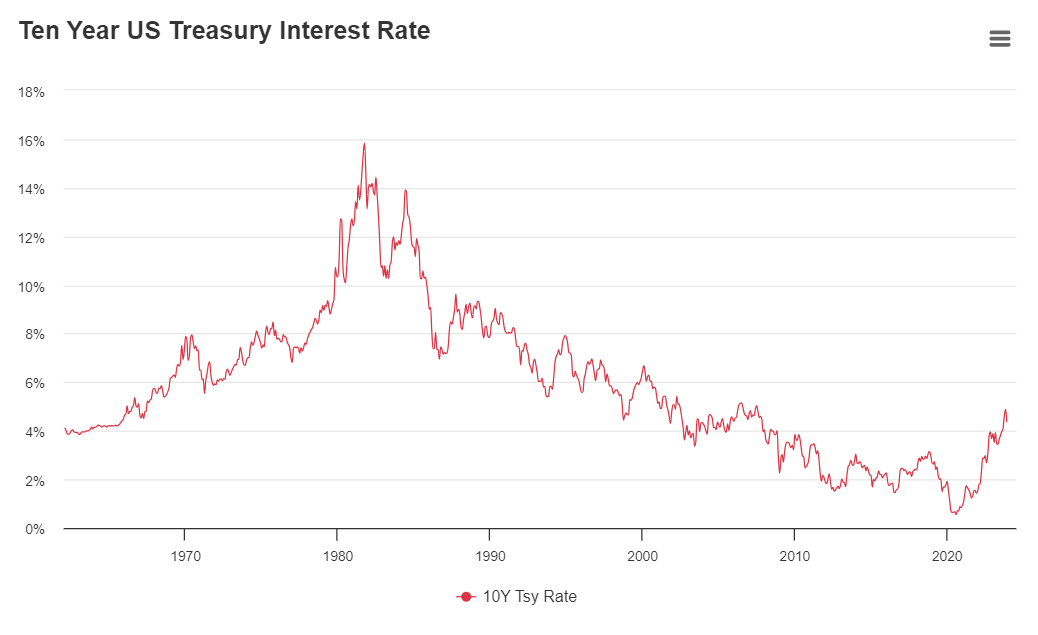
This chart is an economic meme illustrating the concept of "inverse correlation," a theory that suggests interest rates should move in a single direction with the stock market. However, for someone who can't see it, the graph reveals that rates are actually wildly unpredictable and erratic, spiking above 16% in the late 1980s before crashing back down to near 1% by 2020. The chart demonstrates that financial markets do not always follow a clear rule, making price predictions very difficult.
simple-description (llama3.2-vision_11b)
The meme is a screenshot of a graph showing the 10-year US Treasury yield (also known as the 10-Year Treasury Yield) over time. The graph shows a sharp spike in the yield, indicating a significant increase in interest rates, with the text "10-Year Treasury Yield" and "10-Year Treasury Yield Hits 10-Year High" overlaid on the image. This meme is likely being used to comment on the current state of the economy and the impact of rising interest rates on financial markets.
detailed-analysis (gemma3-27b-vision)
Okay, let's break down this chart of the 10-Year US Treasury Rate through the lenses you've requested. I'll organize it by your requested sections, but I'll state upfront that not every theoretical framework will be a perfect fit, and some will be more productive interpretations than others.
1. Visual Description
The chart displays the 10-Year US Treasury rate from approximately 1970 to 2024. It's a line graph, the line being a vibrant red color. Here's a breakdown of the trends:
- 1970s – Early 1980s: A significant and rapid rise in rates, starting around 3-4% and peaking around 15% in the early 1980s. This is the most dramatic portion of the graph.
- 1980s – 2000: A period of decline, fluctuating but overall decreasing from the peak of the early 80s to roughly 5-6%. There's a notable dip in the early 1990s.
- 2000 – 2010: Continued decline, reaching a low point around 2% in the early 2010s. The line is relatively stable within a narrow range.
- 2010 – 2020: A gradual increase, followed by a dip during the pandemic. The rate stays within a range of roughly 1.5% to 3%.
- 2020 – 2024: A steep increase starting from around 0.5% in 2020 to 4.5% in 2024.
Overall, the graph visually represents a cyclical pattern of rising and falling rates, but with significant variation in the scale of those cycles. The most dramatic shift is the initial climb in the 1970s and the recent surge after 2020.
2. Foucauldian Genealogical Discourse Analysis
From a Foucauldian perspective, this graph isn't simply about "interest rates" as a neutral economic indicator. It's a trace of power/knowledge relations operating through the discourse of finance.
- Discipline and Normalization: The chart can be seen as a visualization of how the US Treasury disciplines the economy through interest rate manipulation. High rates in the 70s/80s arguably served to break the back of inflation, but also disciplined individuals and businesses, forcing them into certain behaviors. Lower rates in later periods created a different set of disciplinary effects. The graph traces the normalization of certain economic conditions.
- Genealogy of 'Stability': The idea of "stable" interest rates (as seen in the 2000s) isn't natural; it's a historically constructed concept. A genealogical analysis would ask how this idea of stability came to be considered desirable, what institutions (like the Federal Reserve) played a role in constructing this discourse, and what other possibilities were excluded.
- The Archive: The graph itself is part of an archive of economic data. This archive isn’t a neutral repository of facts; it's a curated collection that shapes how we understand the economy. What is included in this archive (interest rates) and what is excluded (social costs of high rates, alternative economic models) has significant power implications.
- Governmentality: The chart reflects the way the state exercises power over economic life. Through interest rate setting, the state shapes behavior, manages risk, and aims to achieve specific economic outcomes.
3. Critical Theory
Applying a Critical Theory lens (drawing from the Frankfurt School) focuses on the underlying social and ideological forces at play:
- Instrumental Reason: The chart can be interpreted as a manifestation of "instrumental reason"—the use of rational calculation and quantitative data (like interest rates) as ends in themselves, divorced from broader ethical or social concerns. The focus on controlling inflation or GDP growth might overshadow considerations of social justice, income inequality, or environmental sustainability.
- Commodification: Interest rates themselves are part of the commodification of time and money. The graph tracks the price of borrowing money, turning a fundamental aspect of economic life into a tradable commodity.
- Hegemony: The graph represents the dominance of a particular economic ideology—neoliberalism—that emphasizes market-based solutions and the control of inflation. The fluctuations in rates reflect the ongoing efforts to maintain this hegemonic order.
- Culture Industry: The way this data is presented (as a clean, objective chart) contributes to the "culture industry's" ability to normalize certain economic policies and obscure their social consequences. It's a simplified representation that hides the complexities of economic life.
4. Marxist Conflict Theory
From a Marxist perspective, this chart represents the inherent conflicts within the capitalist system:
- Capital Accumulation: The fluctuations in interest rates are directly tied to the drive for capital accumulation. High rates can benefit creditors but harm debtors, while low rates can stimulate investment but risk inflation. The chart shows the ongoing tension between these opposing forces.
- Class Struggle: The benefits and burdens of interest rate policies are not evenly distributed across society. Capitalists and financiers often benefit from high rates, while workers and borrowers may suffer. The chart reflects the ongoing class struggle over the distribution of wealth.
- Contradictions of Capitalism: The cyclical nature of the chart (boom and bust cycles) is seen as an inherent contradiction of capitalism. The system is prone to crises and instability, as the drive for profit leads to overproduction, speculation, and financial bubbles.
- State as Instrument of Class Rule: The Federal Reserve (and the US Treasury) is viewed as an instrument of the ruling class, acting to protect and promote the interests of capital. The chart represents the state's efforts to maintain the conditions necessary for capital accumulation.
5. Postmodernism
A postmodern reading of this chart would question the very notion of objective truth and grand narratives:
- Deconstruction of "Rate": The idea of a single "interest rate" is a simplification. A postmodern analysis would emphasize that this number masks a multitude of competing interests, power dynamics, and subjective interpretations.
- Rejection of Meta-Narratives: The search for a single, overarching explanation for the fluctuations in rates (e.g., "the natural laws of economics") would be rejected. Postmodernism emphasizes the fragmented and contingent nature of knowledge.
- Simulacra and Simulation: The graph itself can be seen as a simulacrum—a representation that has become detached from any underlying reality. It's a simulation of economic activity that has become more real than the thing it represents.
- Local Narratives: A postmodern approach would focus on the local narratives surrounding interest rate changes—how they affect specific communities, individuals, and businesses.
6. Queer Feminist Intersectional Analysis
This is the most challenging lens to apply directly, as the graph doesn’t immediately reveal gender, sexuality, or intersectional dynamics. However:
- Financial Exclusion: Historically, women and marginalized groups have faced systemic barriers to accessing credit and financial services. Interest rate policies can exacerbate these inequalities. A queer feminist analysis would examine how these policies disproportionately impact these groups.
- Care Economy: Interest rate policies can impact the care economy—the unpaid and underpaid work of caregiving that is often performed by women. High rates can increase the cost of borrowing for families and individuals who rely on care services.
- Debt and Vulnerability: Debt is often used as a tool of control and oppression, particularly for marginalized groups. Interest rate policies can contribute to debt burdens and increase vulnerability to exploitation.
- Challenging Economic Norms: A queer feminist analysis would question the dominant economic norms that prioritize profit over people and perpetuate inequalities. It would advocate for alternative economic models that are more just and equitable.
I hope this provides a comprehensive breakdown of the chart through your requested theoretical frameworks. It's important to remember that these are just interpretations, and other readings are possible.
tesseract-ocr
Ten Year US Treasury Interest Rate = 18% 16% 14% 12% 10% 8% 6% 4% 2% a a 1970 1980 1990 2000 2010 2020 -® 10Y Tsy Rate
simple-description (llama3.2-vision)
This meme is an image of a chart showing the 10-year Treasury yield (a measure of interest rates) over time. The chart appears to be a visual representation of a wild ride, with the yield skyrocketing from around 1% to over 4% in a short period of time. The text at the top of the chart reads "10-Year Treasury Yield" and the text at the bottom reads "The Yield is a Wild Ride".