First Seen
2023-05-10T20:59:58+00:00
simple-description (llama3.2-vision_11b)
The meme is a graph illustrating the concept of an inelastic demand curve, which occurs when a product's demand is not affected by changes in its price. The graph shows a vertical line, indicating that the demand for a product is not responsive to changes in its price. The text "Change in price leads to a smaller percentage change in demand" is written above the graph, highlighting the key concept of inelastic demand.
detailed-analysis (gemma3-27b-vision)
Okay, let's break down this economic chart through several theoretical lenses. Please note that some of these lenses might feel like "reaching" or abstract interpretations, as applying them to a simple demand curve requires significant extrapolation and critical thinking.
Visual Description
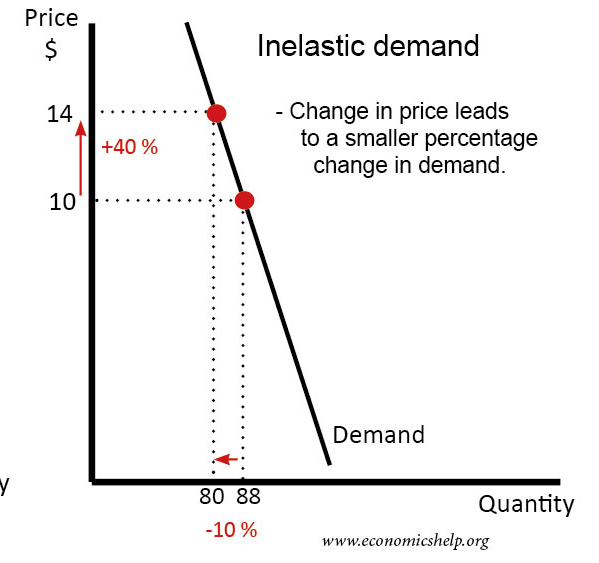
The image depicts a downward-sloping demand curve in a two-dimensional coordinate system with Price on the Y-axis and Quantity on the X-axis. A point on the curve is marked in red. From this point, an arrow shows a 40% increase in price, resulting in a 10% decrease in quantity demanded. The text highlights that this represents "inelastic demand," where changes in price lead to a proportionally smaller change in quantity demanded. The chart is sourced from economicshelp.org.
Foucauldian Genealogical Discourse Analysis
This chart is a discourse that constructs and perpetuates the concept of “demand” and its relationship to price. A Foucauldian approach would examine how this “truth” of inelastic demand has become established through historical power relations.
- Power/Knowledge: The chart doesn't just represent reality; it creates a reality where market forces are naturalized. The idea of “inelasticity” becomes a tool for justifying price increases, framing them as a natural consequence of market dynamics rather than a deliberate action with social consequences.
- Genealogy of "Demand": Tracing the historical development of the concept of “demand” would reveal it wasn’t discovered but constructed through the development of neoclassical economics. The chart represents a culmination of this historical process, obscuring the power dynamics involved in its formulation.
- Normalization & Discipline: By presenting inelastic demand as an objective economic principle, the chart helps to normalize the idea that price increases are sometimes unavoidable, even when they lead to reduced consumption. It subtly disciplines behavior by presenting this as an inherent law.
Critical Theory
A Critical Theory lens focuses on how this chart masks underlying power structures and perpetuates a specific worldview.
- Ideology: The chart operates as an ideological tool. It presents a seemingly neutral economic principle, but in reality, it reinforces the logic of capitalism. Inelastic demand often applies to necessities (like medicine, basic food), suggesting that even when prices rise, people must continue to purchase them. This masks the potential for exploitation and inequity.
- Reason as Domination: The 'rational' economic model presented by the chart appears objective, but it serves to legitimize and maintain existing power structures. The logic of supply and demand, presented as natural laws, obscures the ways in which social and political factors shape economic outcomes.
- Commodification: The chart assumes that everything, even basic necessities, can be treated as a commodity subject to market forces. This commodification obscures the social and ethical dimensions of resource allocation.
Marxist Conflict Theory
A Marxist reading would view this chart as representing the inherent conflicts within a capitalist system.
- Class Struggle: Inelastic demand, particularly for essential goods, can exacerbate class inequalities. If prices for necessities rise while demand remains relatively stable, it disproportionately affects the working class and those with limited incomes.
- Exploitation: The chart implicitly assumes that those who set prices (producers, corporations) have the power to dictate market conditions. Inelastic demand allows them to capture a greater share of consumer surplus, potentially leading to exploitation.
- Capital Accumulation: The chart represents a mechanism for capital accumulation. By raising prices even when demand doesn’t drop significantly, producers can increase their profits and reinvest them, perpetuating the cycle of capital accumulation.
Postmodernism
A postmodern analysis would question the very notion of objective "truth" represented by the chart.
- Deconstruction of "Demand": Postmodernism challenges the idea of a fixed, universal concept of "demand." "Demand" is not an inherent property of the market; it is a socially constructed concept shaped by culture, language, and power.
- Simulation & Hyperreality: The chart can be seen as a simulation of economic reality, rather than a direct representation. The model simplifies complex social interactions and can create a “hyperreality” where the representation becomes more important than the actual lived experience of consumers.
- Rejection of Grand Narratives: Postmodernism rejects the idea of universal economic laws. The chart presents "inelasticity" as a rule, but postmodernists would argue that economic phenomena are always contingent and context-dependent.
Queer Feminist Intersectional Analysis
This analysis would focus on how the "neutral" economic principles in the chart can reinforce existing inequalities based on gender, sexuality, race, and class.
- Gendered Impacts: Inelastic demand for goods like menstrual products, childcare, or healthcare disproportionately affects women and gender non-conforming individuals. Price increases can create significant barriers to accessing essential services.
- Racialized Capitalism: The chart doesn’t account for how systemic racism shapes economic outcomes. Racial minorities may face greater barriers to accessing affordable goods and services, and may be more vulnerable to the effects of price increases.
- Intersectional Vulnerabilities: Individuals who occupy multiple marginalized identities (e.g., a Black transgender woman) may experience compounded disadvantages, making them particularly vulnerable to the negative consequences of inelastic demand.
- Normalization of Exploitation: The chart's neutrality implicitly normalizes economic systems that disproportionately burden marginalized communities, framing it as simply "the way things are" rather than a system that actively perpetuates inequality.
Important Note: These are theoretical interpretations. Applying these lenses to a simple chart requires a degree of abstraction and extrapolation. The goal is to illustrate how different critical perspectives can challenge the assumptions and implications of even seemingly neutral economic representations.
simple-description (llama3.2-vision)
This meme is a humorous illustration of the concept of an inelastic demand curve in economics. It shows a graph with a steeply sloping line that represents a product with a high demand, but the price is so high that the demand is actually decreasing. The text "in elastic demand" is written above the graph, with a red arrow pointing downwards, indicating that the demand is decreasing as the price increases.
tesseract-ocr
Price $ Inelastic demand 14 Ferrers - Change in price leads +40 % $ to a smaller percentage : change in demand. LO proc ig : : Demand <: y : 80 88 Quantity “10% vunomiicinsh www.economicshelp.org