First Seen
2024-02-20T05:54:17+00:00
simple-description (qwen3.5_2b-q8_0)
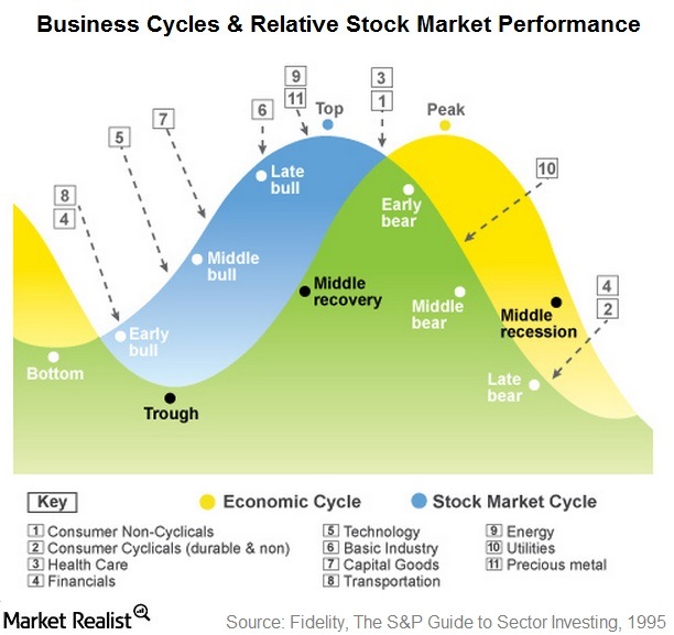
This chart is a visual representation of business cycles that maps the relationship between the economy and the stock market. It uses a large, wavy shape to show how different economic sectors, such as Financials (4) and Technology (5), move up and down with the broader economy, while others remain relatively stable. A legend on the left side lists specific industries and their corresponding numbers, helping you decode which sectors are included in the "Economic Cycle" versus the "Stock Market Cycle."
simple-description (llama3.2-vision_11b)
The meme is a visual representation of the economic cycle, specifically the transition from a recession to a recovery. It shows a graph with a trough (a low point) and a peak (a high point), with the caption "Recession is when you have too many options; depression is when you have too few." This meme is often used to illustrate the idea that a recession is a normal part of the economic cycle, and that it is followed by a recovery.
detailed-analysis (gemma3-27b-vision)
Okay, let's break down this visual representation of business and stock market cycles through various theoretical lenses. It's important to note that applying these complex theories to a seemingly straightforward economic chart requires a degree of interpretation and extrapolation. I'll go through each requested section, indicating if a particular theory doesn't strongly apply.
Visual Description
The image is a circular chart depicting the interplay between the economic cycle and the stock market cycle. It's a gradient color scheme, primarily utilizing greens, yellows, and blues to represent the different phases.
- Economic Cycle: A darker green line shows the economic cycle, moving from trough, through early bull, middle bull, late bull, peak, early bear, middle bear, late bear, and back to trough.
- Stock Market Cycle: A lighter blue line traces a similar path, representing the stock market's response to economic fluctuations.
- Phases: The chart is divided into segments representing phases: trough, early bull, middle bull, late bull, peak, early bear, middle bear, late bear, and recession.
- Sector Key: A numbered key at the bottom assigns sectors (e.g., consumer non-cyclicals, financials, technology) to different phases, indicating where investment in those sectors is likely to perform well. The chart visually implies certain sectors thrive during particular economic phases. For example, precious metals are associated with the "Peak" stage.
Foucauldian Genealogical Discourse Analysis
This chart strongly lends itself to Foucauldian analysis. It isn't about 'truth' but about power/knowledge.
- Discourse of Control: The chart constructs an understanding of the economy as something predictable, manageable, and controllable. It presents a visual 'grammar' for understanding economic shifts, implying that experts can know where we are in the cycle and predict future performance. This generates a discourse of control, where certain actors (financial advisors, economists) gain authority through their perceived ability to interpret and act upon this knowledge.
- Genealogy of 'The Cycle': The concept of "the business cycle" itself isn't a natural phenomenon. It's a historical construction. A genealogical investigation would reveal the historical roots of this concept—how it emerged from specific economic and political contexts, and how the way we define and categorize cycles has changed over time. It's not a neutral description but a way of framing economic reality that has particular consequences.
- Power Dynamics: The chart subtly reinforces power dynamics. It suggests those who understand these cycles (investors, financial institutions) can profit from them. The very act of categorization (labeling sectors, defining phases) establishes hierarchies of value and importance. This knowledge isn’t shared equally; it's a tool for those with access to it to maintain their position.
- Normalisation of Risk: The chart normalizes the idea of economic volatility as a cycle. It presents downturns (bear markets, recessions) not as failures but as inevitable and predictable phases, minimizing the potential for questioning the underlying structures that cause economic hardship.
Critical Theory
Critical Theory (drawing on the Frankfurt School) also offers insightful avenues for analysis.
- Instrumental Rationality: The chart embodies instrumental rationality – the idea that everything is evaluated in terms of its usefulness for achieving a specific goal (in this case, maximizing financial returns). It reduces the complexity of economic life to quantifiable categories and predictable patterns, ignoring the social, political, and ethical dimensions.
- Ideology & False Consciousness: The chart can be seen as contributing to an ideological framework that obscures the systemic inequalities inherent in capitalism. By presenting the cycle as a natural process, it deflects attention from the structures of power that create and perpetuate economic disparities. It might generate a 'false consciousness' – the belief that individual success is determined by understanding and navigating the cycle, rather than by challenging the system itself.
- Domination & Control: The emphasis on prediction and control reinforces the idea that economic life should be managed by experts and institutions, potentially leading to a form of social domination. The chart serves as a tool for maintaining the status quo.
Marxist Conflict Theory
While the chart doesn't explicitly represent class struggle, Marxist analysis can reveal underlying tensions.
- Capital Accumulation: The chart's purpose is fundamentally about capital accumulation – generating profits. The sectors highlighted in different phases are those likely to yield the highest returns. It’s a map for directing investment and maximizing wealth.
- Contradictions of Capitalism: The cyclical nature of the chart implicitly acknowledges the inherent contradictions of capitalism – boom and bust, expansion and contraction. However, it frames these contradictions as natural and inevitable, rather than as symptoms of deeper structural problems.
- Unequal Distribution of Benefits: The chart doesn't address who benefits from the cycles. It ignores the fact that the gains from economic expansion are often concentrated in the hands of a few, while the losses from downturns are disproportionately borne by workers and marginalized communities.
- Commodification of Knowledge: The chart represents a commodification of economic knowledge—information is treated as a product to be bought and sold, used to generate profits, rather than as a tool for social good.
Postmodernism
Postmodernism's relevance is slightly more tenuous, but still present.
- Deconstruction of 'The Cycle': A postmodern approach would question the very notion of a predictable "cycle." It would argue that economic reality is far more complex, fragmented, and contingent than this chart suggests. There isn't a singular, overarching narrative; rather, there are multiple, competing interpretations.
- Simulacra and Simulation: The chart could be seen as a simulacrum – a representation of reality that has become detached from the real. It's a simplified model that creates the illusion of understanding, obscuring the underlying complexities.
- Relativism: A postmodern perspective would emphasize the relativism of economic knowledge. There's no objective truth about the cycle; rather, interpretations are shaped by power, ideology, and historical context.
Queer Feminist Intersectional Analysis
This lens is the least directly applicable, but can offer some nuanced insights.
- Gendered and Racialized Impacts: Economic cycles disproportionately affect marginalized groups. Women, people of color, and LGBTQ+ individuals are often more vulnerable to job losses, wage stagnation, and financial hardship during downturns. The chart erases these differential impacts, presenting a generalized picture of economic experience.
- Care Work & Informal Economy: The chart focuses on formal sectors of the economy, ignoring the vital but often undervalued work of caregiving and the informal economy, which are disproportionately performed by women and people of color.
- Intersectionality of Vulnerability: The chart doesn’t acknowledge that vulnerability is shaped by the intersection of multiple identities. A woman of color may face unique challenges during an economic downturn that are different from those faced by a white man.
- Challenge to Universal Narratives: A queer feminist analysis would challenge the idea of a universal economic narrative. It would argue that economic experiences are shaped by gender, race, sexuality, and other social categories, and that these experiences must be recognized and addressed.
I hope this detailed breakdown, using various theoretical lenses, provides a more comprehensive understanding of the chart. Please let me know if you have any other questions.
tesseract-ocr
Business Cycles & Relative Stock Market Performance (3) ES (a) Top ik Peak ® r Ve &) ‘ : ‘ . \ fe Late ‘, Se Dy e "4 . ay of (as ~ 4 rg e si . x ey © Middle ‘ Cr) ‘ e oO [4] ‘ co miaates [2] an ession |“ 7 Kt 7 o colon X. Trough : [key] Economic Cycle @ Stock Market Cycle Consumer Non-Cyclicals (5) Technology Energy (2) Consumer Cyclicals (durable &non) —_[6] Basic Industry Utilities G)Health Care (7) Capital Goods (f Precious metal (@) Financials (8) Transportation Market Realist Source: Fidelity, The S&P Guide to Sector Investing, 1995
simple-description (llama3.2-vision)
The meme is an image of a stock market chart with a bull and bear market pattern, but it's been manipulated to look like a bull riding a bear. The text "In a bear market, you can't even get a decent ride" appears above the image.