First Seen
2023-05-10T20:59:59+00:00
simple-description (llama3.2-vision_11b)
The meme is a graph showing the GDP per capita of various countries from 1900 to 2000, with the United States' GDP per capita increasing dramatically from 1900 to 2000, while other countries' GDP per capita remain relatively stable. The meme is captioned "When you realize the US is 90% of the world's economy" and "When you realize you're not special". The graph shows the US's GDP per capita growing from $1,000 in 1900 to $1,000,000 in 2000, while other countries' GDP per capita remain relatively stable, with some countries' GDP per capita growing from $100 in 1900 to $1,000 in 2000.
detailed-analysis (gemma3-27b-vision)
Okay, let's break down this graph of GDP per capita across several nations, and attempt analysis through the frameworks you requested. I'll indicate where a particular framework doesn't strongly apply, too.
Please note: Applying complex theoretical frameworks to a single graph is always an exercise in interpretation. The following is a reasoned attempt, but others could find different emphasis or interpretations. It is essential to consider the limitations of applying a theory to a graph showing a narrow slice of data.
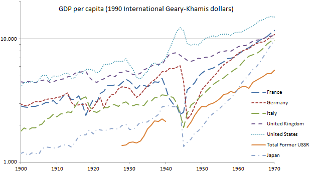
Visual Description
The graph depicts the trend of Gross Domestic Product (GDP) per capita, measured in 1990 International Geary-Khamis dollars, for several nations from 1900 to 1970. The Y-axis is on a logarithmic scale, which emphasizes the rate of change rather than absolute values.
Key Observations:
- Generally Upward Trend: All nations represented exhibit a general upward trend in GDP per capita over the period.
- Significant Disruptions: The graph shows dramatic dips and pauses around 1914-1918 (World War I) and 1939-1945 (World War II).
- Post-War Recovery & Acceleration: The post-World War II period (roughly 1950-1970) sees a significant acceleration of economic growth in most of the nations.
- Differing Trajectories: While all nations grow, the rates and timing of growth differ. The Former USSR experiences a slower start, a significant dip, and a powerful recovery. The United States and Japan show relatively consistent growth, though with fluctuations. The European nations (France, Germany, Italy, and the UK) show more volatility.
- USA as a Leader: The United States consistently displays the highest GDP per capita among the nations represented, maintaining a leadership position throughout the period.
Foucauldian Genealogical Discourse Analysis
This graph becomes interesting through a Foucaultian lens when we consider it as a discourse producing "truths" about economic progress and national identity.
- Power/Knowledge: GDP, as a metric, isn’t a neutral measurement. It’s a construction of knowledge created by economists and institutions. This knowledge isn’t simply a reflection of reality; it shapes our understanding of it. The graph demonstrates the power of economic discourse – it establishes a hierarchy of nations based on this quantifiable measure, influencing policy, political rhetoric, and even cultural perceptions.
- Genealogy of GDP: A genealogical examination would trace the history of GDP as a measure. How did it come to be considered a valid indicator of prosperity? Who defined its parameters? What were the historical contingencies that led to its dominance? Examining the origins of GDP reveals the power relations embedded within its very construction.
- Disciplinary Effect: The graph can be seen as participating in a disciplinary regime. By ranking nations based on GDP, it creates a system of normalization and deviance. Nations that fall behind are subject to scrutiny and pressure to conform to the "successful" model.
- The construction of "development": The graph serves to construct a narrative of "development" – the idea that nations move through stages of economic growth. It obscures the possibility of alternative economic models or values that might not be captured by GDP.
Critical Theory
Applying Critical Theory (particularly Frankfurt School) to this graph brings a focus on ideology and social critique.
- Ideology of Progress: The upward trend in GDP per capita supports an ideology of linear progress – the belief that economic growth is inherently desirable and leads to societal improvement. Critical Theorists would question this assumption. Does economic growth necessarily translate into greater well-being, social justice, or environmental sustainability? The graph doesn't tell us anything about distribution of wealth, social inequality, or the social and environmental costs of economic growth.
- Commodification: The graph represents the increasing commodification of life – the extension of market logic to all spheres of human activity. GDP measures the value of exchange (goods and services traded in the market), not the value of use (the actual satisfaction of human needs).
- Instrumental Reason: The graph reflects the dominance of instrumental reason – the application of rational calculation to achieve specific goals (economic growth). Critical Theorists argue that instrumental reason can lead to the suppression of ethical considerations and the dehumanization of society.
- Repressive Rationality: The seemingly rational and objective data can serve to obscure underlying power relations and inequalities. It suggests a logic of efficiency and optimization that can be used to justify social control and exploitation.
Marxist Conflict Theory
From a Marxist perspective, the graph is a reflection of class struggle and the dynamics of capitalist accumulation.
- Capital Accumulation: The upward trend in GDP represents the accumulation of capital by the ruling class. The graph doesn't reveal who benefits from this growth. It doesn't show the distribution of wealth or the extent of exploitation of labor.
- Imperialism & Uneven Development: The differing trajectories of the nations can be interpreted as evidence of uneven development – the historical relationship between core (developed) and periphery (underdeveloped) nations. The graph might show the effects of colonial exploitation, trade imbalances, and the concentration of capital in certain countries.
- Crises of Capitalism: The dips in GDP around the World Wars can be seen as crises of capitalism – periods of overproduction, financial instability, and social unrest.
- The State: The state (as represented in national GDP data) is an instrument of the ruling class, used to facilitate capital accumulation and maintain social order.
Postmodernism
A Postmodern interpretation focuses on deconstruction, the instability of meaning, and the rejection of grand narratives.
- Deconstruction of “Growth”: Postmodernists would challenge the very concept of “growth” as a meaningful or objective category. They would argue that it is a social construct with multiple interpretations and that it is often used to legitimize power relations.
- Rejection of Grand Narratives: The graph implicitly supports the grand narrative of economic progress. Postmodernists would reject this narrative, arguing that it is a simplification of complex realities and that it ignores alternative ways of life.
- Instability of Meaning: The numbers on the graph are not neutral representations of reality. They are subject to interpretation and can be used to support different arguments. The meaning of GDP is not fixed but is contingent on the context in which it is used.
- Simulacra: The graph is a simulation of economic reality. It is not the thing itself, but a representation that obscures the underlying complexities.
Queer Feminist Intersectional Analysis
This is the most difficult to apply directly to this graph, as it's less about quantifiable economic data and more about subjective experience, social justice, and power dynamics. However, we can attempt a reading.
- Invisible Labor: The graph completely ignores the unpaid labor of women and marginalized groups – housework, childcare, care work for the elderly, and informal economic activities. This invisible labor is essential to the functioning of the economy but is not reflected in GDP.
- Differential Impact of Economic Crises: Economic crises (represented by the dips in the graph) disproportionately affect women and marginalized groups, who are often the first to lose their jobs, face wage cuts, and experience increased poverty.
- Intersectionality: The graph fails to account for the intersection of gender, race, class, and other social categories. The experience of economic growth (or decline) is different for different groups of people.
- The "Public" vs "Private" Divide: GDP data focuses on the "public" sphere of market transactions. It ignores the "private" sphere of social reproduction (family, community, care work), which is often disproportionately burdened by women and those outside of mainstream social norms.
- A Lack of Care: GDP measures productivity, but doesn't account for care. The graph is a symbol of an economic system which prioritises profit over wellbeing, and perpetuates a lack of value and support for care work.
In conclusion:
This seemingly simple graph can be interpreted in a multitude of ways depending on the theoretical framework applied. Each perspective offers a different lens through which to understand the complexities of economic growth, power relations, and social justice. It's important to remember that the graph itself is not neutral; it is a product of specific assumptions, ideologies, and power dynamics.
tesseract-ocr
GDP per capita (1990 International Geary-Khamis dollars) fn LEEe 5 eG . wos a an eu ae AK ee eT ON pe ee "LZ YAN VJ Ye : nha of PN ie — prance! aX? nf oN - eat ere waar Ly C ===-Germany ew / Vu, : — katy _Z eng Va = = United kingdom ot Loe sce Unita States , v aes ° ota Former UssR oo ~sapan 1.000 “00 asi as20 asso asso asso. aseo aso
simple-description (llama3.2-vision)
The meme is a chart showing the GDP per capita of various countries from 1900 to 2000. The chart has a steep decline in the United States in the 1970s, with a caption "US GDP per capita 1970s: when you're making 3 times more money, but your house is still a dump".