First Seen
2024-02-20T05:56:04+00:00
simple-description (qwen3.5_2b-q8_0)
This chart illustrates a repeating business cycle where economic growth and contraction alternate in a pattern. As the economy expands, you can see asset categories like Stocks, Commodities, and Bonds shifting from up to down or down to up. The text labels at the bottom define the progression through 'Stage 1,' 'Stage 2,' and 'Stage 6,' while the text at the top indicates the specific asset type for each column.
simple-description (llama3.2-vision_11b)
The meme is a chart illustrating the cyclical nature of the economy, specifically the stock market. It shows the typical progression of a business cycle, from expansion to recession and back to expansion, with the key phases labeled as "Expansion," "Contraction," "Recession," and "Expansion" again. The chart also includes a reference to "The Business Cycle" and "The Four Stages of Economic Growth," highlighting the cyclical nature of economic activity.
detailed-analysis (gemma3-27b-vision)
Okay, let's break down the image through the requested theoretical lenses. It's important to note that applying complex theoretical frameworks to a relatively simple visual like this will involve some interpretive extrapolation. I will try to make those interpretations clear.
Visual Description
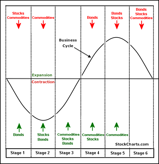
The image depicts a sinusoidal wave representing the "Business Cycle" with stages 1-6. The horizontal axis isn't explicitly labeled with time, but the curve suggests a cyclical pattern. The vertical axis, similarly, lacks specific units but indicates relative levels of investment/value.
Beneath the wave are six stages, each represented by a vertical column. Above the wave are red downward arrows and green upward arrows indicating what investment classes are trending up or down during each stage. Specifically:
- Stage 1: Bonds are trending up. Stocks and Commodities are trending down.
- Stage 2: Stocks and Bonds are trending up.
- Stage 3: Commodities, Stocks, and Bonds are trending up.
- Stage 4: Bonds are trending down.
- Stage 5: Stocks and Commodities are trending down.
- Stage 6: Bonds, Stocks and Commodities are trending down.
The graphic appears to be geared towards financial investors, aiming to illustrate a pattern to predict investment strategies.
Foucauldian Genealogical Discourse Analysis
Foucault's genealogical method focuses on the historical construction of knowledge and power relationships. Applying this to the image:
This chart isn't a neutral representation of a natural “business cycle.” It constructs the concept of a cyclical pattern through its visualization. This construction serves a purpose - it creates a framework for understanding and predicting economic trends. This framework, in turn, is not simply descriptive, but performative. It directs behavior; investors act as if the cycle is real, thereby reinforcing it.
The graphic establishes a discourse around economic predictability. It suggests that the “business cycle” is an objective truth that can be analyzed and mastered. However, this “truth” is created through the selective framing of information (the inclusion of these specific investment classes, the sinusoidal shape itself).
By presenting the cycle as inherent and predictable, it also obscures the political, social, and historical forces that actually shape economic fluctuations. The chart becomes a tool for managing risk and maximizing profit, reinforcing existing power structures within the financial system. It naturalizes the conditions of capitalism, as if economic boom and bust is simply unavoidable.
Critical Theory
From a Critical Theory perspective, this image is a prime example of how dominant ideologies are perpetuated. It presents a simplified, seemingly objective model of economic reality that obscures the structural inequalities inherent in capitalism.
The “business cycle” isn’t a natural phenomenon but a consequence of the system itself. The graphic doesn’t address the social costs of “contraction” (job losses, poverty, social unrest) – it focuses solely on investment strategies. This is a characteristic of ideology – presenting a partial view that serves the interests of those in power.
The chart normalizes the idea that some level of economic fluctuation is inevitable and acceptable. This diminishes the possibility of systemic change. It promotes a focus on individual investment decisions rather than collective action to address the root causes of economic instability. The visualization subtly works to legitimize a system that produces winners and losers.
Marxist Conflict Theory
From a Marxist perspective, this chart is a representation of the inherent contradictions within capitalism. The “business cycle” itself is a product of class struggle and the drive for profit.
“Expansion” and “contraction” aren't neutral phases; they represent periods of increasing and decreasing exploitation of labor. The rising curve represents increased capital accumulation, while the falling curve represents crises of overproduction and the devaluation of labor.
The focus on investment classes (stocks, bonds, commodities) highlights the interests of the capitalist class, who benefit from these cycles. The chart ignores the impact of these cycles on the working class, who bear the brunt of economic downturns. It subtly encourages individuals to participate in a system that inherently generates inequality.
The “business cycle” isn't simply a natural phenomenon; it's a manifestation of the class struggle. The chart obscures this fact by presenting it as an objective process.
Postmodernism
From a postmodern lens, the chart can be seen as a simulation of economic reality. The sinusoidal wave is a stylized representation, a construct that bears little resemblance to the messy, unpredictable nature of real economies.
The chart claims to “predict” the cycle, but this is an illusion. The future is inherently uncertain. The chart merely offers a narrative that provides a sense of control and order.
The graphic deconstructs the idea of a singular, objective “business cycle.” There are multiple competing narratives about economic trends. This chart is just one of them, and it's based on specific assumptions and biases.
From a postmodern perspective, the image is more about the production of meaning than the representation of reality. It's a symbolic representation that reflects the values and beliefs of those who created it.
Queer Feminist Intersectional Analysis
A Queer Feminist Intersectional analysis brings a nuanced perspective on how power operates within this graphic and the systems it represents.
Intersectionality: The "business cycle" doesn't affect everyone equally. The impact of "contraction" is disproportionately felt by marginalized groups – women, people of color, LGBTQ+ individuals, people with disabilities – who often experience higher rates of unemployment and poverty. This graphic, by focusing on abstract investment strategies, erases these differential impacts.
Queer Theory: The chart assumes a linear, predictable progression (the sine wave). Queer theory challenges linear narratives and embraces ambiguity and disruption. The graphic doesn’t account for unexpected events or “black swan” occurrences that can disrupt the cycle.
Feminist Analysis: The graphic reinforces a patriarchal economic system that privileges male dominance in finance and investment. The absence of gendered analysis is telling. How do economic cycles impact women’s economic security differently? The graphic also reinforces the idea of a “rational” investor, a gendered stereotype associated with masculinity.
Power Dynamics: The chart represents a system of power where those who control capital benefit from the cycles, while those who are marginalized are exploited. By presenting the cycle as inevitable, it legitimizes this power imbalance. The lack of representation of marginalized voices within the graphic further reinforces this dynamic.
Erasure: The chart erases the social and emotional costs of economic cycles, focusing solely on financial metrics. This erasure contributes to the normalization of systemic inequalities.
I hope this detailed analysis, framed through various theoretical lenses, provides a comprehensive interpretation of the image! Let me know if you would like me to elaborate on any specific point.
tesseract-ocr
i i Bonds Stocks Bonds {| stocks ‘commodities {commodities y Stocks {commodities Business a™N cycle y Expansion Contraction! Bonds {Stocks _{ Commodities | commouities! Commodities Bonds { Stocks | Stocks { i Bonds 1 stockcharts.com [ staset | Stage2 | Stage3 | Stayed { Stages | Stages
simple-description (llama3.2-vision)
The meme is a chart with six stages of a business cycle, labeled as "Bullish" and "Bearish" for each stage. The chart shows a series of peaks and troughs, with the text "Bullish" and "Bearish" above each stage, indicating the market's attitude towards stocks, bonds, and commodities at each stage.