First Seen
2023-07-14T23:27:03+00:00
simple-description (qwen3.5_2b-q8_0)
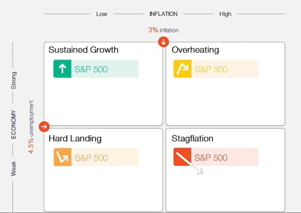
This image is a stock market indicator (often called a "green and red" chart) that tracks the performance of the S&P 500 index based on two economic factors: inflation and economic strength.
In the top-left box, labeled "Sustained Growth," the economy is strong with moderate inflation, which leads to a rising stock price (shown by the green arrow).
In contrast, the bottom-right box, labeled "Stagflation," represents a terrible economic state where high inflation is combined with a weak economy, causing the stock to crash dramatically (shown by the red arrow).
The middle boxes—labeled "Hard Landing" (orange arrow) and "Overheating" (yellow arrow)—represent difficult times for investors where the economy is struggling or growing too quickly.
simple-description (llama3.2-vision_11b)
The meme is a visual representation of the stock market's performance during times of economic uncertainty. The image shows a chart with four quadrants labeled "Bullish", "Bearish", "Stagflation", and "Inflation". The text "It's not a recession when you have to pay less for gas" is written above the chart, implying that economic downturns can have unexpected benefits.
detailed-analysis (gemma3-27b-vision)
Okay, let's break down this visual depiction of economic states, applying the requested theoretical lenses.
Visual Description
The image is a 2x2 grid presenting four potential economic scenarios based on two axes: “Economy - Strong to Weak” (vertical) and "Inflation - Low to High" (horizontal). Each quadrant represents a different economic state, labeled as follows:
- Sustained Growth: Strong economy, low inflation. Depicted with a green upward arrow indicating S&P 500 growth.
- Overheating: Strong economy, high inflation. Depicted with an orange downward arrow and a zig-zag arrow indicating S&P 500 growth.
- Hard Landing: Weak economy, low inflation. Depicted with an orange downward arrow and a broken arrow indicating S&P 500 growth.
- Stagflation: Weak economy, high inflation. Depicted with a broken orange arrow indicating S&P 500 growth.
Each quadrant also includes a representation of the S&P 500, using arrow direction and type to indicate the expected market performance. The colors are coded with green for positive outcomes and orange/red for negative. It's a simplified visual metaphor for economic states.
Foucauldian Genealogical Discourse Analysis
This image is a discourse—a system of thought, language, and practices that constructs and maintains power relations. A genealogical approach would trace the history of the concepts used ("economy", "inflation", "growth", "weak", "strong", even "stagnation") and how they’ve come to be understood in this way.
- Power/Knowledge: The chart isn't a neutral representation of reality. It constitutes "the economy" as something that can be plotted on these two axes. It establishes what counts as an "economic state" and what metrics are considered important (inflation and overall economic strength). This isn’t an objective truth, but a way of exercising power over the economic realm by defining its categories.
- Disciplinary Practices: The chart implicitly promotes a disciplinary regime—a way of managing and controlling populations through economic policy. The categories suggest that certain economic states are desirable (Sustained Growth) and others are to be avoided (Stagflation). This creates a pressure to conform to the ideals represented in the chart.
- Absence of Subjectivity: The image focuses on macro-level indicators and completely erases the experiences of individuals or communities affected by these economic states. It treats “the economy” as an abstract entity, divorced from human lives. This is a key technique for exercising power—by normalizing abstraction and excluding lived experiences.
Critical Theory
From a Critical Theory perspective (drawing on thinkers like Adorno & Horkheimer or the Frankfurt School), this image is a symptom of instrumental reason. The chart reduces complex economic phenomena to quantifiable metrics, treating them as objects to be manipulated for optimal "growth."
- Commodification: The entire chart frames the economy as something to be optimized—turned into a commodity whose value is measured by financial indicators (S&P 500). This reinforces a capitalist logic that prioritizes profit over other values like social justice, environmental sustainability, or well-being.
- One-Dimensionality: The two-dimensional representation limits our understanding of the economy. It presents a simplified, flattened view that obscures the underlying social, political, and cultural forces that shape economic outcomes. It discourages critical thinking about the deeper causes of economic problems.
- Legitimation: The image legitimates a specific way of thinking about the economy—one that is aligned with capitalist ideology. It presents this framework as natural and inevitable, obscuring the fact that it is a constructed and contested system.
Marxist Conflict Theory
From a Marxist perspective, this chart reflects the inherent contradictions within the capitalist mode of production.
- Class Struggle: While the chart doesn't explicitly mention class, the concept of "economy" is inherently tied to relations of production and ownership. Economic "strength" is often associated with the accumulation of capital by a ruling class, while "weakness" can translate into unemployment, poverty, and exploitation for the working class.
- Capital Accumulation: The focus on the S&P 500 as a measure of success reveals the primary goal of the capitalist system: to accumulate capital. The chart implicitly prioritizes policies that promote profit, even if they come at the expense of social welfare.
- Crisis Tendency: The quadrants "Hard Landing" and "Stagflation" represent crises inherent to capitalism. These crises are not accidental, but rather the result of contradictions within the system (e.g., overproduction, falling rates of profit). The chart subtly presents these crises as problems to be managed rather than systemic failures to be addressed.
Postmodernism
From a postmodern perspective, the image reveals the instability of meaning and the constructed nature of reality.
- Simulation & Hyperreality: The chart is a simulation of the economy. It's a representation that claims to capture reality, but it’s always a step removed from the actual lived experiences of economic actors. It creates a hyperreality where the representation becomes more real than the thing it represents.
- Deconstruction of Grand Narratives: The chart implies a "grand narrative" about economic progress—that growth is always desirable and that certain states are inherently "better" than others. A postmodern critique would challenge this narrative, arguing that there is no single, objective standard for evaluating economic success.
- Relativism: The "strong/weak" and "high/low" designations are relative and context-dependent. What constitutes a "strong" economy or "high" inflation depends on historical, cultural, and political factors. The chart presents these categories as universal and objective, but they are ultimately constructed and contingent.
Queer Feminist Intersectional Analysis
This is the most challenging lens to apply directly, as the image doesn't explicitly address gender, sexuality, or intersectionality. However, we can highlight how these dimensions are absent and how the chart reinforces existing power structures.
- Erasing Gendered and Racialized Impacts: Economic policies and outcomes disproportionately affect marginalized groups—women, people of color, LGBTQ+ individuals, disabled people—in complex ways. The chart ignores these disparities, presenting a homogenized picture of "the economy" that obscures the lived experiences of those most vulnerable to economic hardship.
- Reinforcing Heteronormative and Patriarchal Structures: The chart reinforces the idea that economic success is defined by traditional metrics like GDP and stock market performance, which are often tied to patriarchal and heteronormative values. Alternative measures of well-being—such as care work, community resilience, or social justice—are excluded.
- The "Neutral" Mask of Objectivity: The image claims to be objective and neutral, but this is a mask that obscures the ways in which economic systems are inherently gendered, racialized, and sexualized. By ignoring these dimensions, the chart reinforces existing power structures and perpetuates inequalities.
Disclaimer: These are interpretations based on applying complex theoretical frameworks to a simple visual. The purpose is to demonstrate how these lenses can reveal hidden assumptions, power dynamics, and ideological underpinnings.
simple-description (llama3.2-vision)
The meme is a chart showing the performance of the S&P 500 stock index in different economic conditions. The chart has four quadrants labeled "Inflation", "Stagflation", "Deflation", and "Hyperinflation", but the actual text on the meme is "Inflation is a *".
tesseract-ocr
———— low ———— inFLaToN ———— High —— 3% inflation v | Sustained Growth Overheating © S&P 500 S&P 500 8 6 & © & 2 | Hard Landing Stagflation ® I * (8) ser 500 EN ser 500 ¥ 8 =