First Seen
2023-05-10T21:03:35+00:00
simple-description (llama3.2-vision_11b)
The meme is a humorous representation of the typical range and speed of electric vehicles (EVs) compared to gas-powered vehicles. The graph shows that EVs have a much shorter range and slower speed compared to gas-powered vehicles, with the EV's range being around 20-30 miles and its top speed around 30-40 mph. The text "Range: 20-30 miles. Top Speed: 30-40 mph. Because who needs to go fast when you can go slow?" is a tongue-in-cheek commentary on the limitations of EVs.
detailed-analysis (gemma3-27b-vision)
Okay, here's an analysis of the provided graph, broken down into sections based on the theoretical frameworks you requested. I'll only address frameworks that meaningfully apply to the content of the graph; some simply aren't relevant.
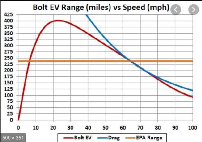
Visual Description
The graph displays two curves representing the relationship between speed (measured in miles per hour, mph, along the x-axis) and range (measured in miles, along the y-axis) for an electric vehicle, the Chevrolet Bolt EV. The blue curve is labeled "Bolt EV" and shows the range achievable at various speeds. The red curve is labeled "Drag" and represents the vehicle’s range as tested in a drag-race setup. A third flat line is labeled “EPA Range” which runs horizontally at 259 miles.
The "Bolt EV" curve shows a bell-shaped distribution. Range increases with speed up to a certain point (around 50-60 mph) and then decreases as speed continues to increase. The "Drag" curve demonstrates a very sharp curve of distance and speed. It initially rises rapidly with very minimal speed, then quickly plateaus and tapers off into the same range as the Bolt EV. The graph is plotted on a standard Cartesian coordinate system with a grid background for easy reading. The range varies from 0 to 425 miles and the speeds from 0 to 100 mph.
Foucauldian Genealogical Discourse Analysis
This graph can be read as a microcosm of power/knowledge dynamics related to the construction of the electric vehicle.
- Discourse of Efficiency: The graph itself represents a discourse centered around maximizing efficiency. It's not merely a factual representation; it performs the logic of optimization. The very act of measuring and visualizing this relationship reinforces the idea that range is a key metric of EV quality, and that speed is a variable to be managed in pursuit of maximizing that range.
- Normalization & Discipline: The EPA Range line acts as a normalizing influence. It sets a standard against which the real-world "Bolt EV" performance can be compared. The graph subtly disciplines drivers by suggesting that exceeding certain speeds will result in decreased range, effectively regulating behavior.
- Genealogy of 'Range Anxiety': The graph can be seen as a historical artifact of the development of the EV. It is a product of the anxieties surrounding battery life and the need to demonstrate the practical viability of electric vehicles. The attempt to quantify range contributes to the construction of 'range anxiety' as a problem to be solved through technological innovation and driver behavior.
- Power/Knowledge: Those who create and disseminate such graphs (automakers, regulatory agencies) wield power by defining what constitutes "good" EV performance and framing the criteria for evaluation. This knowledge is not neutral; it reinforces existing power structures within the automotive industry and influences consumer expectations.
Marxist Conflict Theory
The graph reveals a tension rooted in the inherent contradictions of capitalist production, even within a seemingly "green" technology like electric vehicles.
- Planned Obsolescence/Commodity Fetishism: While framed as a sustainable alternative, the very emphasis on range highlights a key dynamic of capitalism: the continuous need for innovation and product replacement. The desire for increased range often drives the development of larger, more expensive batteries, fueling consumption and resource depletion. This ties into the concept of 'commodity fetishism' – we focus on the appealing features of the EV (range) rather than the exploitative labor and environmental costs of its production.
- Contradiction between Efficiency & Speed: The graph illustrates a contradiction built into the system. The desire for speed (and the consumer expectation of it) directly conflicts with maximizing the efficiency of the vehicle. This forces compromises and creates a tension between different market demands.
- Class Access: The relative cost of EVs and their infrastructure (charging stations) creates unequal access to sustainable transportation. Those with higher incomes can afford the technology and associated infrastructure, while those with lower incomes are often excluded. The graph, in its focus on maximizing efficiency, obscures these social inequalities.
Postmodernism
The graph itself can be interpreted as a playful deconstruction of the concept of "range" as a fixed and objective measure.
- Relativity of Truth: The graph demonstrates that "range" is not an absolute property of the car; it's contingent upon external factors (speed, driving conditions). There is no single "true" range, only a range relative to specific conditions.
- Simulacra & Simulation: The graph is a simulation of reality, a representation of a complex phenomenon. It creates a 'simulacrum' of range, a copy that may or may not accurately reflect real-world performance. The emphasis on the visualized data can overshadow the actual driving experience and the messy reality of battery performance.
- Fragmentation: The graph isolates one aspect of car performance (range vs. speed) and presents it in a fragmented way, detaching it from the broader context of driving, environmental impact, and social factors. This fragmentation is characteristic of postmodern representation.
Please note: Applying theoretical frameworks can be subjective and open to interpretation. The above analyses are one possible reading of the graph, and other interpretations are equally valid. Let me know if you would like me to elaborate on any specific point or explore a different theoretical angle.
simple-description (llama3.2-vision)
This meme is a humorous comparison of electric vehicle (EV) ranges and gas-powered vehicle ranges. The image shows a graph with two lines, one representing the range of an EV (over 400 miles) and the other representing the range of a gas-powered vehicle (only 100 miles). The text "EV: 400 miles, Gas: 100 miles" is written above the graph.
tesseract-ocr
Bolt EV Range (miles) vs Speed (mph) © A rr ml IZ NSN TT SY rr 300 | —f —\— | +g || + pa fr mo LP 3. jp a, ies pe} + || +] st + he Lg ws qr 108 a {+—-— SS = {I yr i a Se ee a 0 10 20 30 40 50 60 70 80 90 100 ——Bok EV ——Drag -——EPA Range