First Seen
2023-11-04T06:25:54+00:00
simple-description (qwen3.5_2b-q8_0)
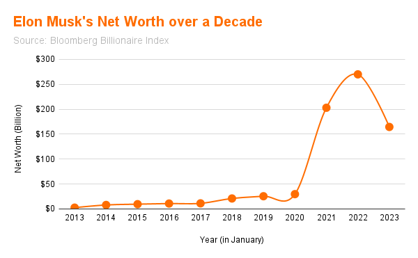
The meme, often joking that Elon Musk is getting "richer and richer," is visually represented by his dramatic net worth graph, which shows a massive spike in wealth starting around 2020. The image displays the text "Elon Musk's Net Worth over a Decade" and cites the "Bloomberg Billionaire Index" as the source for these financial figures.
simple-description (llama3.2-vision_11b)
This meme is a graph showing the fluctuation of Elon Musk's net worth over time. The graph starts at around $0 in 2013 and gradually increases, but then takes a sharp drop in 2020. The graph then recovers, but takes another sharp drop in 2023. The meme likely pokes fun at Elon Musk's financial struggles, with the caption "Elon Musk's net worth" implying that his wealth is unpredictable and prone to sudden drops.
detailed-analysis (gemma3-27b-vision)
Okay, let's break down this graph of Elon Musk's net worth through a few critical lenses.
Visual Description
The graph depicts Elon Musk's net worth (in billions of US dollars) from January 2013 to January 2023. It's a line graph with the year on the x-axis and net worth on the y-axis. The line starts near zero in 2013, remains relatively flat and low until around 2020. From 2020-2022, there is a rapid, exponential increase in net worth, peaking at approximately $340 billion. In 2022-2023, there is a significant decline, with the final point around $180 billion. The overall visual impression is one of remarkable wealth accumulation followed by substantial, though still historically high, loss.
Marxist Conflict Theory
This graph immediately lends itself to Marxist analysis. It powerfully visualizes the concentration of capital within the hands of a single individual. The sharp upward curve from 2020 onwards is not simply a reflection of individual genius or hard work, but a symptom of a capitalist system that inherently generates and rewards extreme wealth accumulation.
- Exploitation of Labor: The graph obscures the labor processes that produce the wealth being represented. The net worth is derived from the work of countless employees in companies like Tesla, SpaceX, and even Twitter, whose labor is arguably not proportionally reflected in Musk's wealth.
- Class Struggle: The sheer scale of this wealth disparity amplifies the underlying conflict between the bourgeoisie (the capitalist class, of which Musk is a prime example) and the proletariat (the working class). The graph highlights how capital flows upward, increasingly concentrating within a smaller and smaller elite, while many struggle with stagnant wages and economic insecurity.
- Commodification: Everything, including human ingenuity and potential (as embodied in Tesla and SpaceX), becomes a commodity in the capitalist system. This graph is, in a sense, the quantification of that commodification.
- Crisis & Contradiction: The dip in 2022/2023 could be interpreted as a moment of crisis within the system – a response to economic conditions, market corrections, or perhaps even a challenge to the concentration of capital.
Foucauldian Genealogical Discourse Analysis
From a Foucauldian perspective, this graph doesn't simply represent wealth; it represents a discourse of wealth and power. It’s a visual embodiment of a particular way of understanding success, innovation, and value.
- Power/Knowledge: The graph is itself a product of institutions (Bloomberg, financial markets) that construct and legitimize certain forms of knowledge about wealth. It shapes our understanding of what counts as valuable. The very act of measuring net worth implies that this is a meaningful and important metric, reinforcing the power of those who are measured.
- Genealogy: Tracing the genealogy of "net worth" as a concept reveals that it's not a natural or objective measure, but a historically constructed one. It evolved alongside capitalism and the modern financial system. Examining the changing methods of calculating net worth, the criteria for valuing assets, and the institutions that track wealth would reveal a power dynamic at play in defining ‘success’.
- Discipline & Normalization: The graph normalizes extreme wealth. By presenting it as a quantifiable and trackable metric, it frames it as an acceptable, even desirable, outcome. It establishes a standard against which others are measured, potentially creating a sense of inadequacy or competition.
Postmodernism
From a Postmodern point of view, this graph is a representation that is not inherently “true.” It’s a simulation of wealth, reliant on abstract valuation methods and market interpretations.
- Simulacra & Simulation: The net worth isn't "real" in the sense of tangible assets, but a simulation based on market expectations and financial instruments. The number itself has become more important than the underlying reality.
- Deconstruction of Grand Narratives: The narrative of “rags to riches” and “meritocracy” embedded in the graph can be deconstructed. It questions the idea that wealth is solely a product of hard work and innovation. It can highlight the role of luck, privilege, and systemic factors.
- Rejection of Objectivity: The way net worth is calculated is subjective and can be manipulated. Different methodologies could produce very different numbers, demonstrating the lack of objective truth in the graph.
Critical Theory
Similar to the Marxist perspective, but broader, Critical Theory sees this graph as a representation of broader societal power dynamics and structures of domination.
- Instrumental Reason: The focus on quantifiable wealth reinforces a purely instrumental rationality – prioritizing profit and efficiency above other values like social justice, environmental sustainability, or human well-being.
- Domination & Ideology: The graph can be seen as part of an ideology that justifies inequality and the concentration of power in the hands of a few. It presents extreme wealth not as a problem, but as an aspiration.
- The Culture Industry: The media coverage of Musk and his wealth (which inevitably accompanies a graph like this) contributes to a “culture industry” that commodifies individuals and reinforces capitalist values.
Note: It's important to remember that these are just interpretations. Any single visual artifact can be analyzed through multiple lenses, and each lens will reveal different aspects of its meaning. Also, a Queer Feminist Intersectional Analysis is difficult to apply to this graph without further information on how this wealth impacted various social groups. The graph itself primarily represents financial data and doesn’t inherently showcase gender, race, or sexual orientation dynamics. However, a deeper investigation into the companies he owns and the demographics of his workforce could be analyzed through that lens.
simple-description (llama3.2-vision)
The meme appears to be a graph showing Elon Musk's net worth over a decade. The graph starts at around $0 in 2013 and increases to over $200 billion by 2022. The caption for the meme is "Elon Musk's net worth over a decade".
tesseract-ocr
Elon Musk's Net Worth over a Decade $300 $250 = $200 & 5150 Z stoo z $50 $0 2013 2014 2015 2016 2017 2018 2019 2020 2021 2022 2023 ‘Year (in January)