First Seen
2023-05-10T21:03:35+00:00
simple-description (llama3.2-vision_11b)
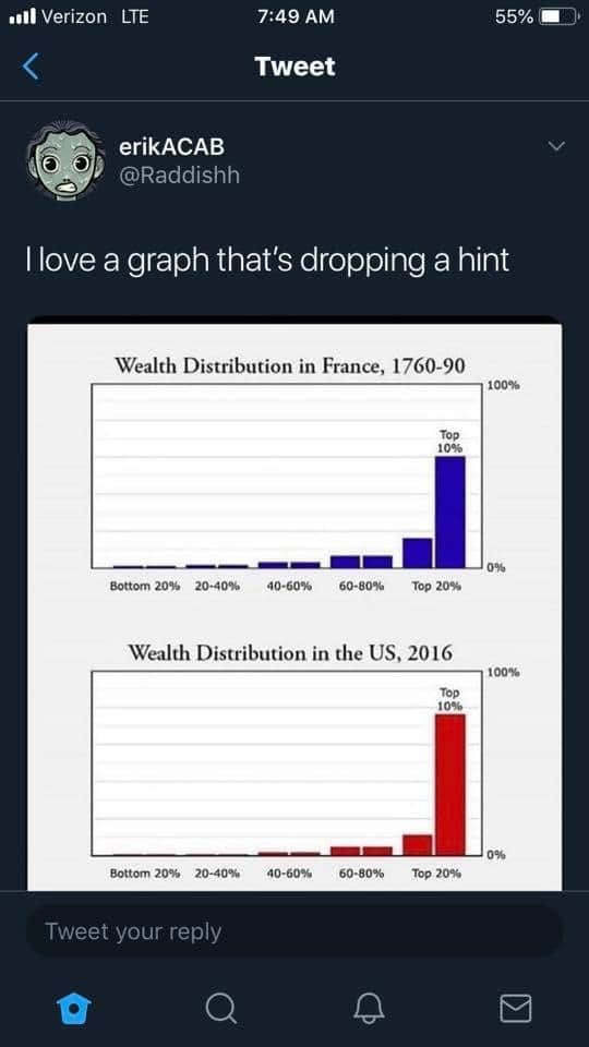
The meme is a tweet that comments on the historical wealth distribution in France and the US. The tweet mentions a graph that shows a significant shift in wealth distribution from 1760 to 2016, implying that the wealth is now concentrated in the hands of a few individuals. The tweet's author is sarcastic about the fact that they love a graph that is "dropping a hint" about the current state of wealth inequality.
detailed-analysis (gemma3-27b-vision)
Okay, let's break down this image (a Twitter post containing two bar graphs) through the lenses you requested. It's a potent image that lends itself to multiple layers of analysis.
1. Visual Description
The image is a screenshot of a Twitter post from the account @Raddishh, with the text "I love a graph that's dropping a hint." Below the text are two bar graphs presented side-by-side.
- Graph 1: "Wealth Distribution in France, 1760-90" This graph shows a relatively flat distribution of wealth. The majority of the population (Bottom 20%, 20-40%, 40-60%, and 60-80% segments) each hold a small but roughly equal share of wealth, represented by small bars. A single, very tall bar dominates the "Top 20%" segment, indicating that a disproportionately large amount of the wealth is held by this elite group.
- Graph 2: "Wealth Distribution in the US, 2016" This graph is almost identical in structure to the first. It features a similarly flat distribution across the bottom 80% of the population, and an overwhelmingly large bar for the "Top 20%" representing extreme wealth concentration.
- The tweet aims to draw a parallel between the wealth distribution in pre-revolutionary France and the wealth distribution in the United States in 2016, hinting at potential societal instability or revolution.
2. Marxist Conflict Theory
This image is strongly suited for a Marxist analysis. The core of Marxism posits that society is characterized by class conflict rooted in the means of production and distribution of wealth.
- Class Polarization: The graphs starkly illustrate extreme class polarization. The mass of the population (bottom 80%) controls only a small portion of the wealth, while a tiny elite (top 20%) holds the vast majority. This aligns directly with Marx’s concepts of the bourgeoisie (the owning class) and the proletariat (the working class).
- Exploitation: The unequal distribution is interpreted as evidence of exploitation. The massive wealth accumulation of the top 20% is seen as derived from the labor of the bottom 80%, who receive a disproportionately small share of the value they create.
- Revolutionary Potential: The tweet explicitly draws a parallel to pre-revolutionary France. Marx argued that extreme economic inequality would inevitably lead to class consciousness, social unrest, and ultimately, revolution. The image suggests the US in 2016 (and beyond) may be heading toward a similar crisis. The tweet points to the historical potential for upheaval when wealth becomes so concentrated.
- Capital accumulation: The bar graphs illustrate the process of capital accumulation. The top 20% have the means to increase their wealth and maintain their economic power. This creates a positive feedback loop where the rich get richer, and the poor remain in a state of economic disparity.
3. Foucauldian Genealogical Discourse Analysis
Foucault’s work focuses on power, knowledge, and discourse. While not directly a study of economic data, it can be applied here.
- Power/Knowledge: The graphs themselves are a form of "knowledge" produced through statistical analysis. However, Foucault would argue this knowledge isn't neutral. The way wealth distribution is measured, presented, and talked about (the discourse) is influenced by power relations. Who commissions these studies? What narratives are promoted around these data?
- Genealogy of Inequality: A genealogical approach wouldn't ask why inequality exists, but how the conditions that make it possible have emerged over time. It would trace the historical shifts in laws, regulations, social norms, and ideological justifications that have allowed wealth to concentrate.
- Discipline & Control: The knowledge produced by these graphs could be used to exercise power. For example, the data might be used to justify policies that reinforce existing inequalities, or to demonize those who challenge the status quo.
- Normalizing Wealth Disparity: Over time, these wealth distributions have been normalized within the existing social structure. As long as the population accepts this as "the way things are," the concentration of wealth continues to thrive.
4. Critical Theory
The image lends itself to Critical Theory, which focuses on questioning and challenging social structures and power dynamics.
- Ideology: The image invites a critique of the ideology that justifies wealth inequality. What narratives are used to explain why some people are rich and others are poor? Are these narratives based on meritocracy, hard work, or other ideals? Critical Theory would reveal how these narratives serve to maintain the status quo.
- Dominant Culture: The image asks questions about the dominant culture and how it perpetuates inequalities. How does the media, education system, and other institutions reinforce the idea that wealth concentration is acceptable?
- Emancipation: A critical analysis of the image would aim to expose the underlying power dynamics and to advocate for social justice. It would challenge the assumption that wealth concentration is inevitable and to explore alternative economic systems.
5. Postmodernism
Postmodernism would take a more deconstructive approach, questioning the very foundations of knowledge and meaning.
- The "Truth" of Statistics: Postmodernism would challenge the notion that the graphs present an objective "truth." It would argue that statistics are constructed and interpreted through particular lenses, and that there are always alternative ways of representing reality.
- Deconstruction of Grand Narratives: Postmodernism would deconstruct the "grand narrative" of economic progress or the "American Dream." It would argue that these narratives are simply constructions used to legitimize inequalities and to obscure the complexities of social life.
- Fragmentation and Local Narratives: Postmodernism would emphasize the fragmentation of experience and the importance of local narratives. It would suggest that there is no single, overarching explanation for wealth inequality, but rather a multitude of individual stories and experiences.
6. Queer Feminist Intersectional Analysis
- Intersectionality: This lens would examine how wealth inequality intersects with other forms of oppression, such as gender, race, sexuality, and disability. The top 20% likely aren't a homogenous group, and within that group, there are likely differences in wealth accumulation based on privilege. Similarly, the bottom 80% are also not homogenous, and certain groups are disproportionately affected by poverty and economic insecurity.
- Gendered and Racial Wealth Gaps: A Queer Feminist analysis would highlight the fact that women and people of color are systematically excluded from wealth accumulation. Historical and ongoing discrimination in areas such as employment, housing, and education contribute to these disparities.
- Queer Disadvantage: LGBTQ+ individuals often face economic discrimination and barriers to wealth creation. This is exacerbated by the fact that they may be excluded from traditional institutions and social networks.
- Challenging the Myth of Meritocracy: A Queer Feminist analysis would challenge the myth of meritocracy, arguing that wealth is not simply the result of hard work and talent, but is also shaped by systemic oppression and privilege. The image calls for a more equitable distribution of wealth and resources.
In conclusion, this image is rich with potential for analysis from multiple theoretical perspectives. It's a powerful visual representation of economic inequality, and it invites us to question the underlying power structures and ideologies that perpetuate it.
simple-description (llama3.2-vision)
The meme is a joke about the difference in wealth distribution between France in 1789 and the United States in 2016. The image shows two graphs, one from 1789 France and one from 2016 US, with the caption "I love a graph that's dropping a hint". The text is likely referencing the significant wealth disparity in the US compared to the more equal distribution in 18th century France.
tesseract-ocr
Pr Aircel oa vee NI ol-y/a MU 4 Tweet | erikACAB N @Raddishh |love a graph that's dropping a hint Wealth Distribution in France, 1760-90 ee | o% Wealth Distribution in the US, 2016 100% om G Q iB &