First Seen
2023-12-27T20:17:52+00:00
simple-description (qwen3.5_2b-q8_0)
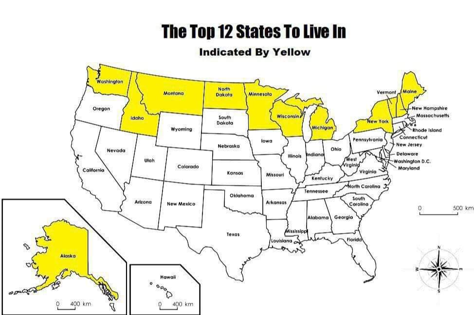
This map visually argues that if the United States were reorganized based on population and size, the "best" places to live would naturally end up in the largest states. The yellow highlighting indicates the top contenders, including the massive states like Washington, Oregon, Montana, and Wyoming, as well as the Great Lakes states like Wisconsin and Michigan. The text at the top confirms this ranking, labeling these specific regions as "The Top 12 States To Live In," which implies that smaller, less populous states are relegated to the white areas as "unlucky" alternatives.
simple-description (llama3.2-vision_11b)
This meme is a map of the United States, where every state is colored yellow, except for a few in the western and northeastern regions. The image includes the text "The Top 12 States To Live In" above the map, and "Indicated By Yellow" below it. The meme is likely referencing a popular article or list that ranked the top 12 states to live in, with the states that were ranked as the top 12 being indicated by yellow on the map.