First Seen
2023-05-10T21:03:37+00:00
simple-description (llama3.2-vision_11b)
The meme is a humorous comparison of the time it takes to travel from San Francisco to New York City by car versus by plane. The image shows a map of the two cities with a red line representing the driving route, and a plane icon flying from San Francisco to New York City. The text reads "I've driven from SF to NYC in 10 hours, but I've flown from SF to NYC in 5 hours. Guess which one I'm doing today?"
detailed-analysis (gemma3-27b-vision)
Okay, here's an analysis of the image provided, broken down into sections, focusing on the requested theoretical frameworks where applicable. I'll note if a section isn't relevant.
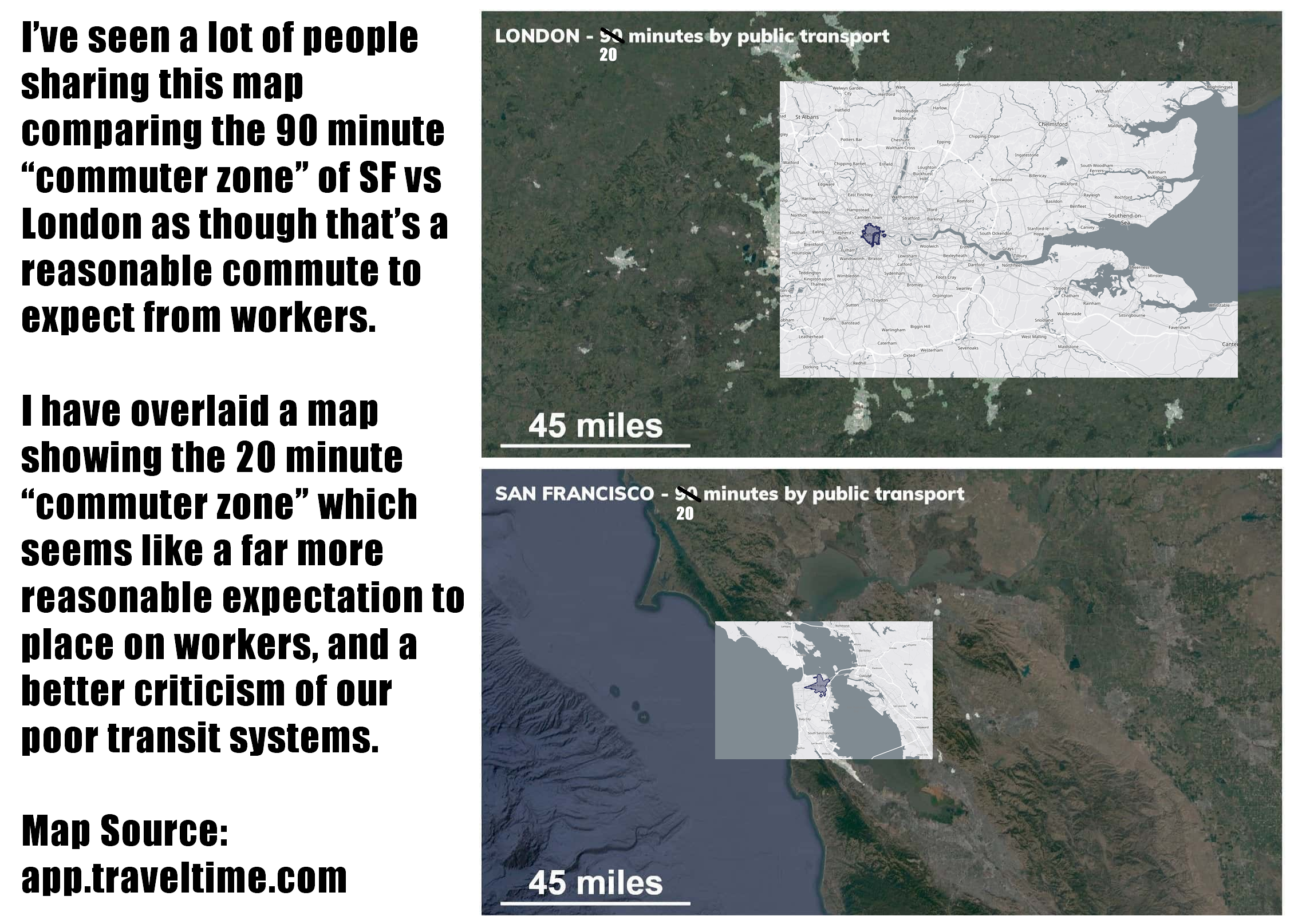
Visual Description
The image presents a side-by-side comparison of two maps illustrating commute times via public transportation. The maps are overlaid onto satellite images of London and San Francisco. Each map displays a circular area representing the reach of a 20 or 90-minute commute, accompanied by a 45-mile scale.
- London: The map indicates that a 90-minute public transport commute can reach significantly further than in San Francisco, potentially encompassing a vast suburban and even exurban area. The scale indicates 45 miles.
- San Francisco: The 20-minute commute circle is considerably smaller, covering primarily the city itself and a small portion of surrounding areas. The scale is also 45 miles.
- Text Overlay: Text on the left side explains the intent: to compare the "commuter zone" expectations in the two cities. The text argues that San Francisco's shorter commute time expectation is “far more reasonable” and criticizes the US transit system.
- Source: At the bottom, the source is noted as app.traveltime.com.
Foucauldian Genealogical Discourse Analysis
This image strongly lends itself to a Foucauldian analysis. The "commuter zone" isn't a natural phenomenon, but a constructed one – a product of discourse that shapes how we understand and accept certain spatial and temporal arrangements.
- Power/Knowledge: The image implicitly points to how the expectation of a long commute (London's 90 minutes) is normalized and accepted, while the shorter San Francisco commute is presented as the more "reasonable" standard. This reveals a power dynamic where the normalization of long commutes is linked to the economic and political conditions that favor suburban sprawl, car dependency, and perhaps limited investment in public transit in certain contexts. The “reasonable” standard is a form of disciplining expectation, influencing worker behavior and spatial arrangements.
- Genealogy of the Commute: The comparison suggests a historical shift in the practices of commuting. The image doesn’t delve into the historical conditions, but invites us to ask how the 90-minute commute became established as an acceptable norm. What technological, economic, and political factors shaped this expectation? What earlier practices of mobility were superseded?
- Disciplinary Practices: The expectation of a long commute functions as a disciplinary practice. It requires workers to organize their lives around a lengthy travel time, potentially limiting their social and leisure activities and reinforcing a specific work/life balance. The smaller zone in San Francisco proposes a different mode of organization, one that’s potentially more focused on urban density and proximity.
Critical Theory
The image, particularly the attached text, engages with elements of Critical Theory, specifically related to urbanization and societal constraints.
- Ideology: The text implicitly critiques the ideology that long commutes are simply an unavoidable part of modern life. It suggests that this is not a natural state of affairs, but a consequence of specific choices and systemic issues – inadequate public transit investment, urban planning that prioritizes car-based transport, and perhaps the economic pressures that force people to live far from their workplaces.
- Habermas & the Public Sphere: The image is being shared online (as evidenced by the caption), implying a circulation within the public sphere. The visual comparison and accompanying text function as a form of social critique, aiming to raise awareness and potentially stimulate debate about urban planning, public transportation, and the quality of life.
- Critique of Rationalization: The implicit argument that a 90-minute commute is "unreasonable" is a critique of the over-rationalization of urban life. The emphasis on maximizing efficiency and cost-saving can lead to undesirable consequences, such as long commutes and increased stress.
Marxist Conflict Theory
This image strongly resonates with Marxist Conflict Theory.
- Class & Spatial Inequality: The differing commute zones can be seen as a manifestation of class-based spatial inequality. Those who cannot afford to live closer to their workplaces (within the 20-minute zone) are effectively penalized with longer commutes, impacting their time, energy, and financial resources. This perpetuates a cycle of disadvantage.
- Means of Production & Transportation: Transportation infrastructure (public transit, roads) can be understood as a "means of production" in a broader sense – it enables and shapes the labor process. The image suggests that the state of transportation in San Francisco (relatively efficient public transit) facilitates a more equitable distribution of access to employment opportunities, while the longer commutes in London may reflect a more exploitative system where workers are forced to endure arduous travel.
- Capitalist Urbanization: The difference between the zones can be linked to the processes of capitalist urbanization, where land is commodified and developed in ways that prioritize profit over the needs of the working class. Suburban sprawl and car dependency, which contribute to longer commutes, are often driven by capitalist logic.
Postmodernism
While not as central as the previous frameworks, Postmodern concepts can be applied.
- Deconstruction of Norms: The image implicitly deconstructs the "norm" of the long commute. By juxtaposing the two zones, it challenges the assumption that this is simply an inevitable part of modern life. It suggests that there are alternative ways of organizing urban space and transportation.
- Relativism & Perspective: The image highlights the relativity of perceptions of time and distance. What seems "reasonable" in one context (San Francisco) may be considered acceptable in another (London). This emphasizes the importance of considering different perspectives and challenging universal claims.
- Simulation & Hyperreality: One could argue that the "commuter zone" is a form of simulation – a constructed representation of mobility that obscures the underlying realities of urban life. It creates the illusion of access and opportunity, while potentially masking the inequalities and inefficiencies of the system.
Queer Feminist Intersectional Analysis
This analysis is applicable but needs some stretching.
- Spatial Justice & Accessibility: From a queer feminist perspective, accessibility to safe and efficient transportation is crucial for marginalized groups. Longer commutes disproportionately affect those with fewer resources, who may be forced to live in less desirable areas or rely on less safe modes of transport.
- Care Work & Commuting: The demands of long commutes can intersect with the demands of care work, particularly for women, who often bear a disproportionate share of caregiving responsibilities. Longer commutes can limit the time available for caregiving, creating additional stress and inequality.
- Challenging Normative Spatial Arrangements: The image implicitly challenges normative spatial arrangements that prioritize certain lifestyles and modes of mobility. The smaller San Francisco zone suggests an alternative model that prioritizes urban density, proximity, and accessibility for all.
I hope this detailed breakdown, using the requested theoretical frameworks, is helpful! Let me know if you’d like any specific aspect elaborated further.
simple-description (llama3.2-vision)
This meme is a humorous comparison between the commute times in San Francisco (SF) and London. The image features two maps, one of SF and one of London, with a red circle around each city's center. The text above the maps reads: "I've seen people complain about SF's 'commute time' vs London's. Let me show you what 90 minutes in the bay area looks like...".
tesseract-ocr
I'veseenalotofpeonle eo CL ae , sharing this map Se oe comparing the 90 minute a a oe a “commuter zone” of SF vs ee ees London as though that’s a a eC cs reasonable commute to Ae, a a ee expect from workers. Meee ee showing the 20 minute ss “commuter zone” which SAN FRANCISCO - < minutes by public transport seems like a far more reasonable expectation to ee place on workers, and a ‘ a better criticism of our 7© poor transit systems. ne 4 Man Source: app.traveltime.com ees