First Seen
2024-02-08T02:18:32.896359+00:00
simple-description (qwen3.5_2b-q8_0)
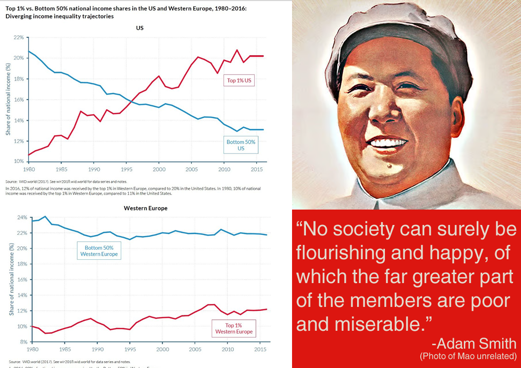
The image presents a statistical chart titled "Top 1% vs. Bottom 50% national income shares in the US and Western Europe, 1980-2016," which illustrates that the top 1% share of income increased significantly in the US while the bottom 50% share decreased. On the right, there is a portrait of Mao Zedong alongside a quote from Adam Smith arguing that a flourishing society is impossible if the majority of its members are poor and miserable. The meme contrasts this historical critique with modern economic data to highlight the complexity of wealth inequality.
simple-description (llama3.2-vision_11b)
This meme is a humorous commentary on the widening income inequality in the United States and Europe. It shows a graph comparing the wealth distribution in the two regions, with the US having a significantly larger wealth gap. The text overlay reads, "The top 1% of Americans have more wealth than the bottom 50% of Europeans combined." This meme highlights the stark contrast between the two regions' economic disparities.
detailed-analysis (gemma3-27b-vision)
Okay, let's break down this image and its potential interpretations through the lenses you've requested. Given the complexity, I'll prioritize the most relevant frameworks.
Visual Description
The image juxtaposes two line graphs representing income share trends from 1980-2015, one for the United States and the other for Western Europe. Each graph shows the percentage of national income received by the top 1% and the bottom 50%.
- US Graph: The top 1% shows a clear, upward trend of increasing income share, starting at around 10% in 1980 and rising to over 20% by 2015. The bottom 50% exhibits a downward trend, starting around 20% and falling to around 12-13% in 2015.
- Western Europe Graph: The top 1% in Western Europe shows an initial rise, but plateaus around 12% in 2015. The bottom 50% also declines, but at a slower rate than in the US, stabilizing around 18-20% by 2015.
A photograph of Mao Zedong is placed to the right of the graphs. Adjacent to both the graphs and the photo is a quote attributed to Adam Smith: “No society can surely be flourishing and happy, which the far greater part of the members are poor and miserable.” The overall layout visually reinforces the comparison between income inequality trends and the historical articulation of that inequality by a classical economist.
Marxist Conflict Theory
This image is powerfully resonant within a Marxist framework. The graphs demonstrate the central tenet of Marxist thought – the inherent contradiction between the bourgeoisie (the top 1%) and the proletariat (the bottom 50%). The increasing income share of the top 1% in both the US and Western Europe represents the intensification of capitalist accumulation.
- Exploitation: The declining share of income for the bottom 50% suggests increasing exploitation – the appropriation of surplus value created by the labor of the many by the few.
- Class Struggle: The diverging lines symbolize the intensifying class struggle. As the gap widens, so too does the potential for social unrest, revolution, or other forms of collective resistance.
- Capitalist Crisis: The image can be interpreted as evidence of a systemic crisis within capitalism – a crisis of distribution where wealth concentrates at the top, leading to stagnation or decline for the majority.
- Mao Zedong's inclusion: Mao is likely a deliberate choice to evoke the history of anti-capitalist revolutions and the potential for radical alternatives to the existing system.
Critical Theory
This image lends itself to critical theory's focus on power relations and social domination. The graphs are not simply neutral depictions of economic trends, but rather reflections of deeply embedded power structures.
- Ideology: The image suggests how dominant ideologies (e.g., neoliberalism, meritocracy) mask the underlying dynamics of exploitation and inequality. These ideologies legitimize the concentration of wealth at the top and justify the declining fortunes of the bottom 50%.
- Rationalization: The image demonstrates a process of rationalization in economic organization, where efficiency and profit maximization take precedence over social justice and well-being.
- Domination: The graphs reveal how power operates through economic structures. The top 1% are not merely successful individuals, but rather beneficiaries of a system that actively favors their accumulation of wealth and power.
- Adam Smith's quote: The inclusion of Adam Smith’s quote highlights the tension between classical economic thought and the current state of capitalist development. Smith, often associated with free markets, would likely be critical of the extreme inequalities depicted in the graphs.
Foucauldian Genealogical Discourse Analysis
A Foucauldian analysis could examine how the discourse of economic inequality has evolved over time.
- Power/Knowledge: The graphs themselves are products of power/knowledge. Economic data is collected, analyzed, and presented by institutions with specific agendas and interests. The very way inequality is measured and defined shapes our understanding of it.
- Genealogy of Inequality: Tracing the historical development of policies (tax cuts for the wealthy, deregulation, weakened labor unions) that have contributed to the widening income gap would reveal how inequality is not a natural phenomenon, but a historically constructed one.
- Discipline and Surveillance: The collection of economic data can be seen as a form of surveillance, normalizing and legitimizing certain ways of thinking about wealth and poverty.
- Subjectivation: The discourse of inequality shapes how individuals perceive their own economic position and their possibilities for social mobility.
Postmodernism (Limited Relevance)
While postmodernism isn't the primary lens, it can offer some insights.
- Deconstruction of Grand Narratives: A postmodern approach might question the very idea of "progress" or "economic development" as universal goals. It could highlight the subjective and contingent nature of economic values.
- Fragmentation: The diverging lines could be seen as a metaphor for the fragmentation of contemporary society, where different groups experience vastly different realities.
- Simulacra and Simulation: The graphs themselves could be seen as simulations of reality, masking the complex social and political forces that drive inequality.
Queer Feminist Intersectional Analysis (Limited Relevance, but potential)
This framework is less directly applicable to the visual content, but can add nuance.
- Interlocking Systems of Oppression: A queer feminist approach would recognize that economic inequality is intertwined with other forms of oppression based on gender, sexuality, race, and other social categories. The bottom 50% is not a monolithic group. Within it, marginalized groups face even greater economic disadvantages.
- Care Work and Unpaid Labor: A feminist perspective could highlight the devaluation of care work, traditionally performed by women, which contributes to economic inequality.
- Critique of Meritocracy: A queer feminist analysis would challenge the notion that economic success is solely based on merit, recognizing the role of privilege and systemic biases.
In conclusion, the image is a powerful visual statement about the growing problem of income inequality, and can be interpreted through a variety of critical theoretical frameworks. The most compelling interpretations arise from Marxist and Critical Theory lenses, which directly address the issues of power, exploitation, and social justice.
tesseract-ocr
‘Top 1% vs. Bottom 50% national income shares in the US and Western Europe, 1980-2016: GE Diverging income inequality trajectories l= VS us f . 22% y 2 ( “ ee =a 7 Dm Bottom 50% | Pn 4 us : 7 tow fT EES, 2 i i go @2 Ga Gf Gu =e Se ° a sxe: Owe 2017 ene ZOR ces teresa N= SF 01s tence eed year carpus 20h ed Sat 80 ote ? — {eS 4 Western Europe seas 28% 22% & 20% Bottom 50% : Western Europe 2 es £ aww Ex 0% 19801985 9901995 200020052010 O15
simple-description (llama3.2-vision)
The meme is a humorous image that juxtaposes a quote from Mao Zedong with a graph showing the income inequality in the United States and China from 1980 to 2016. The quote reads: "No society can be called stable until it is in a state of economic stability. No society can be called stable until it is in a state of economic stability." However, the actual quote is not visible in the image. The image is actually a quote from Mao Zedong, and the text is actually a quote from Mao Zedong's "The People's Daily" newspaper article in 1978, but the actual quote is not visible in the image.