First Seen
2023-05-10T21:03:39+00:00
simple-description (llama3.2-vision_11b)
The meme is an image of a product called "I Can't Believe It's Not Butter" with the words "I Can't Believe It's Not GAY" written on it. The product is a parody of the original, with a rainbow-colored wrapper and a gay pride flag logo. The meme is a play on the idea of "pinkwashing," where companies use LGBTQ+ symbols or language to make their products seem more inclusive or progressive, but actually have no real connection to the community.
detailed-analysis (gemma3-27b-vision)
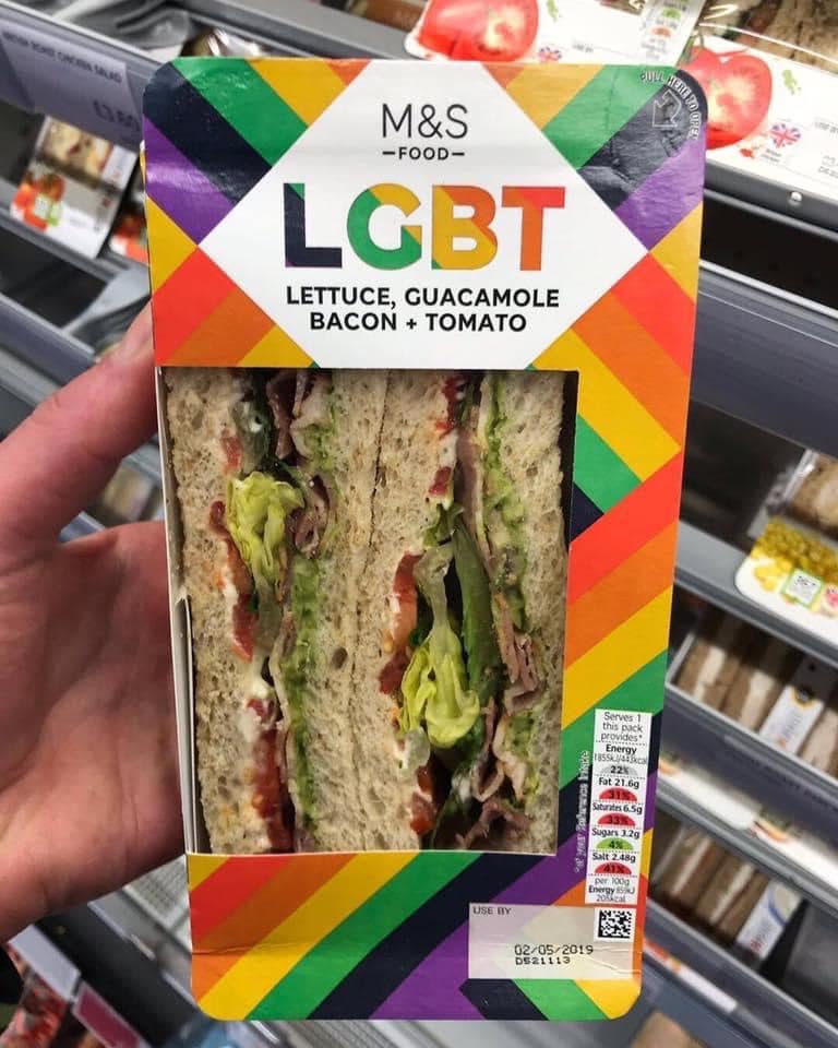
Okay, here's an analysis of the image of the Marks & Spencer sandwich packaging, broken down into the sections you requested. Note that some sections are more applicable than others, and the length of each section will vary accordingly.
1. Visual Description
The image shows a packaged sandwich from Marks & Spencer (M&S). The packaging is predominantly white, with a large, bold "LGBT" title displayed in a rainbow-colored font. Below this, in a smaller font, reads "Lettuce, Guacamole, Bacon + Tomato" indicating the sandwich’s contents. The sandwich itself is visible through a clear plastic window; it appears to be a half sandwich (a cut in half with the fillings visible). The base of the packaging features a rainbow-colored stripe. Nutritional information, use-by date (02/05/2019), and a barcode are present on the bottom-right corner. The sandwich is displayed on a shelf in a refrigerated section of a grocery store, among other similar pre-packaged sandwiches.
2. Foucauldian Genealogical Discourse Analysis
This packaging presents a fascinating case study through a Foucauldian lens. The use of “LGBT” (rather than simply stating the sandwich’s ingredients) immediately frames the sandwich as a statement, a subject of discourse. The genealogy of this sandwich, therefore, isn’t just about its ingredients but about the power/knowledge relationship surrounding LGBTQ+ rights and representation.
- Discourse & Power: The packaging doesn't merely describe a product. It produces a discourse around consumption and identity. By associating a sandwich with “LGBT,” M&S is tapping into a pre-existing discourse of visibility, inclusion, and marketing. This leverages the concept of normalization.
- Episteme: Historically, LGBTQ+ identities were medicalized or criminalized. The sandwich packaging represents a shift in the episteme – the prevailing framework of knowledge – towards a more inclusive and celebratory representation. This shift, however, is produced by discourses of consumerism and capitalist marketing.
- Disciplinary Power: The packaging could be seen as contributing to a form of 'soft' disciplinary power. It encourages a certain type of self-identification or consumption aligned with LGBTQ+ affirmation – 'if you support LGBTQ+ rights, buy this sandwich'.
- Genealogy: Tracing the genealogy of this packaging would involve investigating the historical context of LGBTQ+ rights movements, marketing strategies towards LGBTQ+ consumers ("pinkwashing"), and the evolving discourses around inclusivity.
3. Critical Theory
From a Critical Theory perspective (drawing on thinkers like Adorno and Horkheimer), this packaging represents a key dynamic of the "culture industry."
- Commodification of Identity: The packaging commodifies LGBTQ+ identity. It reduces complex identities and struggles to a marketable label, turning affirmation into a consumable product. The association of the sandwich with "LGBT" suggests that supporting the LGBTQ+ community can be achieved through purchasing this product, obscuring the need for deeper social and political engagement.
- False Consciousness: The packaging can be analyzed in terms of 'false consciousness'. Consumers might believe that by buying this sandwich, they are meaningfully contributing to LGBTQ+ equality, without recognizing the larger structures of power and oppression that continue to exist.
- Spectacle: The packaging contributes to the 'spectacle' (Debord), a world where images and commodities replace authentic social life. The sandwich isn't just food; it’s a symbol, a performance of inclusivity, and a distraction from the complexities of social issues.
4. Marxist Conflict Theory
Applying a Marxist lens reveals how the packaging operates within a system of economic exploitation and class struggle.
- Capitalist Co-optation: The packaging represents the co-optation of a social justice movement by capitalist forces. M&S is strategically aligning itself with LGBTQ+ affirmation to appeal to a consumer base and maximize profit.
- Commodity Fetishism: The packaging contributes to commodity fetishism – the obscuring of the labor and exploitation involved in the production of the sandwich. Focus is directed onto the symbolic meaning of the “LGBT” label, while the working conditions of the farmers, factory workers, and retail employees are rendered invisible.
- Class & Consumption: The ability to purchase this sandwich suggests a certain level of disposable income, highlighting a class dimension to participation in this form of ‘progressive’ consumerism.
5. Postmodernism
From a postmodern perspective, the packaging embodies several key tenets:
- Simulacra & Simulation: The packaging is a simulacrum, a copy without an original. It is a representation of inclusivity that may or may not be genuine. The “LGBT” label becomes detached from its original meaning and becomes a signifier that circulates within the world of consumerism.
- Deconstruction of Meaning: The very act of associating a sandwich with “LGBT” destabilizes the meaning of both. It forces a connection between disparate concepts, creating ambiguity and challenging traditional categories.
- Hyperreality: The packaging contributes to a state of hyperreality, where simulations and representations have become more real than reality itself. The image of inclusivity presented by the packaging may be more persuasive than genuine social progress.
- Playfulness & Irony: There’s a degree of playfulness and irony in the packaging, suggesting a self-awareness of the contradictions inherent in this form of marketing.
6. Queer Feminist Intersectional Analysis
This framework offers the most nuanced understanding of the packaging.
- Commodification of Queer Identity: The packaging participates in the commodification of queer identity, turning a historically marginalized community into a target market. This raises questions about the ethics of 'pinkwashing' and the potential for exploitation.
- Intersectionality: The analysis should consider who benefits from this type of marketing. While the packaging may appeal to some members of the LGBTQ+ community, it may also reinforce existing inequalities and exclude those who are less visible or marginalized (e.g., trans people of color).
- Performance of Allyship: The packaging is a performance of allyship by a corporate entity. It signals support for LGBTQ+ rights without necessarily addressing systemic issues or making meaningful changes within the company.
- Representation & Visibility: The packaging contributes to increased LGBTQ+ visibility, but this visibility is mediated through the lens of consumerism. It may create a superficial understanding of queer identities and experiences.
- Critique of Essentialism: The packaging risks essentializing LGBTQ+ identities by suggesting a unified, homogenous community. A queer feminist analysis would emphasize the diversity and complexity within the LGBTQ+ community and challenge any attempt to reduce identities to simple labels.
This multi-layered analysis demonstrates that even a seemingly simple piece of packaging can be deeply embedded in complex social, political, and economic systems. It’s important to note that these frameworks are not mutually exclusive and can be used in combination to provide a more comprehensive understanding of the image.
simple-description (llama3.2-vision)
This meme is an image of a packaged sandwich from the UK supermarket chain Marks & Spencer, with the name of the sandwich being "LGBT" (an acronym for Lesbian, Gay, Bisexual, and Transgender). The text "LGBT" is in the same font and color scheme as the brand's logo, implying that the sandwich is a playful and humorous reference to the LGBTQ+ community. The image is likely meant to be ironic or satirical, poking fun at the idea of a sandwich being named after a community.
tesseract-ocr
>. M& Sg en. ‘ M&S ye = < Ay LGBT NS MIACON s TOMATO SS. v 7 — A 3. a ed i y ao BP > id Fe s 4 to; \ ee ada . at Aa. a = wR 5 Se J) ‘ AL MNS