First Seen
2023-05-10T20:59:50+00:00
simple-description (llama3.2-vision_11b)
This meme is a political alignment chart, where the left is associated with socialism and the right is associated with capitalism. The chart is divided into four quadrants, with the top-left being socialist, top-right being libertarian, bottom-left being authoritarian, and bottom-right being anarchist. The chart is often used to categorize individuals based on their political beliefs, with the left being liberal and the right being conservative.
The image is a chart with a grid, where the x-axis represents authoritarianism and the y-axis represents libertarianism. The chart is labeled with various political ideologies, including socialism, capitalism, libertarianism, and anarchism. The chart is often used to categorize individuals based on their political beliefs, with the left being liberal and the right being conservative.
The chart is often used to categorize individuals based on their political beliefs, with the left being liberal and the right being conservative. The chart is often used to categorize individuals based on their political beliefs, with the left being liberal and the right being conservative.
detailed-analysis (gemma3-27b-vision)
Okay, let's break down this political chart image through the lenses you've requested. Be aware that applying these complex theoretical frameworks to a simplified visual like this will inevitably involve interpretation and highlighting particular aspects.
Visual Description
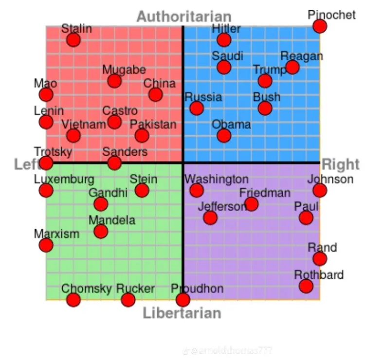
The image is a two-dimensional political compass chart, divided into four quadrants. The horizontal axis runs from "Left" to "Right," while the vertical axis runs from "Authoritarian" to "Libertarian." Various names of historical and political figures, ideologies, and countries are plotted onto this chart.
- Red Quadrant (Authoritarian Left): Occupied by figures like Stalin, Mao, Lenin, Vietnam, Castro, and Pakistan. This area suggests an emphasis on state control and collectivist ideologies.
- Blue Quadrant (Authoritarian Right): Houses figures like Hitler, Saudi Arabia, Trump, and Bush. This quadrant indicates a preference for strong central authority and potentially nationalistic or conservative values.
- Green Quadrant (Libertarian Left): Contains figures such as Luxemburg, Gandhi, Mandela, and Chomsky. This suggests a commitment to individual freedom combined with socialist or progressive principles.
- Purple Quadrant (Libertarian Right): Includes figures like Washington, Jefferson, Friedman, Paul, Rand, and Rothbard. This area represents an emphasis on individual liberty and limited government, often associated with classical liberalism or libertarianism.
The placement of each entity isn't precise, suggesting an acknowledgement that any real-world political position is complex and doesn't fit neatly into a single category.
Foucauldian Genealogical Discourse Analysis
From a Foucaultian perspective, this chart isn't a neutral representation of political positions but a discourse. It constructs and reinforces certain ways of understanding power, knowledge, and the subject.
- Power/Knowledge: The very act of categorizing and plotting these entities demonstrates a power dynamic. Who decided these were the relevant figures? What criteria were used to place them? The chart suggests that power is understood as a force operating through categorization and labeling. It doesn’t account for nuances that may exist outside the categories.
- Genealogy: A genealogical analysis might examine the history of this type of chart. Where did the "political compass" as a concept originate? How have its parameters and categories changed over time? What historical anxieties and power struggles does it reflect? The simple two-axis approach is a specific historical construct.
- Subject Formation: The chart implies a "political subject" defined by its position on these two axes. This is a particular way of constructing identity. Individuals or nations are defined by their placement, potentially obscuring other aspects of their identity. It frames "the political" as solely existing along these specific lines.
The chart produces a certain type of political subject by forcing simplification. A Foucaultian reading would emphasize the historical contingencies and power relations embedded in this seemingly objective representation.
Critical Theory
Drawing on Critical Theory (particularly the Frankfurt School), this chart can be analyzed in terms of ideology and domination.
- Ideology: The chart itself can be seen as an ideological tool. It presents a specific way of organizing political thought that may serve to naturalize certain power structures. The implicit assumption that politics can be reduced to these two dimensions is itself ideological.
- Domination: The chart may subtly reproduce existing power imbalances. For example, the relative prominence of Western figures in some quadrants might reinforce Western hegemony. The choice of which entities to include and exclude is a form of power.
- Reason as Domination: Horkheimer and Adorno's critique of the Enlightenment as "instrumental reason" might be applied. The chart attempts to apply a rational, logical framework to the complex world of politics, potentially overlooking the irrational, emotional, and material forces at play. It seeks to categorize and control the political landscape.
- False Consciousness: A Critical Theorist might argue that the chart contributes to "false consciousness" by presenting a simplified and potentially misleading representation of political reality. It obscures the underlying structures of domination.
Marxist Conflict Theory
From a Marxist perspective, the chart is inevitably shaped by class struggle, even if it doesn't explicitly mention class.
- Material Basis: The underlying material conditions (economic systems, modes of production) are largely absent from this chart. This is a crucial omission from a Marxist viewpoint. The ideologies represented are seen as superstructures built upon the material base.
- Class Struggle: While the chart doesn't explicitly show class positions, the ideologies it represents are often linked to particular class interests. For example, libertarianism is often associated with capitalist elites, while socialism is linked to the working class. The chart's very construction reflects a particular class viewpoint.
- Ideology as False Consciousness: Marxism would view many of the ideologies represented as serving the interests of the ruling class. They are seen as ways of legitimizing and maintaining the existing power structure.
- State as Instrument of Class Rule: The "Authoritarian" axis is particularly relevant. From a Marxist perspective, the state is always an instrument of class rule. The figures placed on this axis represent various forms of state power used to maintain class domination.
Postmodernism
A Postmodern analysis would deconstruct the chart’s claims to objectivity and universality.
- Deconstruction of Binary Oppositions: The chart relies on binary oppositions ("Left/Right," "Authoritarian/Libertarian"). A Postmodernist would argue that these binaries are artificial and unstable. They are constructed through discourse and reinforce existing power relations.
- Rejection of Grand Narratives: The chart implies a "grand narrative" of political thought, attempting to organize all ideologies within a single framework. Postmodernists reject such grand narratives as totalizing and oppressive.
- Emphasis on Difference and Fragmentation: The chart homogenizes complex ideologies and individuals. A Postmodernist would emphasize the inherent complexity and internal contradictions within each category. It glosses over the multiplicity of perspectives and experiences.
- Simulation and Hyperreality: The chart itself is a simulation of political reality. It's a representation of a representation, removed from the lived experiences of those it depicts. It can contribute to a "hyperreality" where the map becomes more important than the territory.
Queer Feminist Intersectional Analysis
This is a particularly challenging lens to apply to such a simplified visual, but it's possible to point out how it omits crucial dimensions of power and identity.
- Absence of Gender and Sexuality: The chart completely ignores issues of gender and sexuality. This is a significant omission, as these are fundamental axes of power and oppression. The chart reinforces a patriarchal framework by neglecting the specific experiences of women and LGBTQ+ individuals.
- Intersectional Analysis: The chart doesn't account for the intersection of different forms of oppression. The experiences of marginalized groups are shaped by the interplay of class, race, gender, sexuality, and other factors. This complexity is lost in the two-dimensional framework.
- Critique of Universalism: The chart implies a universal standard of political thought. A Queer Feminist analysis would challenge this universalism, arguing that political positions are always situated and shaped by specific social contexts.
- Power Relations: Intersectional feminism emphasizes the need to analyze power relations at multiple levels. The chart focuses primarily on state power but neglects other forms of power, such as those operating within families, workplaces, and social institutions.
It's important to remember that applying these theoretical frameworks to this visual is an exercise in interpretation. The chart is a simplification, and any analysis will inevitably highlight certain aspects while omitting others. It's a useful starting point for discussion, but it shouldn't be taken as a definitive representation of political reality.
simple-description (llama3.2-vision)
The meme is a political compass chart, a diagram that maps individuals' political views on two axes: economic (left-right) and social (libertarian-authoritarian). The chart is divided into four quadrants: liberal, conservative, libertarian, and authoritarian. The text "Liberal" and "Conservative" labels are written at the top and left of the chart, respectively.
tesseract-ocr
ni Authoritarian Fpochet OH ~~ Ngpabe ; eo a oe 10 ina 1 2 ere ee ‘oe en S | Troisky Sanders , Lei ‘@ fe tea Right ere Se dgnson eS Sencha , Mpote é , i gs Ps a lo Yl el FB] ard Cer Oe e Libertarian