First Seen
2023-05-10T21:03:40+00:00
simple-description (llama3.2-vision_11b)
The meme is a humorous representation of the income inequality in the United States, comparing the wealth distribution in 2016 to the distribution in 1776, when the first US tax code was established. The image shows a graph with two lines, one representing the wealth distribution in 1776 and the other representing the wealth distribution in 2016. The text "I love a graph that's just going to destroy my entire worldview" is overlaid on the image, implying that the graph's stark contrast between the two time periods is shocking and thought-provoking.
detailed-analysis (gemma3-27b-vision)
Okay, let's break down this image, a tweet featuring a comparison of wealth distribution graphs, through the lenses you requested.
Visual Description
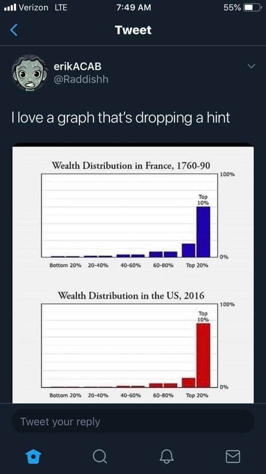
The image is a screenshot of a tweet from a user named @Raddishh, with a profile picture of a cartoonish, stylized face. The tweet's text reads, "I love a graph that's dropping a hint". Below the text are two bar graphs, presented side-by-side.
- Top Graph: Wealth Distribution in France, 1760-90 – This graph shows a fairly even distribution of wealth, with the largest bar representing the 40-60% income range, followed by 20-40% and then similar bars for the bottom and top 20%.
- Bottom Graph: Wealth Distribution in the US, 2016 – This graph shows a dramatically skewed distribution of wealth. The largest bar by a significant margin represents the top 20% of the population, with dramatically smaller bars for all other income ranges. The bottom 20% is essentially zero.
The implicit comparison highlights the drastic change in wealth concentration over time.
Marxist Conflict Theory
This image is extremely potent through a Marxist lens. The comparison directly illustrates the intensification of class stratification.
- Historical Materialism: The graphs can be seen as material evidence of how the mode of production (and its transformations) shapes social relations. The French graph, while not perfectly equitable, represents a system where wealth wasn't as heavily concentrated. The US graph represents the current stage of late-stage capitalism, marked by extreme accumulation of capital in the hands of a few.
- Class Struggle: The graphs visually depict the growing chasm between the bourgeoisie (the wealthy top 20%) and the proletariat (the rest of the population). The enormous size of the top 20% bar in the US graph exemplifies the dominance of capital and the exploitation of labor. It can be seen as a clear visualization of the "increasing misery" predicted by some interpretations of Marx, where the gap between the classes widens.
- Alienation: The visual evidence of a rigged system can contribute to a sense of alienation among the masses, feeling disconnected from the means of production and the benefits of economic growth.
- Revolutionary Potential: The stark contrast can be interpreted as a catalyst for class consciousness and potentially revolutionary action. It suggests the inherent instability of a system built on such extreme inequality.
Critical Theory
Critical Theory broadens the analysis beyond strictly economic factors.
- Power Dynamics: The graphs are not just about money; they're about power. The concentration of wealth signifies a concentration of political and social power.
- Ideology: The image subtly challenges the dominant ideology of meritocracy. The idea that success is solely based on individual effort is undermined by the clear visual evidence of systemic inequalities. The vast disparity in wealth suggests that opportunities are not equal and that systemic factors play a significant role in shaping outcomes.
- Domination: The US graph exemplifies the ways in which the ruling class (the top 20%) maintains its dominance over the rest of society. This dominance isn't just economic; it's cultural, political, and ideological.
- Emancipation: The image, while pessimistic, can be seen as a call for emancipation. By exposing the systemic inequalities, it challenges the status quo and calls for a more just and equitable society.
Foucauldian Genealogical Discourse Analysis
A Foucauldian approach would focus on how knowledge about wealth distribution is constructed and used to exert power.
- Discourse on Wealth: The very act of representing wealth distribution in a graph is a discourse. It frames wealth as something quantifiable, measurable, and thus susceptible to analysis and control.
- Power/Knowledge: The graphs demonstrate a relationship between power and knowledge. Those who control the data and the means of representing it (like creating graphs) also have the power to shape the narrative around wealth. The US graph, with its stark inequality, is likely downplayed or ignored by those in power, while alternative narratives are constructed to justify the system.
- Genealogy: We could trace the historical genealogy of wealth distribution graphs to understand how they have evolved over time and how they have been used to legitimize or challenge existing power structures.
- Normalization: The fact that the US graph is now "normal" (despite its extreme inequality) is a key point. Power operates by normalizing certain conditions and obscuring the ways in which they are constructed. This graph, in a way, is a counter-discourse, attempting to disrupt that normalization.
Postmodernism
A postmodern lens would deconstruct the idea of a singular, objective "truth" about wealth distribution.
- Deconstruction of "Progress": The image challenges the notion of linear progress. While the US may be considered a "developed" nation, the graph suggests that economic development has come at the cost of extreme inequality.
- Relativism of Knowledge: The graphs themselves are constructions. They are based on specific data and methods of calculation. A postmodernist would question the authority of these graphs and acknowledge that alternative ways of representing wealth distribution exist.
- Hyperreality: The US graph may be viewed as a symbol of a hyperreal society, where the representation of wealth (and inequality) has become more important than the reality itself. The media and popular culture often portray wealth in ways that obscure the underlying systemic issues.
Queer Feminist Intersectional Analysis
This framework would examine how wealth distribution intersects with other forms of oppression, particularly gender, sexuality, and race.
- Intersectional Inequality: The graphs represent an aggregate view of wealth distribution. However, within each income bracket, there are significant disparities based on gender, race, and sexuality. For example, women and people of color are disproportionately represented in the lower income brackets.
- Care Work and Unpaid Labor: The wealth of the top 20% is often built on the exploitation of marginalized groups, including women who perform unpaid care work and people of color who are subjected to discriminatory labor practices.
- Devaluation of Queer/Trans Bodies: The economic system actively devalues queer and trans bodies, limiting access to employment, healthcare, and other resources.
- Challenge to Normative Capitalism: Queer feminist theory challenges the normative assumptions of capitalism, such as the emphasis on individual accumulation and the prioritization of profit over people. It calls for a more just and equitable economic system that recognizes the value of care, community, and social reproduction.
Hopefully, this thorough breakdown of the image from various theoretical perspectives is helpful. It demonstrates that a seemingly simple visual can be incredibly rich in meaning when analyzed through different critical lenses.
simple-description (llama3.2-vision)
The meme is a comparison of two wealth distribution charts, one from 1789 and one from 2016. The chart from 1789 shows a very narrow top 1% of the population owning almost all of the wealth, while the chart from 2016 shows an even more extreme concentration of wealth at the top. The meme is captioned "I love a graph that's dropping a hint" and implies that the wealth distribution in the US has become even more skewed in favor of the top 1% since the 18th century.
tesseract-ocr
Pr Aircel oa vee NI ol-y/a MU 4 Tweet | erikACAB N @Raddishh |love a graph that's dropping a hint Wealth Distribution in France, 1760-90 ee | o% Wealth Distribution in the US, 2016 100% om G Q iB &