First Seen
2023-05-10T21:03:42+00:00
simple-description (qwen3.5_2b-q8_0)
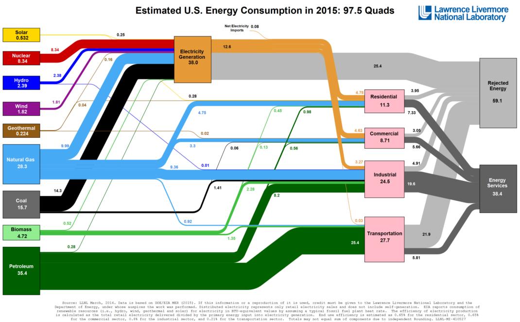
This infographic serves as a visual critique of urban energy consumption, specifically highlighting the high cost of building and running our infrastructure. It breaks down "Electricity Generation" at 38.0 Quads, noting that Residential (11.3 Quads) and Commercial (8.71 Quads) sectors—representing the city itself—consume a significant amount of fuel.
However, the chart warns that a staggering 59.1 Quads of this generated energy is "Rejected Energy," suggesting that nearly half of our grid's output is ultimately lost as waste or heat. Ultimately, the diagram exposes that a massive fraction of the fuel we burn—specifically Coal (15.7 Quads) and Petroleum (35.4 Quads)—is dedicated to powering the grid rather than being used directly for heating or lighting the city.
simple-description (llama3.2-vision_11b)
The meme is a graphic illustration of the world's energy consumption, with various sources (e.g. solar, wind, coal) depicted as roads or highways that converge and diverge in a city-like layout. The text "Urbanism - Energy" is likely a caption or title for this meme, highlighting the intersection of urban planning and energy consumption.
detailed-analysis (gemma3-27b-vision)
Okay, here's an analysis of the "Estimated U.S. Energy Consumption in 2015" Sankey Diagram, broken down into sections relevant to the theoretical frameworks you requested. I will indicate where a framework doesn't apply strongly.
Please note: Applying these theories to a diagram like this often requires a degree of interpretive reach. I'm providing an attempt to apply them, with explanations of how the diagram can be 'read' through that lens. Some sections will be much more robust than others.
Visual Description
The image is a Sankey diagram, a flow chart used to visually represent the flow of energy in the United States during 2015. The diagram presents a series of colored flows (widths representing quantities in quadrillions of BTU - Quads), beginning with primary energy sources on the left (Petroleum, Natural Gas, Coal, Biomass, Nuclear, Hydro, Wind, Geothermal, Solar) and flowing through "Electricity Generation" towards end-use sectors on the right (Residential, Commercial, Industrial, Transportation). A significant portion of energy is represented as "Rejected Energy" (dissipation as heat or other waste).
The diagram uses color coding to differentiate energy sources and sectors. The width of each flow indicates the magnitude of the energy transfer. Numbers are superimposed on the flows indicating the quantity (in Quads) of energy. The primary sources are arranged vertically. The diagram highlights the overall energy system, illustrating how energy is extracted, converted, and consumed. It’s a data visualization that emphasizes the quantity of flows, but not necessarily their qualities or impacts. A total of 97.5 Quads of energy were used in 2015.
Foucauldian Genealogical Discourse Analysis
This diagram is a discourse – a system of thought, knowledge, and practice that shapes our understanding of energy. A genealogical approach (tracing the historical construction of this understanding) reveals how this diagram is not a neutral representation of 'reality,' but a constructed narrative with power effects.
- Power/Knowledge: The diagram embodies power/knowledge. The Lawrence Livermore National Laboratory, as the originator, holds a position of authority in defining 'energy' and its measurements. This 'expertise' legitimizes certain energy sources and consumption patterns while potentially obscuring others. The diagram performs an authoritative version of energy flow.
- Normalizing Judgement: The diagram normalizes certain energy pathways and end uses. The dominance of fossil fuels (coal, petroleum, natural gas) is visually prominent, framing them as the default, accepted way of powering the US economy. It subtly implies a 'natural' or inevitable progression of energy flow.
- Disciplinary Power: The diagram, when presented in policy contexts, can contribute to 'disciplinary' power. It can be used to justify investments in specific energy infrastructures or to rationalize existing energy policies. It could serve as a baseline for setting targets or evaluating progress, indirectly shaping behavior and regulation.
- Genealogy of "Energy": Tracing the historical development of the concept of 'energy' would reveal how it’s a historically contingent concept, shaped by scientific, economic, and political forces. This diagram doesn't reveal that history; it presents energy as a fixed, objective entity.
Critical Theory
Critical Theory, particularly as influenced by the Frankfurt School, challenges the assumption that knowledge is neutral. Applying it to this diagram:
- Instrumental Reason: The diagram exemplifies “instrumental reason” - the logic of efficiency and optimization that dominates modern technological systems. The focus on quantifying energy flows and maximizing output prioritizes how to achieve goals (energy supply) over why those goals are desirable (economic growth, consumption).
- Domination of Nature: The diagram implicitly reinforces a relationship of domination over nature. Energy sources are extracted from the environment and used for human purposes, with little visual representation of environmental consequences. The "Rejected Energy" is presented as waste, rather than as environmental impact.
- Commodification of Energy: The diagram depicts energy as a quantifiable commodity, readily exchanged and consumed. It doesn’t acknowledge the social and ecological costs of extraction, transportation, and consumption.
- Ideology: The diagram can function ideologically by presenting the current energy system as inevitable and natural. It obscures the historical and political choices that have shaped it.
Marxist Conflict Theory
From a Marxist perspective, the diagram reveals underlying class struggles and power imbalances within the energy system:
- Means of Production: The primary energy sources (fossil fuels, nuclear) represent the ‘means of production’ in this case. Ownership and control of these resources are concentrated in the hands of a few powerful corporations and states. The diagram doesn't show who owns these resources, but the sheer volume of fossil fuel flows suggests their central role in maintaining capitalist accumulation.
- Exploitation of Labor & Nature: The extraction of energy resources involves the exploitation of both human labor (miners, oil rig workers) and natural resources. The diagram hides this exploitation behind abstract numbers.
- Class Relations: The high levels of energy consumption in sectors like transportation and industry suggest a pattern of consumption driven by the needs of capital accumulation, rather than meeting basic human needs. The diagram implicitly reinforces existing class inequalities.
- Contradictions: The "Rejected Energy" category points to the inherent contradictions of capitalism – the tendency to overproduce and waste resources in the pursuit of profit.
Postmodernism
A postmodern reading of this diagram would emphasize the constructedness of knowledge and the instability of meaning:
- Simulacra & Simulation: The diagram is a simulacrum – a representation that precedes and defines the 'real' thing. It presents a simplified, abstracted version of a complex system, creating a sense of reality that may be detached from actual lived experiences.
- Deconstruction: A deconstructive reading would challenge the diagram's seemingly neutral representation of energy. It would question the categories used (what counts as 'energy'?) and the implicit hierarchies embedded within the visualization.
- Relativism: Postmodernism would suggest that there is no single, objective 'truth' about energy. This diagram is just one possible interpretation, shaped by the values and interests of its creators.
- Fragmentation: The diagram’s segmented flows could be seen as reflecting the fragmented and disconnected nature of modern life. Energy is presented as a flow of abstract units, rather than as a source of meaning or connection to the natural world.
Queer Feminist Intersectional Analysis (This framework is less directly applicable, requiring significant interpretation)
While the diagram doesn’t explicitly deal with gender, sexuality, or intersectionality, a queer feminist lens can still offer a critique:
- Invisible Labor: The diagram obscures the gendered and racialized labor involved in energy production (mining, transportation, etc.). Historically, these jobs have been disproportionately performed by marginalized communities, whose contributions are made invisible in the abstract numbers.
- Disproportionate Impacts: Environmental impacts of energy production (pollution, climate change) disproportionately affect marginalized communities. The diagram doesn’t represent these differential impacts.
- Masculinist Logic: The emphasis on efficiency, control, and quantification can be seen as embodying a ‘masculinist’ logic, prioritizing rational calculation over care and connection.
- Challenging Binary Categories: The diagram reinforces binary categories (sources/sinks, production/consumption). A queer feminist analysis would challenge these binaries, recognizing the fluidity and interconnectedness of systems.
- The Politics of Scale: The focus on the macro-level (national energy consumption) obscures the micro-level impacts on individual bodies and communities.
Important Note: Applying these theoretical frameworks to a data visualization requires interpretive leaps. These are possible readings, and others could be equally valid. The diagram serves as a starting point for critical inquiry, rather than providing definitive answers.
simple-description (llama3.2-vision)
The meme is an image of a chart comparing the 2015 energy consumption of the United States. The chart shows that the largest source of energy consumption is natural gas, followed by electricity, and then coal. The chart's title reads "Energy Consumption in the United States in 2015".
tesseract-ocr
Estimated U.S. Energy Consumption in 2015: 97.5 Quads \g fagronce Livenrire Nuclear a on Sf bal Br Fe 7 w08 boieka P Po oe) rr