First Seen
2023-05-10T20:59:59+00:00
simple-description (llama3.2-vision_11b)
The meme is a chart showing the predicted housing prices in San Francisco from 2014 to 2023, with a red line indicating the actual prices in 2023. The chart shows a steep increase in prices from 2014 to 2021, followed by a sharp drop in 2023. The text at the bottom of the chart reads: "The 2023 prediction: 1.5 million. The actual: $1.4 million."
detailed-analysis (gemma3-27b-vision)
Okay, let's break down this chart through various theoretical lenses. Since not all lenses will be directly applicable (or fruitful), I'll focus on the ones that resonate most strongly, and indicate where others are less effective.
I. Visual Description
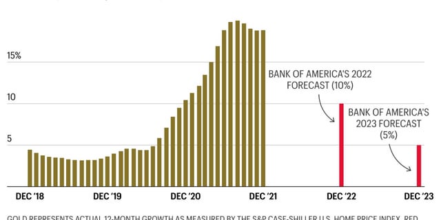
The chart presents a bar graph illustrating the 12-month growth (measured by the S&P CoreLogic Case-Shiller U.S. Home Price Index) from December 2018 to December 2023.
- Trend: From December 2018 to late 2021, the growth rate steadily increases, accelerating particularly from 2020 onwards, peaking around 15% in the Spring/Summer of 2021. This is represented by a dense cluster of tall, green bars.
- Shift: From late 2021 into 2022, there is a sharp and dramatic decrease in growth. The bars noticeably shorten.
- Forecast: Two red bars are added to show the Bank of America's forecast for December 2022 (10% growth) and December 2023 (5% growth), indicating a further expected decline. These forecasts contrast with the prior green growth trajectory.
- Color Coding: The use of green to represent the historical growth and red to represent the forecasts subtly suggests a change from "positive" to "negative" or "caution" regarding the housing market.
- Scale: The Y-axis measures percentage growth, highlighting the magnitude of the increase and subsequent decline.
II. Foucauldian Genealogical Discourse Analysis
This chart exemplifies how the concept of "housing" itself is not a natural, pre-existing category, but a discourse constructed through power/knowledge relations. A Foucauldian analysis can reveal:
- Discursive Formation of "Homeownership": The chart’s focus on growth reinforces the dominant discourse of housing as an investment and a driver of economic progress. This framing masks other potential understandings of “home” (as shelter, community, belonging, etc.). The pursuit of "growth" becomes a self-fulfilling prophecy, driving up prices and potentially excluding individuals from accessing shelter.
- Normalization of Risk: The expectation of consistent growth (as shown in the earlier period) normalizes risk and incentivizes speculative behavior. When the growth slows, it isn’t seen as a return to a more stable state, but as a crisis. The Bank of America’s forecast participates in shaping this discourse.
- The Role of "Experts": The inclusion of Bank of America’s forecasts demonstrates the power of institutional "experts" in defining what constitutes acceptable or expected housing market behavior. These forecasts are presented as objective truth but are inherently based on particular (often neoliberal) economic models.
- Power/Knowledge: The visualization itself performs power/knowledge. It presents a particular way of understanding the housing market (as measurable by this index, driven by growth) and presents that understanding as authoritative.
III. Marxist Conflict Theory
From a Marxist perspective, the chart represents a clear illustration of the inherent contradictions within capitalism.
- Capital Accumulation: The rapid growth in housing prices represents a process of capital accumulation—wealth concentrating in the hands of homeowners, real estate investors, and financial institutions. This wealth is generated through the exploitation of labor and the commodification of basic needs.
- Crisis of Overproduction: The slowdown in growth can be interpreted as a crisis of overproduction—a point where the market becomes saturated and demand cannot keep up with supply. This can lead to deflation, recession, and increased social unrest.
- Class Struggle: The chart implicitly reveals the unequal distribution of wealth and power in society. Those who already own property benefit from rising prices, while those who cannot afford to enter the market are further marginalized. The forecasts suggest that a potential downturn could exacerbate these inequalities.
- Commodification of Shelter: The focus on "growth" and "investment" highlights the commodification of shelter—reducing housing from a fundamental human right to a tradable asset.
IV. Postmodernism
Postmodern analysis finds less direct purchase here, but can be applied to an extent:
- Deconstruction of "Growth": A postmodern lens would question the very concept of "growth." What does it mean for housing prices to grow? Whose definition of "growth" is being privileged? The chart presents growth as an objective and positive value, but a postmodern perspective would deconstruct that assumption.
- Simulation and Hyperreality: The chart itself is a simulation of the housing market. It reduces complex social and economic realities to a single numerical index. This creates a hyperreality—a representation that becomes more real than the reality it is supposed to represent.
- Loss of Grand Narratives: The chart highlights the unpredictability and instability of the market. This challenges the grand narratives of economic progress and stability that have long dominated Western thought.
V. Queer Feminist Intersectional Analysis
This perspective is less directly applicable but can offer nuanced insights:
- Intersection of Housing and Identity: Access to housing is deeply intertwined with identity. Women, people of color, LGBTQ+ individuals, and those with disabilities are disproportionately affected by housing insecurity and discrimination. The chart, while seemingly neutral, masks the ways in which these intersecting identities shape access to housing.
- Care Work and Housing: Housing is often central to care work (childcare, eldercare, etc.). The rising cost of housing can create barriers to providing and receiving care, particularly for women who are often primary caregivers.
- Challenging Traditional "Home" Norms: Traditional notions of "home" and family are often tied to property ownership. Queer and feminist perspectives challenge these norms and advocate for more diverse and inclusive housing options.
- Financialization of Care: The commodification of housing links housing insecurity to the broader financialization of care, putting marginalized groups at higher risk of precarity.
In conclusion: The seemingly simple bar graph is rich with potential interpretations when viewed through various critical lenses. While not all frameworks are equally impactful, each offers unique insights into the complexities of the housing market and its social, economic, and political implications.
simple-description (llama3.2-vision)
The meme is a chart showing the growth of the S&P 500 stock market index from December 2018 to December 2022, with a red line indicating Bank of America's 2022 and 2023 stock market forecasts. The chart shows that the actual growth of the S&P 500 was much higher than the Bank of America's 2022 forecast of 10%, but lower than the 2023 forecast of 5%. The chart is meant to be humorous, implying that the Bank of America's 2023 forecast was so low that it was actually a prediction of a 5% drop in the S&P 500.
tesseract-ocr
15% BANK OF AMERICA'S 2022 FORECAST (10%) 10 \ BANK OF AMERICA'S 2023 FORECAST 5 (5%) DEC 18 DEC ‘19 DEC‘20 DEC ‘21 DEC ‘22 DEC‘23