First Seen
2023-05-10T21:04:28+00:00
simple-description (qwen3.5_2b-q8_0)
This infographic compares Modes of Transit (Left Chart) with Modes of Transport/Travel (Right Chart).
- Left Chart (Modes of Transit): Shows how vehicles move. It's dominated by vehicle-based transport (Cars 43%, Highway 75%, Medium Trucks 12%).
- Right Chart (Modes of Travel): Shows how people travel by specific purpose/activity. It's a mix of ground, air, water, and construction modes (Air 46%, Water 21%, Construction 35%).
- Conclusion: The infographic shows that 99% of urban transport is by vehicle (Left), while 46% of urban travel is by Air (Right).
simple-description (llama3.2-vision_11b)
I couldn't find any information about a meme that matches the description you provided. The text you provided doesn't seem to match any known meme or image. If you could provide more context or information about the meme, I'd be happy to help explain it.
detailed-analysis (gemma3-27b-vision)
Okay, let's break down this graphic through the requested theoretical lenses.
Visual Description
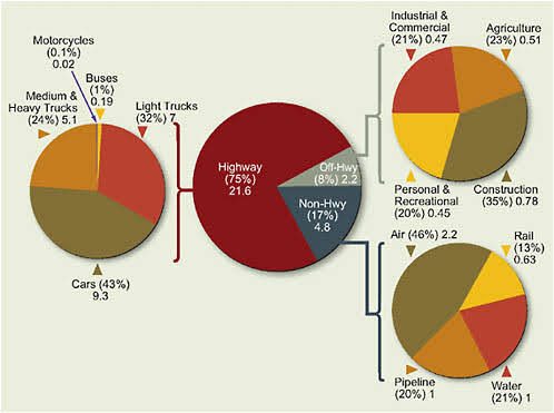
The image is a series of pie charts illustrating the breakdown of oil consumption in the US, measured in billions of gallons (the numbers provided). A large central pie chart shows the overall distribution of oil usage across different transportation modes, categorized as Highway (75%), Non-Highway (17%), and Off-Highway (2.2%). Connected to this main chart are smaller pie charts, each representing a sector of oil usage. These sectors include Cars (9.3), Medium & Heavy Trucks (5.1), Light Trucks (7), Buses (0.19), Rail (0.63), Pipeline (1), Water (1), Air (2.2), Construction (0.78), Agriculture (0.51), Personal & Recreational (0.45), and Industrial & Commercial (0.47). The percentages shown reflect the proportion of overall oil usage contributed by each sector. Colors are generally red, green, and brown.
Foucauldian Genealogical Discourse Analysis
A Foucauldian approach would focus on the discourses surrounding oil consumption and how they have historically constructed our understanding of energy, mobility, and societal needs.
- Power/Knowledge: The graphic itself is a product of power/knowledge. It represents data collected and categorized by institutions, which inherently shape what counts as “oil consumption” and how it’s measured. This categorization shapes how we understand the problem (or lack thereof) of oil usage.
- Genealogy: Tracing the "genealogy" of this data would reveal the historical shifts in how oil consumption is perceived. Initially framed as a sign of progress and modernization, the discourse has shifted (though incompletely) towards environmental concerns. However, the graphic still presents the data as neutral, obscuring the interests that drive oil demand.
- Disciplinary Power: The graphic implicitly reinforces disciplinary power by normalizing oil-based consumption. It doesn't question why these sectors consume so much oil, merely presenting it as a fact. This reinforces the existing structures that rely on oil.
- The "Normal": The chart normalizes the high levels of oil consumption in sectors like highway travel and trucking. It positions this as the “natural” state of affairs, rather than as a consequence of specific policy choices and infrastructure investments.
Critical Theory
A Critical Theory lens would examine the underlying social structures and power relations that shape oil consumption.
- Ideology: The graphic functions ideologically by presenting oil consumption as a practical necessity rather than as a system that benefits specific groups. It does not highlight the inequalities in access to sustainable alternatives or the environmental injustices associated with oil production.
- Commodification: Oil is presented as a commodity, with its consumption treated as a quantifiable metric of economic activity. This overlooks the social and environmental costs of oil production and use.
- The Culture Industry: The graphic is part of a larger "culture industry" that constantly reinforces our dependence on oil. Advertising, media representations of travel, and infrastructure investments all contribute to this process.
- Rationalization & Control: The quantification of oil usage (through charts like this) contributes to the rationalization and control of society. It allows for efficient management of resources but also reinforces existing power structures.
Marxist Conflict Theory
From a Marxist perspective, the graphic reveals the inherent class conflicts embedded within oil consumption.
- Means of Production: The graphic highlights the sectors that rely on oil as a key means of production (transportation, industry, agriculture). The control of these means of production is concentrated in the hands of a small number of corporations and individuals.
- Exploitation: The graphic obscures the exploitation of labor involved in oil production and transportation. The benefits of oil consumption are enjoyed by a select few, while the costs are borne by workers and communities impacted by extraction and pollution.
- Capital Accumulation: Oil consumption fuels capital accumulation for corporations in the energy, transportation, and industrial sectors. The graphic represents a snapshot of this ongoing process.
- False Consciousness: The presentation of oil consumption as a neutral fact contributes to “false consciousness,” preventing people from recognizing the exploitative nature of the system.
Postmodernism
A Postmodern analysis might deconstruct the idea of a single, objective "truth" about oil consumption.
- Deconstruction: The graphic presents a seemingly clear and objective picture of oil usage, but it is a construction – a selective representation of data based on specific categories and methodologies. A postmodern lens would question these categories and methodologies.
- Simulacra & Simulation: The graphic can be seen as a “simulacrum” – a copy of a copy, removed from the lived realities of oil production and consumption. It creates a simplified representation that obscures the complexities of the system.
- Fragmentation: The division of oil usage into discrete sectors (cars, trucks, agriculture) represents a fragmentation of reality. It obscures the interconnectedness of these sectors and the broader systemic issues.
- Relativism: From a postmodern perspective, there is no single "correct" way to measure or interpret oil consumption. Different perspectives and methodologies would yield different results.
Queer Feminist Intersectional Analysis
This lens would examine how power operates through overlapping systems of oppression, specifically focusing on gender, sexuality, and their intersection with oil dependence.
- Gendered Labor: The extraction, refining, and transportation of oil rely heavily on exploitable, often racialized and gendered labor. The graphic does not acknowledge this. The image hides the gendered division of labor in the fossil fuel industry.
- Environmental Justice: The negative environmental impacts of oil extraction and transportation disproportionately affect marginalized communities – often those with intersections of race, class, and gender. The chart disregards these disproportionate effects.
- Mobility and Control: Access to mobility (through cars, trucks, etc.) is often linked to gender and class privilege. The graphic subtly reinforces this privilege by presenting car ownership and highway travel as normal.
- Challenging Binaries: This perspective would challenge the dominant narrative that frames oil consumption as a necessary part of modern life, and offer alternative modes of being that prioritize sustainability, equity, and care.
- Intersectionality: This lens would recognize that oil dependence intersects with other forms of oppression, such as racism, ableism, and colonialism, to create complex systems of inequality.
Important Note: These analyses are interpretations based on the provided graphic. More nuanced readings would require additional context and data. They are presented as potential frameworks for critical engagement with the image.
simple-description (llama3.2-vision)
The image is a pie chart showing the distribution of transportation modes in the United States. The chart is split into four sections, labeled "Highway", "Air", "Water", and "Other", with corresponding percentages. The text "Transportation in the United States" appears above the chart.
tesseract-ocr
Industria & Canmore Aaretre Motorcycles CayOar (eh (0.1%) Veg 02 ea t NG f sadiom &\ 8) { | tony Treks ght trucks = vegas Ay BB? 4 } & ss Suc Rede n i \ on cy | ™ | tpt r reational (35%) 0.78 er Rect (35%) Gre) (20%) 0.45 ue Air (46%) 2.2 Rail v. (3%) oes a \ ars (49% ys a Pete oe (20%) 1 (21%) 1