First Seen
2023-09-22T22:59:36+00:00
simple-description (qwen3.5_2b-q8_0)
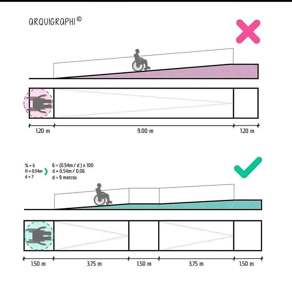
This infographic visually compares two methods for constructing an accessible ramp for wheelchair users. The top diagram, marked with a red "X," depicts a very long ramp (9 meters) that is too flat, making it physically exhausting for the user to climb and leaving them with no vision of the destination. The bottom diagram, marked with a green "check," illustrates a safer "step-up" design that uses shorter, steeper sections to achieve the same 6% safety gradient. The text on the left provides the necessary math: to create a 6% safe slope, the ramp needs a length of 9 meters, and the green design achieves this by distributing the gradient over shorter distances.
simple-description (llama3.2-vision_11b)
The meme is a humorous illustration of a wheelchair user navigating a poorly designed street with a steep incline. The image shows a wheelchair user trying to climb a steep hill, with the caption "When you're trying to get to the other side, but the city didn't think about accessibility." The meme is a commentary on the lack of universal accessibility in urban planning, highlighting the challenges faced by people with disabilities in navigating public spaces.
detailed-analysis (gemma3-27b-vision)
Okay, let's break down this image through the lenses you've requested. It's a compelling visual, rich with potential for analysis. I'll organize it by your suggested headings, only addressing the ones that clearly apply, and indicating when a particular framework doesn't seem relevant.
1. Visual Description
The image is a diagram, a type of technical illustration, presenting two architectural accessibility proposals for a ramp. The style is minimal, using flat colors and simple line drawings.
- Composition: The image is split into two horizontal sections, each representing a ramp design. Each section includes a detailed length measurement of the sections within.
- Ramp Designs:
- Top Ramp: This ramp is a single, long slope. A silhouette of a wheelchair user is positioned near the top, suggesting its function. A prominent red “X” marks this design as unacceptable.
- Bottom Ramp: This ramp is segmented by a series of platforms creating stepped inclines. A wheelchair user silhouette is similarly positioned, and a green checkmark marks this design as acceptable.
- Measurements: The diagram prominently features precise measurements in meters. These are broken down for each section of each ramp.
- Formula: A mathematical formula (“% = (0.54m / d) x 100”) and related data ("H = 0.54m", "d = 0.54m / 0.06") are included, presumably related to calculating the slope or gradient. A question mark is included ("d = ?"), as though asking what measurement is needed.
- Branding: The top of the diagram includes the text “ARQUIgraphi” suggesting this is a technical illustration from a company of that name.
2. Critical Theory
This image strongly invites a Critical Theory analysis, particularly concerning the social construction of “accessibility.”
- Power Structures & Normalization: The diagram immediately presents a “normal” and “abnormal” version of accessibility. The "X" on the long ramp highlights how a solution that appears to provide access can, in fact, be exclusionary. This reveals an underlying power structure – the architect, the building code, etc. – that defines what constitutes “access” and therefore who is included. The long ramp, while visually a continuous slope, is declared unacceptable because it doesn’t meet standards for usability.
- Deconstruction of the ‘Neutral’ Object: The ramp itself isn’t a neutral, objective object. It is designed according to a set of principles (represented by the measurements and the formula). These principles are not universal; they are based on societal assumptions about the capabilities of people with disabilities. Critical theory asks us to question why these standards exist, and who benefits from them.
- Embodied Experience: The silhouetted wheelchair users emphasize the lived experience of disability. The diagram is not merely about calculating angles and distances; it's about the ability of a person to navigate space with dignity and independence.
- Knowledge/Power: The formula and measurements demonstrate how technical knowledge is used to define and control access. The design of the ramp is framed as a mathematical problem with a “correct” solution, obscuring the social and political context of accessibility.
3. Foucauldian Genealogical Discourse Analysis
This image lends itself well to a Foucauldian analysis.
- Discourse of Disability: The diagram participates in the broader discourse around disability. It defines what "accessibility" means through the language of measurement, calculation, and standardized design.
- Power/Knowledge: Similar to the critical theory lens, the diagram demonstrates how knowledge (about slope, gradients, etc.) is inextricably linked to power. Those who possess this knowledge (architects, building inspectors, etc.) have the power to define what is considered accessible and to enforce those standards.
- Genealogy of Accessibility: A genealogical analysis would trace the historical development of accessibility standards. What were the initial motivations behind creating these standards? How have they evolved over time? Who was included in (and excluded from) these discussions?
- Normalisation: The green tick and the red cross work as forms of discipline to normalise accessible design. The visual categorisation of 'correct' and 'incorrect' shapes how we understand what is expected, and what is considered 'acceptable'
4. Queer Feminist Intersectional Analysis
This is a more nuanced connection, but potentially relevant.
- Accessibility as a Social Justice Issue: A queer feminist intersectional approach would view accessibility not simply as a technical problem, but as a social justice issue. Access is not just about physical limitations, but about challenging systemic barriers that exclude marginalized groups.
- Intersectionality: Disability intersects with other identities (race, gender, class, sexuality, etc.). An analysis might explore how accessibility needs differ based on these intersecting identities. For example, a woman using a wheelchair may encounter different barriers than a man using a wheelchair.
- Challenging Normative Standards: This lens would question the implicit assumptions about “normal” bodies and abilities that underlie accessibility standards. What constitutes a "standard" user? Who is considered "normal" in the design process?
- Focus on Agency: The silhouetted figure of the wheelchair user is a symbol, but it’s important to consider their agency. Are they active participants in the design process? Or are they simply objects to be accommodated?
5. Marxist Conflict Theory
This is less directly applicable. While there's a power dynamic present, it doesn't naturally align with a class-based conflict.
- Access as a Resource: One could argue that access to buildings and public spaces is a resource, and that the design of these spaces reflects existing power imbalances. Those who control the built environment (developers, architects, government) have the power to allocate this resource (access) in ways that benefit certain groups and exclude others.
- Economic Considerations: The cost of implementing accessibility features can be a point of conflict. Developers may resist making these changes due to cost concerns, creating a tension between profit and social responsibility. However, this connection isn't as strong as in the other frameworks.
In conclusion, this diagram is a powerful visual statement about accessibility. It invites a deep analysis through the lens of Critical Theory and Foucauldian discourse analysis, revealing how seemingly neutral technical solutions are actually shaped by social, political, and historical forces. While other frameworks offer potential connections, they are less central to understanding the image's message.
simple-description (llama3.2-vision)
The meme is a comparison of two diagrams showing the height of a wheelchair ramp. The top diagram shows a ramp with a steep incline, while the bottom diagram shows a ramp with a gentle incline. The text in the image says "No" in response to a question about whether the top ramp is accessible, and "Yes" in response to a question about whether the bottom ramp is accessible.
tesseract-ocr
ARQUIGRAPHI® x @ <n ee ee \U 5 a 120m 9.00 m 120m %=6 6 =(0.54m/d)x 100 H=05S4m ) d=0.54m/0.06 d=? d=9 metros tt 1.50 m 375m 1.50 m 375m 150 m