First Seen
2023-06-13T19:33:54+00:00
simple-description (qwen3.5_2b-q8_0)
This infographic uses towering stacks of blocks to visualize a "city" made entirely of infrastructure. The massive, blocky iron ore is compared to the bedrock and foundation of a giant urban development. Below it, the industrial metals like copper and aluminum are stacked like steel beams and concrete used to build that city. Finally, the tiny, scattered precious metals are treated like the high-density, high-tech components—such as smartphones and security systems—that populate the modern urban skyline.
simple-description (llama3.2-vision_11b)
The meme is a picture of a large, cube-shaped building with a small, rectangular window on one side. The text "I can see for miles" is written above the window, referencing the classic phrase from the song "I Can See for Miles" by The Who. The meme is poking fun at the idea that the building is so large that it can see for miles, but it's actually just a small window on one side, making the phrase ironic and humorous.
detailed-analysis (gemma3-27b-vision)
Okay, let's break down this infographic about metal mining through the lenses you've provided. It's a complex task to apply all these theoretical frameworks comprehensively, so I will aim for detailed, focused analyses where appropriate, and acknowledge when certain frameworks are less relevant.
Please note: This is a substantial response, as you've requested in-depth analysis through multiple theoretical lenses.
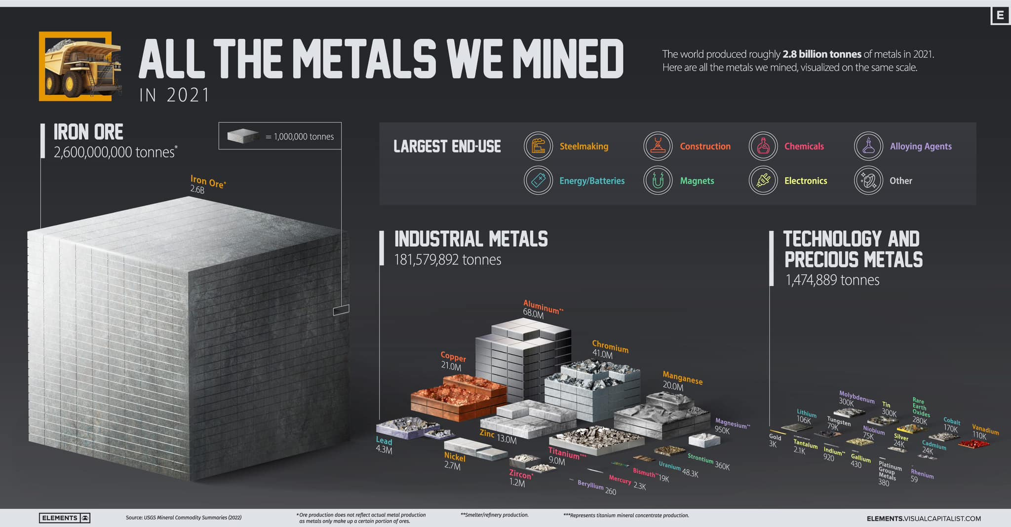
1. Visual Description
The infographic, titled “All the Metals We Mined in 2021”, is a data visualization presented with a minimalist design aesthetic. It shows a layered bar chart, visually representing the tonnage of various metals mined globally in 2021, totaling 2.8 billion tonnes. The bars are stacked to emphasize comparative amounts, using a muted color palette of oranges, blues and greys.
The infographic is divided into three main sections. The largest bar represents Iron Ore (2.6 billion tonnes). This is followed by 'Industrial Metals' (181,579,892 tonnes) and 'Technology and Precious Metals' (1,474,889 tonnes). Each metal is represented by a stacked section within these broader categories, with tonnages clearly indicated.
Icons above the chart represent the main end uses of the metals, categorized as Steemaking, Construction, Chemicals, Alloying Agents, Energy/Batteries, Magnets, and Electronics. A key is provided to help correlate the bar heights with specific tonnage values (1,000,000 tonnes). The bottom of the infographic credits data sources and notes that production quantities do not represent a holistic view of metal activity. The visualization's layout suggests a hierarchical ranking of metal importance based on production volume, with iron ore at the top and precious metals at the bottom.
2. Foucauldian Genealogical Discourse Analysis
This infographic immediately invites a Foucauldian analysis focusing on power/knowledge. The visualization isn't a neutral representation of "metals," but a discourse that constructs metals as resources, commodities, and objects of quantifiable value.
- Genealogy of Mining: Foucault's genealogical method seeks to trace the historical emergence of concepts. Here, the infographic exemplifies the historical shift towards quantifying natural resources, moving from pre-industrial understandings of metals as intrinsically valuable (for craftsmanship, religious objects, etc.) to their modern function as units of production and economic growth. The "mining" of metals is not merely an extraction process but a discourse that constructs the earth as something to be extracted from, defining the relationship between humans and the environment.
- Disciplinary Power: The infographic, by presenting metals as quantifiable and categorized, participates in a disciplinary regime. It reinforces systems of measurement and categorization that enable control and optimization of resource extraction. The visualization's emphasis on tonnage normalizes the idea of viewing the natural world through the lens of production and consumption.
- Power/Knowledge Nexus: The infographic claims to be a source of knowledge, but that knowledge is always intertwined with power. The selection of which metals to include, the way they are categorized, and the emphasis on tonnage are all choices that reflect specific interests and power relations. Who commissioned this visualization? Who benefits from the construction of metals as quantifiable resources? These questions are central to a Foucauldian reading. The use of “mined” is significant, framing the activity as an inherent positive act of resource extraction, rather than a potentially destructive process.
3. Critical Theory
From a Critical Theory perspective (influenced by the Frankfurt School), the infographic can be seen as a reflection of the instrumental reason that characterizes modern capitalist society.
- Commodification of Nature: The visual presents metals as commodities – objects stripped of their inherent value and defined solely by their exchange value. This is a prime example of the “colonization of the life-world” identified by Jürgen Habermas, where systems of production and consumption penetrate and dominate all aspects of human experience.
- Reification: The infographic reifies metals - it presents them as concrete, objective entities, obscuring the social relations of production that are embedded in their extraction and processing. The infographic doesn’t show the labor, environmental damage, or geopolitical conflicts that are often associated with metal mining.
- Ideology: The presentation of "mining" as a fundamental activity reinforces an ideology of endless growth and resource extraction. It normalizes the idea that constant production is necessary for societal progress, while obscuring the potential ecological and social costs. The infographic implicitly frames metal extraction as a necessary component of a functioning society, potentially silencing critiques of unsustainable practices.
- One-Dimensionality: Adorno and Horkheimer’s concept of a “one-dimensional” society suggests a loss of critical thought and genuine individuality. The infographic, by reducing metals to quantifiable units, contributes to this flattening of experience.
4. Marxist Conflict Theory
A Marxist analysis highlights the inherent class conflicts embedded within the infographic's depiction of metal mining.
- Means of Production: Metals are fundamental means of production in a capitalist system. The infographic illustrates the scale of resource control necessary to fuel industrial processes, revealing a concentration of power in the hands of those who control access to these metals.
- Exploitation of Labor: While not visually represented, the infographic implicitly relies on the exploitation of labor in metal mining operations. Workers in mining are often subjected to dangerous working conditions and low wages, a fact obscured by the visualization’s focus on tonnage.
- Imperialism and Resource Control: Historically, the acquisition of metals has been closely linked to imperialism and the exploitation of resources in colonized countries. The infographic, while global in scope, does not address the uneven distribution of mining operations or the geopolitical conflicts that often surround resource control.
- Class Struggle: The infographic inadvertently reveals the stakes of class struggle. The control of metals and the means of production based on them are crucial to maintaining the power of the capitalist class. The visualization could be interpreted as a celebration of the sheer scale of extraction, thereby masking the inherent contradictions and inequalities of the system.
5. Postmodernism
A Postmodern reading of the infographic would question its claim to objectivity and universality.
- Deconstruction of Categories: The infographic categorizes metals into "Industrial" and "Technology/Precious." A postmodern analysis would challenge these categories as arbitrary and constructed. What constitutes “precious”? Why are some metals deemed “industrial” while others are not? These categories are not natural but reflect specific cultural and economic values.
- Simulation and Hyperreality: The infographic is a simulation of reality, a visual representation that never fully captures the complex processes involved in metal mining. It creates a hyperreality – a simulacrum that feels more real than the reality it represents. The visual spectacle of the infographic can distract from the underlying social and environmental issues.
- Subjectivity of Knowledge: Postmodernism challenges the idea of objective knowledge. The infographic is not a neutral representation of “metals” but a subjective interpretation constructed from a particular perspective. The selection of data, the visual design, and the overall framing reflect the biases and values of the creators.
- Fragmentation and Discontinuity: The infographic presents a fragmented view of metal mining, focusing on tonnage without acknowledging the complex interconnections between different metals, regions, and stakeholders. This fragmentation reflects a broader postmodern condition of fragmentation and discontinuity.
6. Queer Feminist Intersectional Analysis
This lens is less directly applicable, but can offer valuable insights.
- Invisible Labor & Gendered Division of Labor: Mining is often associated with masculine labor, and the infographic obscures the gendered division of labor involved in the entire supply chain, from extraction to processing to manufacturing. The invisible labor of women in support roles or in communities impacted by mining is absent.
- Environmental Justice & Intersectionality: Mining disproportionately impacts marginalized communities (racial, economic, Indigenous). A queer feminist analysis would highlight how environmental damage intersects with other forms of oppression. For example, communities of color often bear the brunt of pollution from mining operations, and Indigenous lands are frequently targeted for resource extraction.
- Deconstruction of Binary Categories: The categorization of metals as “Industrial” or “Precious” can be seen as reinforcing binary oppositions. A queer feminist analysis would question these binaries and explore the fluidity and interconnectedness of different categories.
- Challenging the “Resource” Narrative: The infographic frames metals as resources to be exploited. A queer feminist perspective might challenge this narrative and advocate for a more ethical and sustainable approach to resource management that prioritizes the well-being of both people and the planet. It might ask whose interests are served by the “resource” narrative, and whose voices are silenced.
This is a lengthy analysis, demonstrating how multiple theoretical frameworks can be applied to a single visual representation. Each lens offers a unique perspective and reveals different layers of meaning and power dynamics embedded within the infographic. It’s important to remember that these analyses are not mutually exclusive and can be combined to create a more nuanced and comprehensive understanding.
simple-description (llama3.2-vision)
The meme is an image of a giant metal cube with the caption "I can see you're a 3D model, but I'm a 2D taxpayer". The image is a play on the phrase "I see you", implying that the 3D model is aware of the 2D taxpayer, but the taxpayer is not aware of the 3D model.
tesseract-ocr
LS The world produced roughly 2.8 billion tonnes of metals in 2021. — £ Here are all the metals we mined, visualized on the same scale. Sey Ca Daaonnnton worn LARGEST END-USE Sy rite) Construction ernie Eon suid Born easier ect} Ete atacy Lara teonit lay Other eer a WU Rh aR) TECHNOLOGY AND = 181,579,892 tonnes ete aU) aPAV Re tse mre lalalsy y = ee Pe at j ic ee 5 Sri SS CL ee | 3 — Ra toe eee [Ris = basic, 72 * zoom "** Hi ee ae i ee Sead > Saee = a ie ee io oo ee a . —————__ 2 e aa Toa a = NL a Ee Lee BS a ta pe TN \ (og a = —" slum rag Pri | ae deg ee be een yl Cael — -* ai Sa os os ee ‘gion 3 hi rey \ eel ie , 3K Plan Sap? ele Ses ee Nick ysis SN eC Sa ie a a age =, ium er 5 i aT 4 Ao ek 0) Tae = Cen 7 rian 7 oe co el renee x Sas